Three Customers Said Nice Things. Your Landing Page Still Looks Empty.
Micro-SaaS social proof for solo founders: collect real testimonials, place them where strangers convert, and skip the widget theater when you have four paying users.
 By Reese25 min read
A founder sent me her landing page on a Thursday. Eight paying customers. Real revenue. She had asked two of them how they liked the product and both said something friendly in Slack. Her homepage still had a giant empty band labeled "What customers say" and a carousel widget spinning through zero entries.
That gap is more common than people admit. Building got fast. Stripe works. You can ship a pricing page in an afternoon. Collecting and placing social proof still takes awkward human follow-up, and most solo founders would rather tweak the hero headline for the sixth time than send a testimonial request to someone who already paid them.
If you are trying to figure out micro saas social proof as a solo founder, this post is about the unglamorous middle: you have a few customers, strangers still bounce, and you need proof that does not read like you invented it. Not a roundup of widget tools. Not a lecture on why trust matters. The ask, the edit, the placement, and the honest moment when a wall of love is still theater.
I am not a developer. I do not wire up embed scripts for fun. I have spent years watching landing pages fail the eight-second test because the founder treated testimonials like a launch-day checkbox instead of a distribution habit. Max covers the product and pricing mechanics. I cover what strangers see before they click Start trial. If your page structure is broken, read micro-SaaS landing page for solo founders first. If your positioning sounds like everyone else, fix micro saas positioning before you polish quotes. Social proof amplifies a clear message. It does not fix a vague one.
Micro saas social proof solo founder: what strangers need before they pay
Strangers are not skeptical because they hate indie products. They are skeptical because they have clicked Start trial on forty tools that looked identical and half of them never sent a receipt. Your job on a cold landing page is not to impress them with feature depth. It is to reduce the perceived risk of trying something built by one person they have never heard of.
Social proof is borrowed trust. A quote from another freelancer who invoices on the 15th tells a new freelancer you might understand their month. A logo row from companies nobody recognizes tells them you had time to design a logo row. One is useful. One is wallpaper.
I think about proof in three layers for micro-SaaS at SMB scale. Identity proof: who is this person and will they still exist in six months. Outcome proof: someone like me got a result I care about. Process proof: I can see roughly how this works without signing up. Most solo founders jump to layer three (screenshots and feature lists) while layer two sits empty. That is backwards for cold traffic.
Cold visitors do not owe you attention. Warm visitors from your newsletter or a Reddit thread where you have been helpful for three weeks arrive with partial trust. They need less proof near the button. Cold visitors from search or a paid click need outcome proof above the fold or they leave. Same product. Different page emphasis. I have seen founders copy a competitor's wall of love layout while sending 100 percent cold traffic to the page. The layout was fine. The trust gap was not.
Paid ads amplify whatever page you send them to. If you are running small-budget tests from profitable paid ads playbooks, proof near the CTA is part of the ad unit even though it lives on the page. I have watched founders blame creative when the landing page showed zero evidence that anyone like the clicker had succeeded. Fix proof before you refresh ad copy for the third time.
The proof threshold I use
I do not add a testimonial section to a cold landing page until at least one paying customer can describe a specific outcome in one sentence. Beta praise does not count. Neither does your co-founder's LinkedIn comment.
This is not about faking scale. Three honest quotes from people in your best-fit segment beat thirty generic stars. If you are pre-revenue, skip the widget entirely and lean on problem specificity in the hero. Pretending you have social proof when you have none is a conversion leak that shows up as high bounce rate on the pricing section, not as angry emails.
Why your landing page feels empty even with real customers
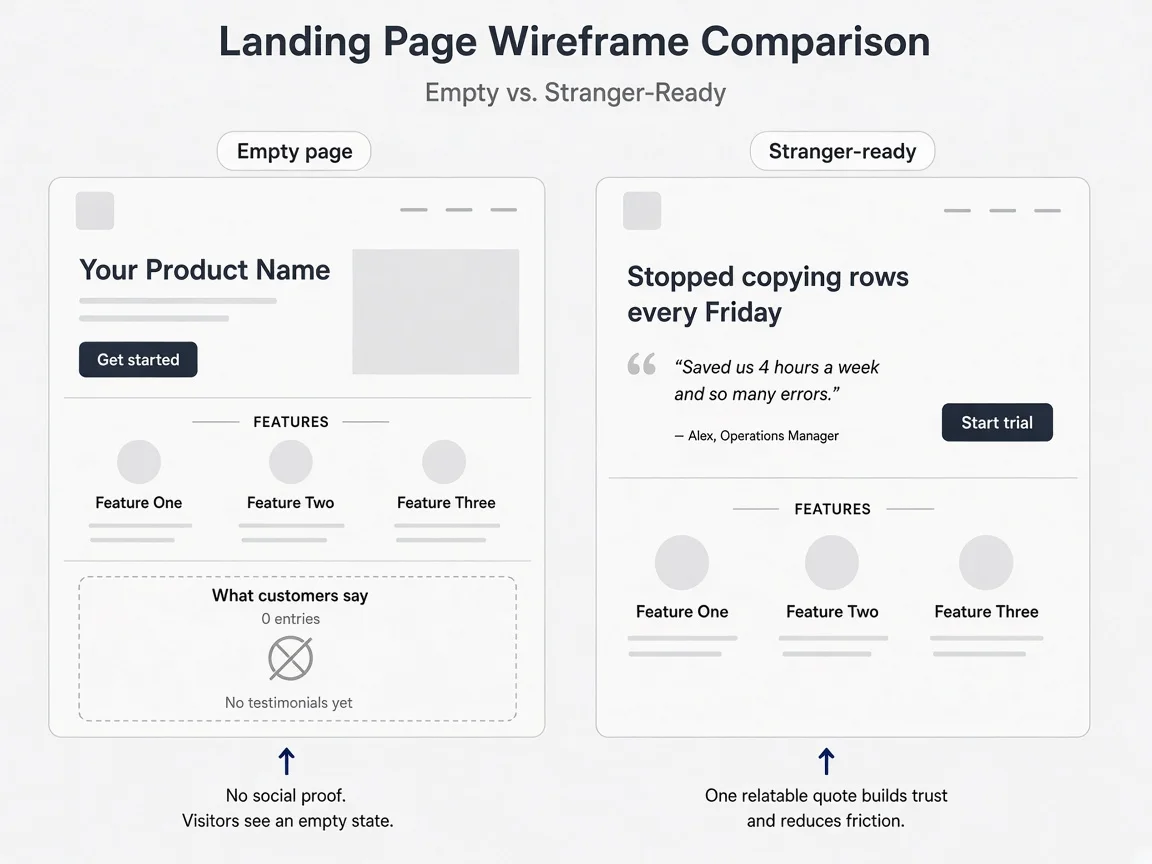
You have customers. The page still feels hollow. That usually means one of four things is true, and only one of them is fixed by installing Senja.
First, you never asked. Friendly Slack reactions are not assets. They live in a channel you cannot embed. Founders tell me they did not want to bother paying customers. Those same customers emailed support twice last month. A two-sentence ask after you solved their problem is not bothering them. It is giving them a chance to be quoted accurately.
Second, you asked too early. Day two praise is often politeness. Day seven, after they ran a real workflow and hit a small win, produces quotes you can actually use. I once watched a founder blast a Typeform to everyone who signed up for a trial. Response rate was fine. Every answer said great UI. None of them converted to paid. The quotes would have attracted more tire-kickers.
Third, you collected words you cannot show. Private DMs, voice notes, and I love this in a Zoom chat need permission and editing before they go public. Founders stash these in a Notion page and feel proof-rich while the live site stays empty. The bottleneck is not collection. It is publication.
Fourth, you placed proof where strangers never scroll. A carousel at the bottom of a long page is a graveyard for quotes. Your best line about saving four hours on client reporting belongs near the primary CTA on cold traffic, not below six feature cards that repeat your homepage headline in different fonts.
There is a fifth flavor that hurts more: you have proof, but it is the wrong kind. Builder compliments from Indie Hackers threads. Your mom. A former coworker who got a free lifetime account. Strangers smell that. They might not articulate it. They just do not click.
I audit a lot of solo-founder pages by doing the stranger test. Open the URL in a private window. Start a timer. At eight seconds, can you answer: who is this for, what changes after signup, and why should I believe one other person paid for it? If the third answer is missing, you do not have a social proof tool problem. You have a ask-and-place problem.
The three types of proof that actually move SMB buyers
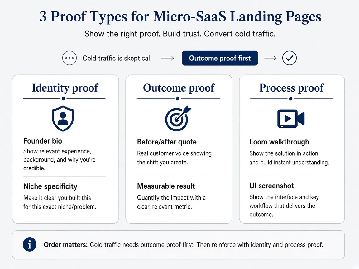
Not all proof works the same way. At enterprise scale, Derek would talk about security packets and procurement references. At micro-SaaS SMB scale, I watch three types move the needle when they are specific.
Identity proof answers whether you look like a real operator. Founder photo with a plain bio beats a stock illustration. Showing your support email and response time beats we care about customers in footer gray text. For B2B micro-SaaS, naming your niche helps. Solo bookkeeper is better than professionals worldwide. Identity proof does not close the sale alone. It stops the lizard brain from assuming scam.
Outcome proof is the quote that names a before and after. Saved me three hours on month-end reconciliations is outcome proof. Great tool is not. Numbers help when they are real. Even without numbers, concrete verbs win. I stopped copying data between two spreadsheets every Friday is a quote I would put near a CTA. I really like the dashboard is a quote I would thank them for and not publish.
Process proof shows the shape of the product without a signup wall. Short Loom walkthrough, annotated screenshot, or a three-step how it works with real UI. This overlaps with product marketing, but on a landing page it functions as proof that the thing exists and does what you claim. Process proof matters more when the category is crowded. Outcome proof matters more when the category is new and scary.
Most pages overweight process proof because founders control it. You can screenshot your own app tonight. Outcome proof requires another human and a slightly uncomfortable email. That is exactly why it converts better when a stranger lands cold.
Here is how I allocate them by traffic temperature. Cold search or paid traffic: outcome proof near the button, identity proof in the hero subhead or founder line, process proof mid-page for the skimmers who need to see the UI. Warm email or community traffic: shorten outcome proof, move it lower, lead with the offer because trust started before the click. If you only have energy for one block this week, write one outcome quote and place it correctly. Skip the logo parade.
When social proof fits a micro-SaaS (and when widgets are theater)
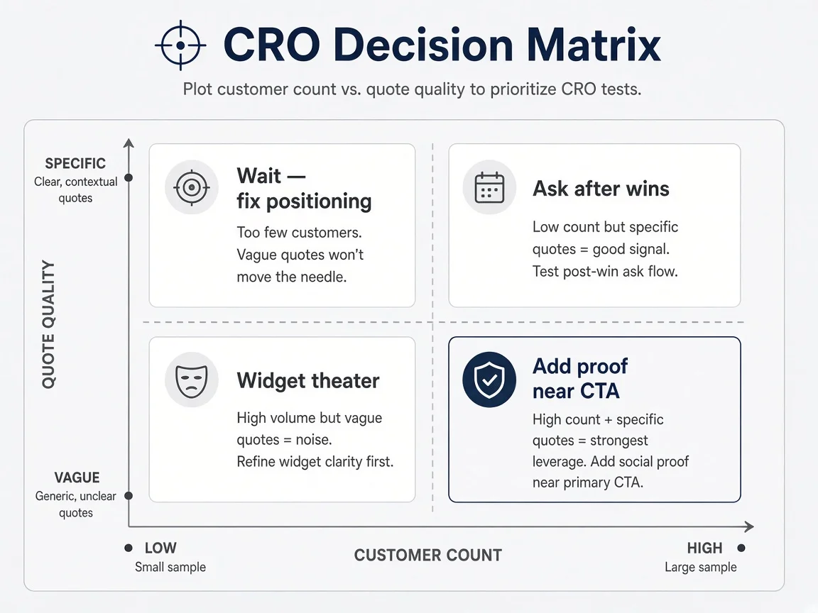
Social proof is not a moral good. It is a tool. There are situations where collecting testimonials is the wrong use of your Tuesday.
If you have zero paying customers, do not install a wall of love. Do not fake it with friends. Fix positioning and get three people to pay, even manually. Proof without payment is performance.
If your product changes every week, old quotes can lie. A testimonial about a workflow you removed last month is worse than no testimonial. Update or cut stale quotes the same way you would update a screenshot. I keep a simple rule: if the feature mentioned in the quote no longer exists, the quote comes down until I get a fresh one.
If your buyer is internal tools for teams of fifty, a solo founder quote from another solo founder might not match. Match the proof to the ICP you want next, not the ICP you accidentally attracted first. One agency owner quote on a page aimed at freelancers sends a mixed signal.
Widgets become theater when they are empty, generic, or misaligned. A spinning carousel with three stars and no names is theater. A Senja embed with two outcome quotes and job titles you verified is operational. The tool is rarely the problem. The inventory and placement are.
I am pro-widget for solo founders once you have quotes worth showing. Building a custom testimonial grid in Framer is a fine Saturday project the first time. Maintaining it across five landing pages is not how you should spend month four. Use Senja, Testimonial.to, or a simple static block in your page builder. Save custom design for when proof is a bottleneck, which is almost never at under fifty customers.
Also skip social proof on pages that are not decision pages. Your changelog does not need a testimonial carousel. Your documentation homepage might need one line about who the product is for, not a wall of praise. Match the asset to the job.
One more trap: collecting proof from the wrong audience. If your first ten users are other founders who joined because you post on Indie Hackers, their quotes attract more founders, not the bookkeepers you actually want. That is not dishonest. It is misaligned inventory. Tag quotes by role when you save them so you do not accidentally populate a page aimed at agencies with freelancer-builder praise.
How to ask your first five customers without sounding desperate
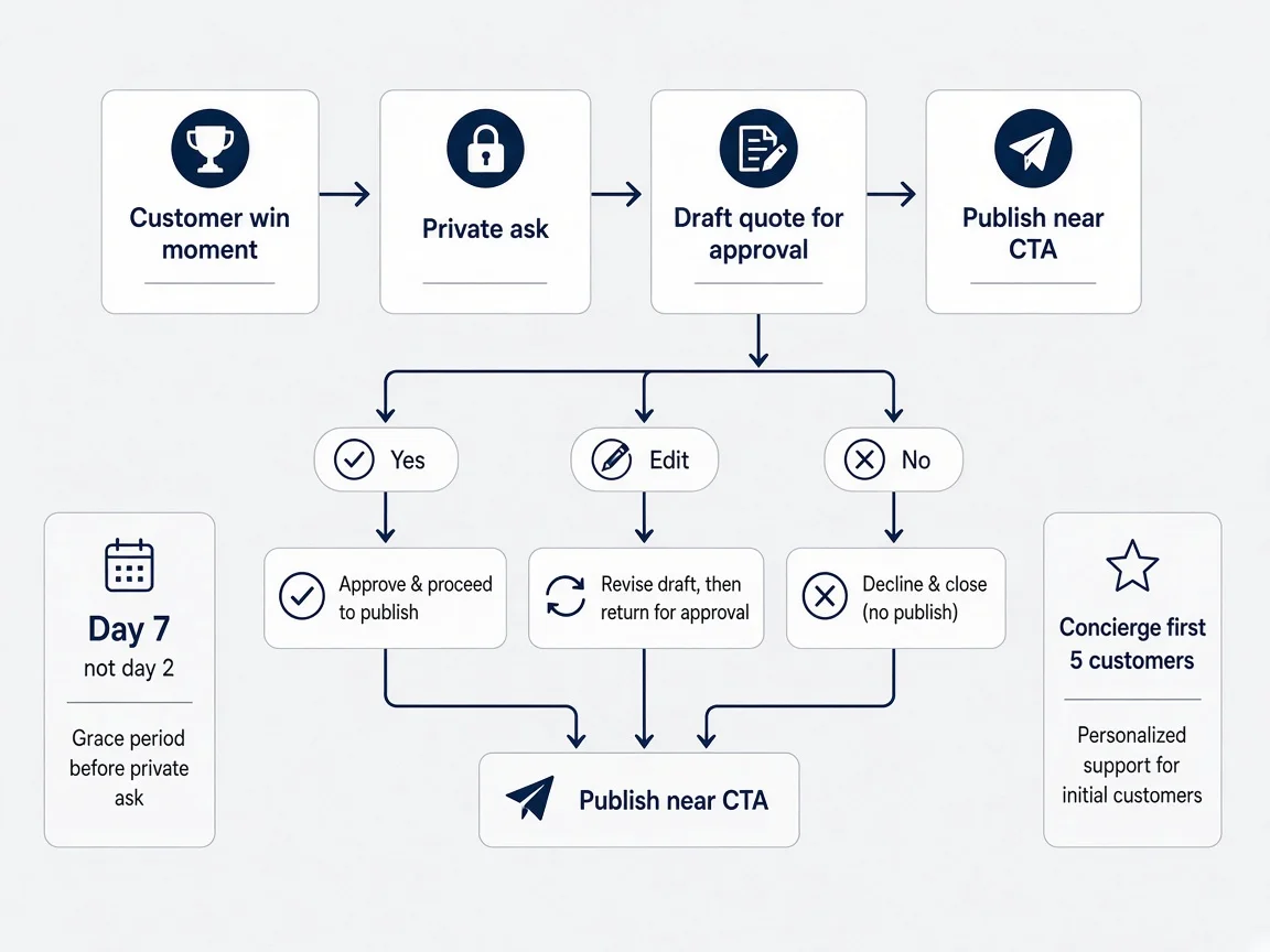
The ask feels awkward because you are treating payment as the end of the relationship when it is the start of distribution leverage. You do not need a formal program. You need a habit.
I trigger the ask after a win moment, not after signup. They exported the report successfully. They replied to your onboarding email saying this replaced a spreadsheet. They renewed without you nudging. That is when trust peaks. Asking on day one feels like you want marketing assets before you delivered value.
Keep the first ask private and low friction. Email or DM, not a public @ mention. I use a short pattern: name the thing they did, ask if I can quote them, offer to send the exact sentence for approval. People say yes more often when they do not have to write marketing copy from scratch.
For your first five customers, I would personally do concierge asks. Not a form. Not an automated email sequence. One human message per person. You learn what language they actually use, which feeds back into your hero headline. Automated collection can come at customer fifteen when you see which questions produce usable answers.
If they say yes, send them the draft quote. Almost always. Founders hesitate here like editing is dishonest. Customers appreciate not having to wordsmith. You are not putting words in their mouth if you ask them to approve. You are saving them time.
If they say no, thank them and move on. Never publish without permission. Never paraphrase so hard it becomes a claim they would dispute. A no is data. Sometimes the product delighted them but not enough to attach their name. That tells you the outcome is not sharp enough yet.
Say you have five paying customers and three agree to be quoted. That is enough for launch-grade proof if the quotes are specific. Do not wait for twenty. Do not delay the landing page update because the carousel looks sparse. One strong line above the fold beats a sparse grid below it. I have seen founders hide behind we are waiting for more customers while eight people pay quietly and say kind things in support tickets. Eight is enough to ask. Three published lines is enough to ship.
The testimonial request email I send on day seven
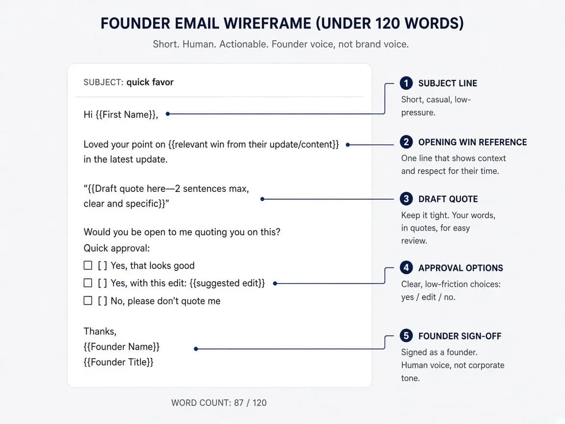
Templates help only when you mean them. Here is the structure I use for B2B micro-SaaS customers after they have been paid for about a week and I know they used the core workflow at least twice.
Subject line: quick favor, not Can I pick your brain for twenty minutes. They already bought. Respect that.
Opening: one sentence referencing something specific they did in the product or told you in support. Not I hope you are enjoying the platform. Try something like: You mentioned last Tuesday you stopped manually copying invoice rows into your master sheet.
Ask: permission to quote them, with an out. Would it be okay if I used that on the landing page? I can keep your name off if you prefer.
Draft quote: write the outcome sentence for them. Would this be accurate: I stopped copying invoice rows every Friday and close the month about three hours faster?
Approval: ask them to reply yes, edit, or no. One tap decision.
Sign-off: your name, not the brand voice. Founder emails convert better for this because it feels human.
Subject: quick favor — ok to quote you?

Hi Alex,

You mentioned last week you stopped copying invoice rows into your master sheet every Friday. Glad that part is working.

Would it be okay if I used that on the landing page? Happy to keep your name off.

Would this be accurate?
"I stopped copying invoice rows every Friday and close the month faster."

Reply yes, tweak it, or no — all fine.

— Reese
That email is under 120 words. Long testimonial requests get archived. If they edit the quote, use their version or a blend you agree on. Their words beat your polish when the polish drifted from how they talk.
Timing note: day seven is a default, not a law. If your product is daily-use, day four after a clear win can work. If it is monthly reporting software, wait until they have run a second billing cycle. The signal you are waiting for is they got value twice, not that a calendar flipped.
Follow-up matters. Half of yes responses arrive after a gentle bump three days later, not from the first email. Keep the bump shorter than the original. Still no guilt trip. Still offer to kill the quote entirely. Founders ghost their own customers after one unanswered ask and then complain that social proof is hard. The hard part is consistent follow-through, not copywriting.
If you use a form for scale later, cap it at three questions. What were you doing before? What changed after you used the product? Can we publish your name and role? More fields mean fewer completions. You are not running a case study interview yet. You are mining one line for the hero.
Outcome quotes beat feature praise every time
Feature praise is easy to collect and weak to display. Outcome quotes are harder and do the work near the button.
Great UI means the product did not offend them. Replaced our Friday spreadsheet ritual means a stranger can picture a Tuesday they hate. You want quotes that answer: what did you do differently after paying?
When I edit quotes, I cut adjectives first. Amazing, seamless, robust, game-changer. Those words are empty on a landing page. I keep verbs and nouns tied to work. Export, reconcile, invoice, onboard, report, approve. If the quote does not change after I remove adjectives, it was never useful.
Role lines matter at SMB scale. Freelance bookkeeper in Ohio is better than Customer. Not because Ohio is magic. Because specificity signals you serve someone. Anonymous quotes are okay early. Named roles beat anonymous when you can get them.
Numbers are optional and dangerous. Do not invent them. If a customer said about three hours, write about three hours, not exactly 3.2 hours. If they did not quantify, do not quantify for them. Round, honest ranges beat fake precision.
Mix quote lengths on the page. One short line near the CTA. One slightly longer story lower for readers who need context. Every quote does not need to carry the whole sale. They need to reinforce the same outcome your hero promises. If your hero says stop copying data between tools, every published quote should orbit that job, not praise your dark mode.
I keep a swipe file of bad quotes I do not publish. Love the vibe. Super helpful. Can not wait to see where this goes. Those live in a private doc as morale, not on the homepage as proof.
Negative proof is real but rarely belongs on your homepage. If every objection in sales calls is about one missing integration, a quote that says I wish it connected to X is useful internally, not publicly. Public proof should reduce fear, not advertise gaps. Handle product gaps in the roadmap and in honest sales emails, not in the hero carousel.
When customers offer to write long case studies, say yes and bank them for later. Case studies are sales assets for warm deals, not always landing page blocks. A one-sentence outcome near the button does the job for strangers. Save the eight-paragraph PDF for prospects who already booked a call.
Where to place proof on your landing page
Placement is half the conversion job. The quote you have is less important than whether a cold stranger sees it before they bounce.
On cold traffic pages, I want one outcome quote visible without scrolling on a laptop viewport. That usually means hero adjacent: under the subheadline, beside the CTA, or directly below the hero block before feature grids start. The stranger test from landing page for solo founders applies here. If they cannot see proof in eight seconds, the quote might as well not exist.
On pricing pages, proof belongs near the plan you want people to pick. If most customers choose the $49 tier, put a quote from someone on that tier next to it. A testimonial from an enterprise pilot you do not sell anymore belongs nowhere on that page.
On comparison or alternative pages you write for SEO, proof should mention the switch. I moved from spreadsheets, not I love SaaS. Those pages attract people already shopping. They want migration confidence.
Do not scatter quotes randomly between every feature section. That pattern reads like a template demo, not editorial choice. Two well-placed blocks beat six repetitive carousels.
Heatmaps lie when you have twelve visitors a day. Use logic instead. Where does the page ask for a decision? Put proof one beat before that ask. Signup button, trial start, book a demo, pay now. The beat before is where borrowed trust pays rent.
Mobile placement matters more than founders think. On a phone, the hero stack is tall. If proof is five swipes down, it is gone. Repeat the strongest one-line quote above the mobile CTA sticky bar if you use one. Repetition is fine when it is the same true sentence, not when it is six different vague ones.
Walls of love vs one sharp quote near the CTA
Walls of love are trendy in indie SaaS design. A grid of cards with faces and stars. They can work. They can also be a procrastination project that delays the one line that actually matters.
When you have fewer than ten quotes, I would not build a wall. I would pick the best outcome sentence and place it near the button. Add a second quote below if you have it. Stop there. Sparse walls look like you are pretending scale. One strong line looks like confidence.
When you have fifteen or more usable quotes segmented by ICP, a wall helps different visitors find themselves. Agency owners scroll to agency cards. Freelancers find freelancers. That is segmentation proof, not vanity layout. The work is tagging quotes when you collect them, not buying a prettier widget skin.
Carousels auto-rotate are almost always worse than static text for conversion. Movement distracts from the CTA. Accessibility suffers. Mobile users miss the rotation. If you must use a carousel because your theme demands it, disable autoplay and show the best quote first.
Video testimonials are powerful and expensive in founder time. At micro-SaaS scale, I rarely start there. A thirty-second Loom from a happy customer is gold. Getting five of them is a part-time job. Text quotes you can collect in email beat zero video testimonials you never finish editing.
The wall of love belongs on a social proof page or lower on the homepage, not as a substitute for hero-level outcome proof. Think of the wall as depth for researchers, not hook for strangers.
Logos are a special case. At micro-SaaS scale, logo rows often hurt more than they help unless the names are instantly recognizable in your niche. Showing twelve logos nobody knows reads like you made a Figma template and could not leave the section blank. If you have two customers whose companies are known in your target community, show two. If not, skip logos and use quotes with roles. I would rather see Freelance bookkeeper, Columbus than a row of gray squares labeled Coming soon.
Importing tweets and DMs without looking scammy
Founders who build in public already have proof scattered on X, LinkedIn, and in DMs. Importing it is fine. Presenting it dishonestly is where things get gross.
Public tweets you can embed or screenshot with attribution are fair game if the author is clearly talking about your product as a user. A reply that says this saved my reporting week from another founder in your niche is usable. A generic nice launch tweet from a mutual who never logged in is not.
Always ask before putting someone's face and name on your landing page, even if the post was public. A public tweet is not the same as consent to be marketing collateral forever. A quick DM takes thirty seconds and prevents bad blood.
Do not fake chat UI. Do not generate synthetic DMs. Do not use stock avatars with invented names. Strangers cannot always articulate why a proof section feels wrong, but fake chat screenshots are a known scam pattern now.
When you import, edit for clarity with permission, same as email quotes. Thread context matters. If the praise only makes sense with the complaint in the tweet above it, include both or paraphrase into one honest sentence and get approval.
Tools like Senja and CollectMonial can pull from social platforms. The tool does not remove your judgment. Curate. Three strong imports beat twelve mediocre ones where half are from people who are not your ICP.
For B2B micro-SaaS, LinkedIn comments can be higher trust than X posts because job titles are visible. Still verify the person actually uses the product. A comment from someone who got a free beta key and never upgraded is not buyer proof.
Keep a simple permission log. Spreadsheet is fine. Customer name, date asked, quote text, where published, yes or no on updates. Six months later you will forget who approved what, and the GDPR-minded customer will email asking you to remove a line you pasted on three pages. Organization is part of trust maintenance, not bureaucracy.
If you rebrand or rename the product, re-confirm old quotes or rewrite the page. Nothing erodes trust faster than a testimonial referencing a feature brand you retired two releases ago. Same rule as stale screenshots.
What to do when you have zero public quotes yet
Pre-revenue or pre-quote is not a moral failure. It is a stage. The mistake is installing an empty widget or writing Trusted by thousands in the footer while three people have accounts.
Lead with problem specificity. Describe the Tuesday morning your customer hates in their words, not yours. That is not social proof. It is empathy signal. It holds the page until real quotes arrive.
Show your face and name if you are the founder selling to SMB buyers. Identity proof is available on day zero. A photo, a one-line bio about who you built this for, and a real support email beat anonymous SaaS branding.
Use process proof aggressively. A ninety-second Loom walking through the exact workflow, blurred customer data, is more honest than fake testimonials. Pair it with we are early, here is what works today if that is true.
Run concierge onboarding for the first ten customers if you can. The side effect is testimonial opportunities after you personally help them win. Customer onboarding for solo founders and proof collection are the same pipeline at small scale.
Start the ask loop on customer one. Do not wait until the homepage embarrasses you. By customer five you should have two publishable lines if you timed the ask after wins.
If you are driving cold traffic before you have proof, pause the spend. Send traffic to a page with proof gaps and you are paying to teach yourself bounce rates. Warm outreach and community work can happen in parallel while you collect quotes. Cold email for first customers works better when the page they land on shows someone like them already paid.
While you wait for quotes, tighten the rest of the conversion path. Proof is one trust input. Confusing pricing, a vague hero, and a signup flow that errors on mobile will waste good quotes the same way bad quotes waste good traffic. I see founders add a testimonial widget and ignore the button that does not work on Safari. Fix both. Proof gets attention because it feels like marketing. Broken checkout is engineering until it silently kills revenue.
Track one metric while you iterate: cold landing page click-through to signup or trial start. Not time on page. Not scroll depth from a heatmap with nine sessions. If adding one quote near the CTA moves that rate, collect two more quotes in the same shape. If nothing moves, the quote might still be vague, or the offer might be wrong. Social proof is not a substitute for positioning that names a painful job.
Questions solo founders ask about social proof
How many testimonials do I need before adding social proof to my landing page?
One sharp outcome quote from a real paying customer beats a wall of twelve vague praise lines. If you have three customers who got a measurable result, you have enough for a credible hero section. If you only have beta testers who said cool app, wait until someone paid and can describe what changed for them.
Should solo founders use a testimonial widget like Senja or Testimonial.to?
Yes, once you have quotes worth displaying and a place on the page that needs them. Widgets save design time. They do not replace the work of asking customers properly and editing quotes for outcomes. At zero quotes, a widget is an empty frame. At three good quotes, a simple embed near your CTA is fine.
Can I use tweets and DMs as social proof on my landing page?
Yes, if you have permission and the message names a specific outcome. Screenshot tweets with permission, or use tools that embed public posts. Do not fake DMs, do not crop out context that makes the praise vague, and do not mix builder compliments with buyer proof on a page meant for paying customers.
Where should social proof go on a micro-SaaS landing page?
Near the primary CTA on cold traffic pages, where strangers decide in eight seconds. On warm traffic from email or community, proof can sit lower because trust already started elsewhere. Never bury your best quote below three feature sections nobody reads.
Is it okay to edit customer testimonials?
Light editing for clarity is normal. Fix grammar, tighten wording, and ask the customer to approve the final version. Do not invent metrics, change the meaning, or add claims they did not make. If they said saved me time, do not upgrade that to saved ten hours a week without confirmation.
What if I have no testimonials yet?
Use founder story and specificity instead of fake proof. Name the problem in the customer's language, show a before-and-after workflow screenshot, or offer a short Loom walkthrough. Start collecting quotes from customer number one on day seven after they pay, not after you realize the homepage looks bare.
Proof is borrowed trust you have to earn
Social proof is not a section you add before Product Hunt. It is a habit that starts when someone first pays you and you notice they said something useful in passing.
Three customers who got a real outcome and let you quote them will outperform a wall of forty vague stars every time. Ask after the win. Edit for clarity, not hype. Place the strongest line where cold strangers decide. Cut anything that smells like builder praise or fake scale.
Your landing page feels empty because the quotes are still in Slack, not because you picked the wrong widget. Fix that this week with one email to your best customer. Everything else is decoration.
I still treat proof collection like weekly metrics. Not a dashboard obsession. One line on the marketing board: did we ask someone who won this week? If the answer is no for a month while you have paying customers, the homepage will stay hollow no matter how many widget demos you watch on YouTube. Distribution is repetitive. Social proof is just the part where someone else's words do the talking for you.




Comments