Your App Store Page Is Doing More Work Than You Think
App Store optimization for solo founders who ship consumer apps: keywords, screenshots, reviews, and the iteration rhythm that fits one person with evenings and a $99 developer account.
 By Iryna29 min read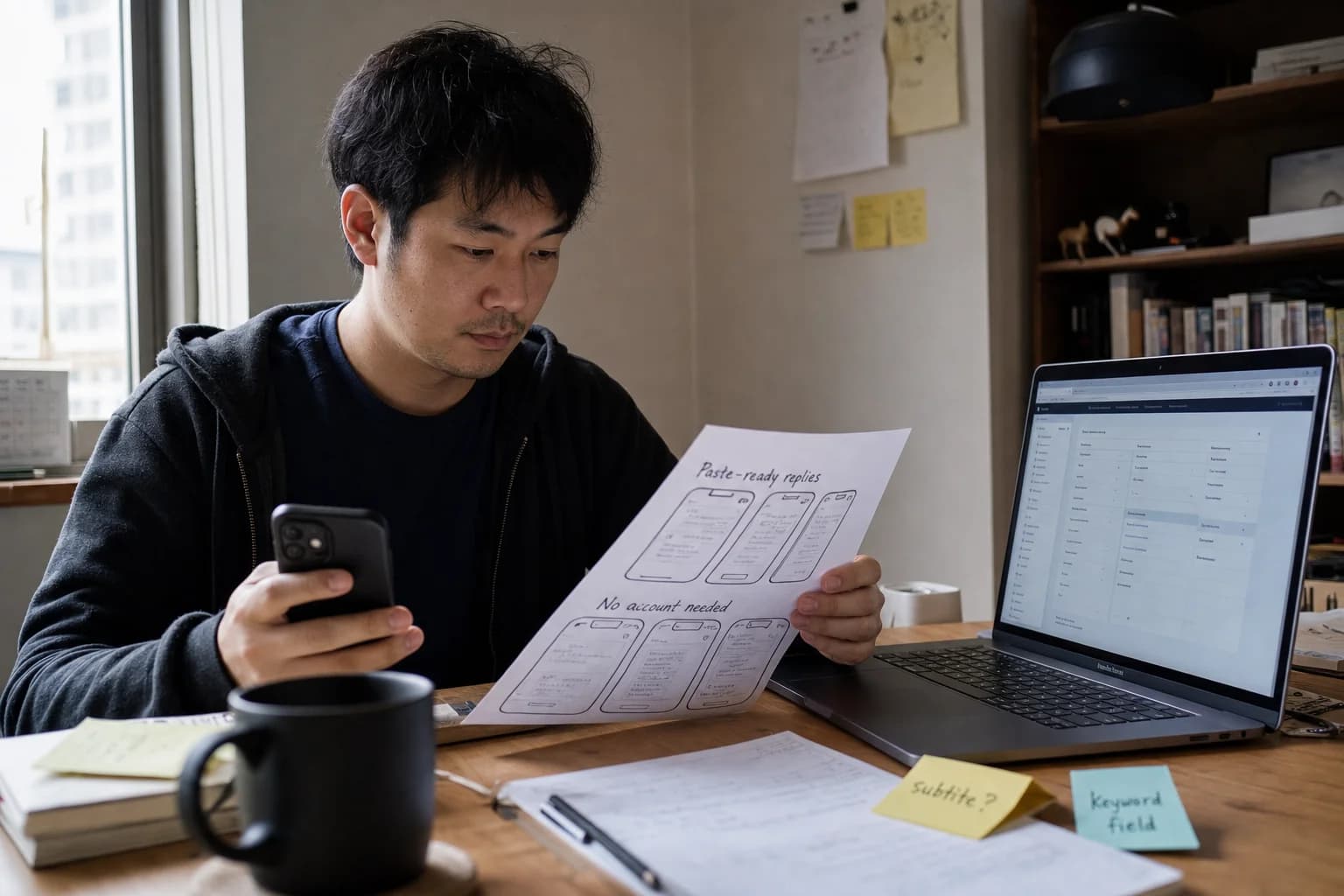
Listen to this article
20:39AI-generated podcast-style overview of this article (not a word-for-word narration).
I refreshed App Store Connect eleven times on a Thursday while my app sat in review and the dashboard had nothing new to show me. The numbers were flat. Zero impressions. Zero product page views. Zero installs from search because search did not exist yet for an app that was not live. I still opened the analytics tab like checking it would summon approval. It did not. What it did do was remind me that the moment my listing went public, the store page would become my only salesperson. No demo call. No founder tweet thread required. Just thirty characters of title, three screenshots strangers scroll past in two seconds, and whatever trust they infer from stars you do not have yet.
If you are looking for app store optimization solo founder advice that fits how you actually work, you have probably already seen the enterprise playbooks. Sensor Tower. AppTweak. Keyword difficulty scores. Localization agencies. Competitive intelligence dashboards that assume you manage a portfolio, not one app you built after deleting the same text message for six minutes. I am Iryna. I design consumer products, I shipped Finish Him Replies, and I am still learning what App Store discovery looks like when you are the entire marketing team. This is the ASO guide I wanted before I treated my listing like a formality instead of a product surface.
App store optimization solo founder work is not separate from product. A confusing screenshot of your settings screen is a conversion problem. A subtitle that lists features instead of the moment of relief is a positioning problem. A keyword field stuffed with words already in your title is wasted characters. Reese can teach you landing page conversion for B2B traffic. Max covers launch when you have email lists and warm audiences. Consumer iOS apps live in the pocket. Your listing is the landing page Apple gives every developer for free. Most solo founders fill it once, feel embarrassed about their icon, and wonder why paid ads are their only lever six months later.
I am not an ASO agency. I am someone who spent years designing other people's paywalls and onboarding flows, then had to write my own App Store copy at midnight with no brand recognition and no review count. Everything below is what I would do again, what I would skip, and what I think matters at solo-founder scale. Some numbers are illustrative examples, not claims about my bank account. When I say "say forty subscribers," I mean imagine a scenario, not report my revenue.
The goal is not to win the keyword "productivity app." The goal is to own the long-tail phrase a stranger types when they feel the problem your app solves, then convert that visit into an install before they bounce back to Instagram. ASO compounds slowly. That is annoying and also the point. You do not need perfection on day one. You need a listing honest enough to convert the right people, and a rhythm to improve it without burning your only free distribution channel.
App store optimization solo founder: what actually moves the needle
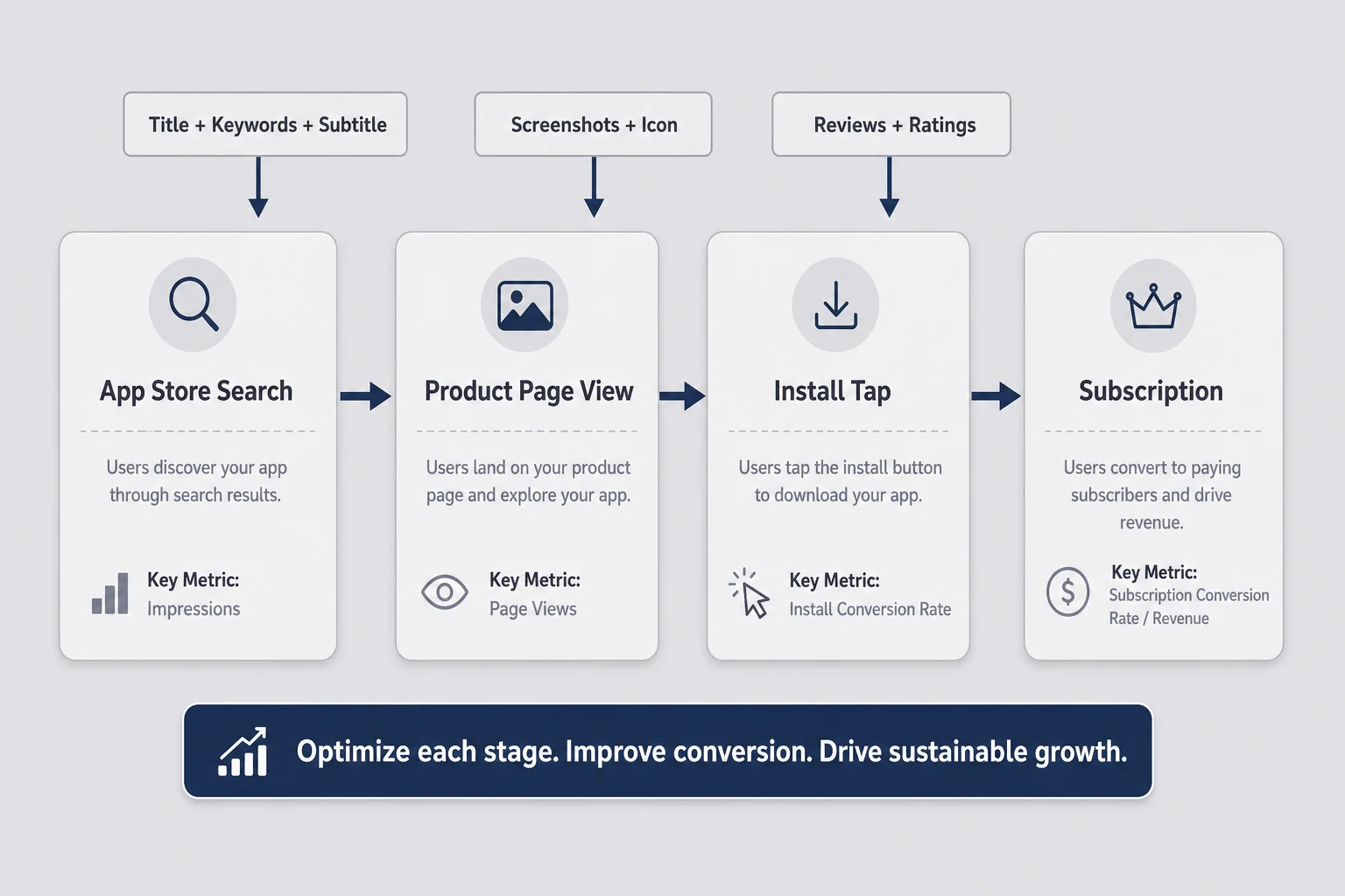
Most app store optimization solo founder guides read like SEO circa 2012: stuff keywords everywhere, buy a tool, pray. Apple is not Google. The App Store is not a blog. Users do not read four thousand words of description on iOS before installing. They search, they see an icon and a title, they swipe screenshots, they glance at stars, they tap Install or they leave. Your job is to optimize that short path, not to win a spreadsheet beauty contest.
Think of ASO as two linked problems: visibility and conversion. Visibility is whether you appear when someone searches a phrase that matches your app. Conversion is whether they install after they land on your page. Keywords, title, and subtitle mostly feed visibility. Screenshots, preview video if you use one, icon, ratings, and subtitle clarity feed conversion. Reviews feed both because stars show up in search results and social proof changes behavior.
When you are one person, you cannot optimize twelve levers at once. I would pick four in order: align title and subtitle with how strangers describe the problem, make the first three screenshots sell an outcome, collect your first twenty-five honest reviews without being weird about it, then watch product page conversion rate in App Store Connect once you have traffic. Everything else is seasoning.
This is different from B2B micro-SaaS marketing where you might own a blog post and a cold email sequence. App Store search is high intent. Someone typing "reply helper for texts" or "screenshot to caption" is closer to buying than someone who clicked a display ad. ASO is the cheapest durable channel indie mobile founders have because Apple already aggregated demand. You are not creating the audience from zero. You are showing up where they already look.
That does not mean ASO is easy. It means it is worth learning before you spend money on ads trying to compensate for a listing that shows your login screen as screenshot one. I checked competitor listings for Finish Him before I wrote a word of metadata. Not to copy them. To see what language real apps in the category already use, what screenshots look like in the wild, and where the emotional promise is missing. Consumer apps compete on feelings in search results, not feature matrices.
If you have not shipped yet, read this alongside how to validate a consumer app idea and how to build your first consumer iOS app once validation passes. ASO cannot rescue an idea strangers do not want. It can rescue a good idea hidden behind developer jargon and UI dumps. Build the thing first. Then treat the listing like a screen in your app that deserves the same design attention as onboarding.
Your App Store listing is the landing page nobody gave you
Reese writes about eight seconds on a landing page. The App Store gives you less patience than that. Search results show icon, title, subtitle or first line, and maybe a screenshot strip depending on device and layout. Product page visitors scroll fast. They are standing in line, half watching a show, deciding whether your app feels legit enough to download before the cashier calls them forward.
Your listing has zones whether Apple labels them that way or not. Icon is recognition at a glance. Title is brand plus primary keyword real estate. Subtitle is the second hook, only thirty characters on iOS, which forces brutal clarity. Screenshots are the storyboard. Description matters more on Google Play than iOS, but the first lines still set tone everywhere. Reviews are trust infrastructure. Promo text on iOS can be updated without a full release, which makes it the most underused free billboard solo founders ignore.
I treated my first draft listing like a spec sheet. "AI-powered reply generation with multiple tones." Nobody searches for AI-powered anything on their phone when they are anxious about a message. They search for the outcome or the situation. "Text reply ideas" beats "LLM assistant." "Help writing a response" beats "multi-tone generation engine." Product designers spend years learning that users buy relief, not architecture. Then founders write App Store copy like engineers submitting documentation.
The listing is also where privacy promises live for consumer apps. If your app touches screenshots, dating threads, health data, or money, your screenshots and description need to signal discretion without sounding like a legal document. "Paste-ready replies from a screenshot. No account required." communicates more trust than a bullet list of model names. I learned that from designing onboarding for apps where the first session felt invasive. App Store visitors decide trust before they install. Your metadata is part of that first session.
Compare mentally to the web funnel Reese diagrams: traffic, page, signup, payment. App Store ASO compresses that into search impression, product page view, install, then in-app subscription if you monetize that way. You do not control the storefront layout. You control the assets inside your slot. That is liberating and terrifying. Liberating because the format is standardized. Terrifying because everyone else's app sits right next to yours with more reviews and prettier screenshots.
When I feel overwhelmed, I open my listing on my phone, not the simulator. Thumb reach matters. Screenshot text has to be readable at phone width without squinting. If you design screenshots on a twenty-seven-inch monitor, you will lie to yourself about legibility. The store is a mobile surface. Optimize for the device where installs happen.
The four levers that matter when you are one person
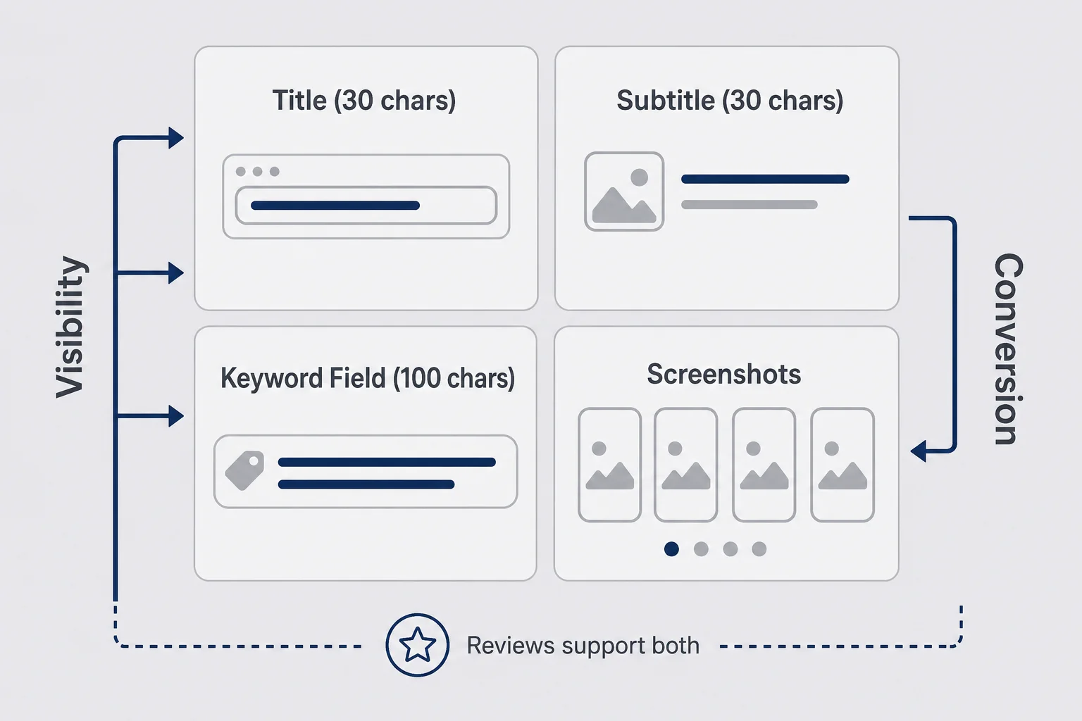
Enterprise ASO teams track dozens of metrics. Solo founders need a short list they can actually maintain between bug fixes and customer support emails from the three people who found them. I reduce aso for indie developers work to four levers: title, subtitle, keyword field, and screenshots. Reviews and localization sit right behind them, but those four are the foundation you set before launch and iterate monthly after.
Title gets thirty characters. Subtitle gets thirty characters on iOS. Keyword field gets a hundred characters Apple indexes separately from visible copy. Screenshots get the emotional sell. That is the whole visible game for most users. Description and promo text matter at the margin. Icon matters but you probably already obsessed over icon in Figma for two weeks. If you only have three hours this weekend, spend two on screenshots and one on keyword alignment, not on rewriting paragraph three of your description nobody expands. When you draft those three metadata fields, the App Store title character counter on this site shows remaining characters live so you are not counting by hand in Notes.
Title should include your brand and your strongest search phrase if you can fit both without sounding like spam. "Finish Him Replies" plus a clear category word is harder than it looks. Subtitle should extend the promise, not repeat the title. If title says the app name, subtitle should say what happens in the user's life when they open it. Keywords should capture synonyms and long-tail phrases you cannot fit in thirty plus thirty. Screenshots should show outcomes in the first frame, social proof or differentiation in the second, core flow in the third.
Levers interact. Great keywords with weak screenshots produce impressions that do not convert. Beautiful screenshots with irrelevant keywords produce installs that churn because the app was not what search promised. I watch product page conversion rate in App Store Connect once I have enough views for the number to mean something. If impressions climb and conversion flatlines, I suspect screenshot or relevance mismatch before I blame keywords.
Do not change everything at once. Apple gives you product page optimization tests on iOS now for some assets. If you are not eligible yet or the feature feels like overhead, run manual sequential tests. Change subtitle one month. Swap screenshot order the next. Note the date. ASO rewards patience and punishes panic edits where you cannot tell what moved the needle.
This four-lever frame also stops you from buying tools too early. Until you have regular organic traffic, a five-hundred-dollar monthly keyword platform is dashboard tourism. You need a coherent listing and iteration habit first. Tools help when you are choosing between ten phrases that all sort of fit and you need historical rank data. They do not help when screenshot one is your settings page.
Keyword research without a five-hundred-dollar monthly tool
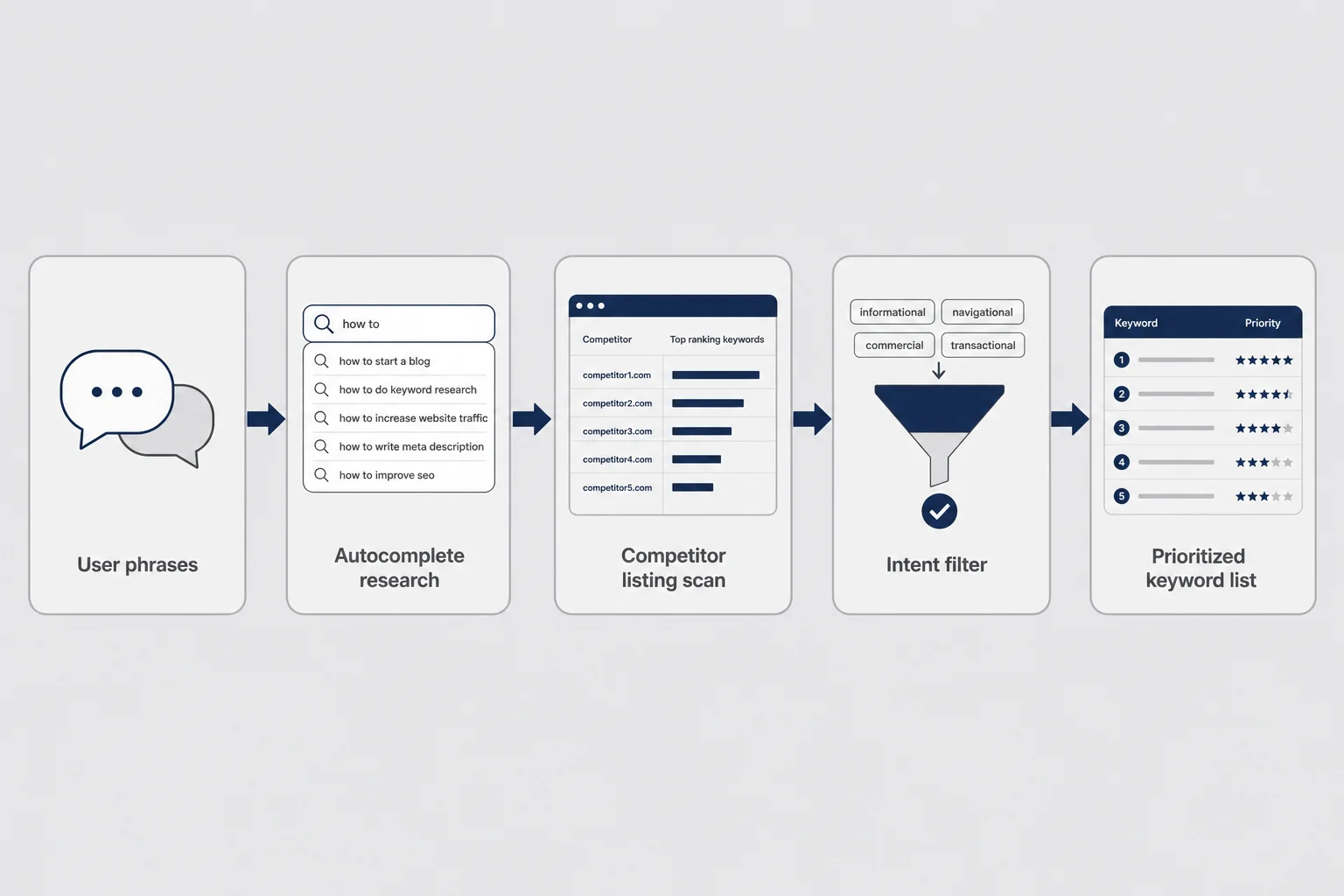
App store keywords ios research for solo founders starts in embarrassingly low-tech places. Talk to ten people who have the problem. Write down the exact words they use. Not your product vocabulary. Theirs. Then open the App Store on your phone and type partial phrases. Autocomplete is free demand data. If Apple suggests a completion, real humans in your storefront typed something like it recently. If autocomplete stays blank, you might be guessing about volume or using words normal people do not search.
Competitor listings are the second free source. Not to clone them. To audit language. Read titles, subtitles, and screenshot captions in your category. Read one-star reviews of competitors for unprompted pain language. "Still can't figure out how to..." is a keyword clue. "Too many steps" tells you what screenshot story to avoid. Reddit threads and TikTok comments where people complain about the problem are messy and valuable. Consumer apps live in informal language.
Build a raw list of twenty phrases. Cut to ten that match intent. "Reply helper" matches someone who wants help replying. "Chatbot" matches someone who wants a conversation partner. Those are not the same install. Intent match beats volume fantasies when you are small. Long-tail three- and four-word phrases often beat head terms dominated by apps with a hundred thousand reviews. "Budget tracker for couples" beats "finance app" for a solo founder every time.
For iOS, the keyword field is a game of efficient characters. Separate words with commas, no spaces after commas, no need to repeat words from title or subtitle because Apple already indexes those fields. Do not waste characters repeating "app" or your brand name unless you have room and a strategic reason. Singular often beats plural because Apple combines variants. Use the full hundred characters when you have legitimate synonyms left after title and subtitle.
I keep a simple spreadsheet, not because spreadsheets are magic, because memory is unreliable. Columns: phrase, source (autocomplete, competitor, user quote), intent fit (high medium low), in title (yes/no), in keyword field (yes/no), notes. Update it quarterly. That is enough until you have roughly a thousand organic installs a month and feel blind without rank tracking.
Google Play works differently. Description length matters more. Keywords belong woven into readable sentences, not comma-separated lists. If you ship both stores eventually, do not copy-paste iOS keyword field into Play description like a robot. Same intent, different packaging. Finish Him is iOS-first, so Play ASO is a future problem. I still note Play language now when I research because Android users often describe the same pain with different slang.
Free tools exist: App Store Connect search terms report once you have data, public autocomplete, occasional rank checkers with limited free tiers. Paid tools become worth it when opportunity cost of your time exceeds their subscription and you have enough traffic to learn from experiments. Before that, paid tools are procrastination dressed as professionalism.
Title and subtitle: the thirty-character problem twice
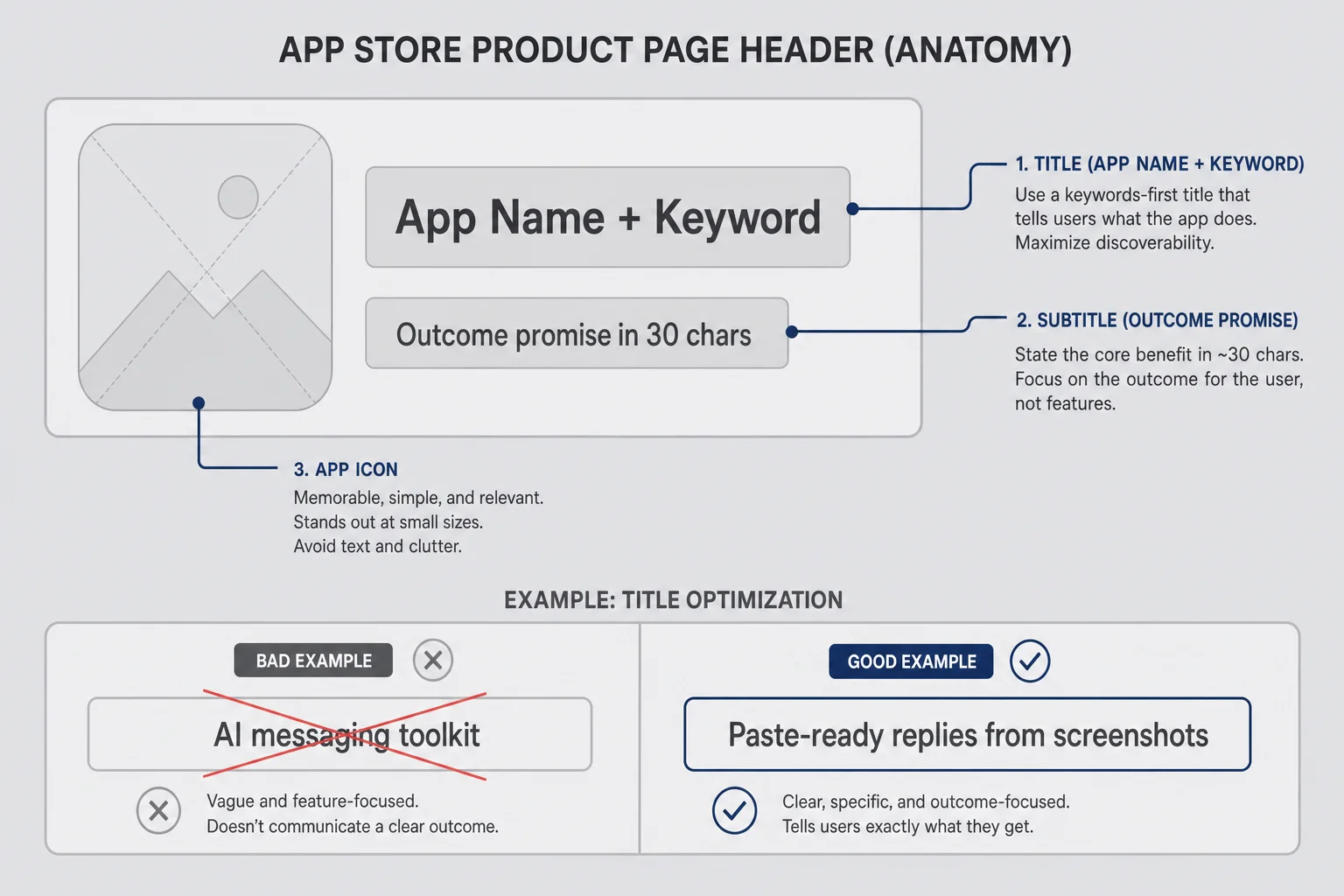
Thirty characters is not a lot. It is enough if you stop trying to sound impressive. iOS app store listing titles must balance brand and discoverability. If your app name is unknown, the title carries more keyword weight because nobody searches your brand yet. If your app name is descriptive already, subtitle might do more work. There is no universal template. There is a stranger test: show the title and subtitle to someone who has the problem but has never heard of you. Do they know what happens when they install?
Bad subtitle: "Advanced AI messaging toolkit." Good subtitle: "Paste-ready replies from screenshots." Bad subtitle: "Revolutionizing communication." Good subtitle: "Three tones: funny, savage, kind." You are not writing for investors. You are writing for a tired human who typed four words into search and has four seconds of attention left.
Avoid keyword stuffing that reads like spam. Apple penalizes manipulation vibes even when they do not send you a formal penalty email. Readable copy that includes one strong phrase beats unreadable comma piles. Title changes are risky because they can reset ranking signals temporarily. Pick carefully at launch. Change title rarely, usually only on rebrand. Subtitle and keyword field are safer iteration surfaces monthly.
Include your primary category intuition in subtitle if space allows. "Photo editor for food bloggers" tells a story. "Photo editor plus" tells nothing. Consumer apps should telegraph privacy or speed when those are differentiators. "No account needed" is four words that matter for trust in personal categories. "Works offline" matters for travel apps. Do not waste subtitle on "best app 2026." Nobody believes it.
Localization starts at title and subtitle too, not only screenshots. If you target Japan, Brazil, or Germany, direct translation of English marketing often fails. Autocomplete differs by storefront. A phrase that works in US English might be invisible in French. Start with one primary market until listing conversion is decent, then expand. More on that later. For launch, nail one locale before you pretend to be global.
When I get stuck, I write ten subtitle variants in Notes and read them aloud. If I stumbled, strangers would too. The winner was not the cleverest. It was the clearest about the moment of relief. Design instinct applies here. App Store copy is UX writing with character limits. Paste candidates into the App Store title character counter when you want the thirty-character wall visible while you edit, then steal the winner into App Store Connect.
The keyword field is not a tag cloud
The hundred-character app store keywords ios field tempts founders into treating it like Instagram hashtags. Comma-separated soup. Every synonym they ever considered. Words already sitting in the title repeated for superstition. Apple gives you limited indexed space. Use it like Scrabble tiles, not like a word cloud poster.
Rules I follow: no spaces after commas, no duplicate words from title or subtitle, no competitor brand names, no irrelevant high-volume terms that attract wrong installs and hurt retention. Include misspellings only if common and you lack better uses for characters. Include plurals sparingly because stemming often handles them. Prioritize phrases you cannot fit in visible fields.
Think in buckets. Core problem words. Outcome words. Audience or context words. Alternate phrasing real people use. For a reply helper app, problem words might include text, message, reply. Outcome words might include ideas, help, writer. Context might include dating, awkward, screenshot if they fit honestly and match app scope. Do not claim dating if your app is generic business email reply unless you actually serve that use case and show it in screenshots.
Wrong installs hurt more than small apps can afford. They tank conversion, generate confused reviews, and teach Apple's algorithms your listing is not relevant. Relevance is a quiet ASO factor people underestimate. High impressions with low installs signal mismatch. Better to rank for a narrower phrase and convert than rank broadly and confuse.
Update keyword field quarterly, not daily. Indexing takes time. Patience is boring. Boring works. When you refresh, remove terms that never generated impressions in App Store Connect analytics after two cycles. Add terms surfaced by new autocomplete research or competitor shifts. Document the date you changed keywords so you do not panic two weeks in when nothing moved yet.
If you also run Apple Search Ads later, search term reports become gold for organic keyword iteration. That is a paid channel topic I will not pretend to master yet. Organic ASO comes first because it compounds without spend. Ads can teach you language faster once you have budget. Solo founders often have time before they have ad money. Use time on free research.
Screenshots are product marketing, not UI dumps
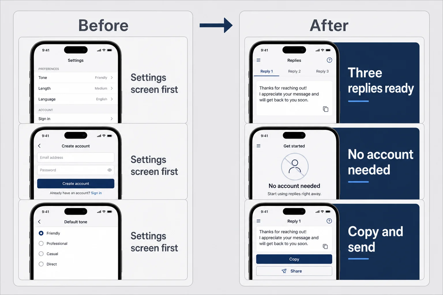
App store screenshots conversion is where solo founders lose installs they already earned. Keywords brought the visitor. Screenshots close the deal. I see this constantly in consumer categories: screenshot one is a login screen. Screenshot two is a settings panel. Screenshot three is a dark mode toggle nobody asked for. The UI might be beautiful. The story is absent.
Screenshots are not documentation. They are compressed advertising you still control without paying Meta. Each frame needs a headline humans read without opening the image full screen. Show the outcome first. "Three replies ready to paste" beats a photo of your chat bubble component library. Show social proof second if you have it: a real review quote, a star rating, press mention, user count if honest and modest. Show the core flow third: upload, result, copy, send. Save feature deep dives for later frames fewer people reach.
Design for legibility. Large type. High contrast. Few words per frame. Mockups on device frames help context but do not require them. Consistent visual system across frames looks professional. Chaos looks like a scam. You do not need a designer agency. You need Figma and the discipline to write captions like a human, not like a release notes changelog.
Portrait versus landscape screenshot order depends on category norms. Check top apps in your niche on a phone and copy the format convention, not the lazy content. If everyone uses portrait story frames, do not upload raw landscape UI captures because you built in landscape. Conventions exist because users learned to read them.
Preview video can help for complex apps. It can also become an expensive side project that delays launch. For v1 consumer apps with a simple loop, strong static screenshots often beat a mediocre video. If video shows the thirty-second magic moment clearly, consider it. If video is you scrolling settings in screen recording voiceover hell, skip it.
Apple lets you localize screenshot captions per locale without rebuilding the whole binary sometimes through App Store Connect localization slots. Use that when you expand markets. English captions on screenshots shipped globally signal you do not care about those users. Effort matters even when translation is imperfect.
Run the stranger test again with screenshots blurred slightly. Can you still read the promise? If not, type size is wrong. I once designed gorgeous screenshot captions that looked perfect on my monitor and turned into gray smear on a phone in sunlight. Test on device. Always test on device.
Product page optimization tests on iOS let you compare screenshot sets for conversion. If you have access, use it methodically one hypothesis at a time. If not, swap order manually and watch conversion over a few weeks with enough traffic. Low traffic makes A/B conclusions noisy. Do not rewrite screenshots weekly on fifty views total. You are guessing with extra steps.
How I order screenshot stories for consumer apps
Consumer apps sell moments, not feature checklists. My default app store screenshots conversion sequence for personal apps like Finish Him looks like this mentally: frame one outcome, frame two trust, frame three how it works, frame four differentiation, frame five optional depth or pricing honesty if subscriptions matter.
Frame one outcome answers "what do I get?" Paste-ready replies in three tones. Calm budget number after linking accounts. Workout plan generated from a photo. Whatever your relief is, say it in six words max overlaying a stylized UI, not raw production screenshots with tiny text.
Frame two trust answers "why should I believe you?" Early on you might not have reviews. Use specificity instead. "No account required." "Screenshot never stored." "Delete anytime." Those are trust claims you must honor in product, not marketing lies. If you have a handful of beta quotes, use one real sentence with permission. Fake testimonials are an instant ethical no and they read fake.
Frame three how it works answers "can I do this in one hand on the couch?" Show three steps maximum. Upload screenshot, pick tone, copy reply. Not seventeen onboarding coach marks. Consumer apps win on speed and clarity. If your screenshot story needs a paragraph, your app might need simplification before ASO fixes anything.
Frame four differentiation answers "why not ChatGPT or a free alternative?" This is uncomfortable and necessary. If generic AI already solves your problem with extra steps, say what you remove. Speed, tone presets, privacy, one-tap copy. Honest positioning beats pretending competitors do not exist. Users already know ChatGPT exists. They downloaded your listing because they want something narrower.
Frame five optional depth can show paywall transparency if subscriptions are core. "Three free tries, then $4.99/month" on a screenshot beats surprising people inside the app. Surprise inside the app creates one-star reviews that hurt ASO more than showing price upfront hurts conversion among people who would never pay anyway. You want installs from people who might pay, not installs from people who feel tricked.
Seasonal refreshes matter for some categories, not all. Fitness apps in January. Tax apps in March. Dating apps before Valentine's if you want to be cliché. Finish Him is evergreen awkward texting, which is nice because I do not need a holiday calendar for screenshot updates. Still update when UI changes materially so screenshots match reality. Outdated UI in screenshots feels like abandonment.
Ratings, reviews, and the polite ask nobody believes
Stars show up in search. Stars change minds on product pages. aso for indie developers who ignore reviews leave conversion on the table and let one angry early bug define public perception forever. You do not control whether people review. You control timing, tone, and response.
Ask after value, not before. Apple's SKStoreReviewController API enforces frequency limits partly so founders do not spam. Good. Use the prompt when someone completes a meaningful action: exported result, finished session twice, unlocked a win state. Do not ask on first launch unless you enjoy one-star "stop nagging me" reviews. Do not gate features behind reviews. Apple forbids manipulative patterns and users punish them anyway.
Respond to negative reviews publicly when you can fix or explain. Short, human, no corporate boilerplate. "Sorry the upload failed on iOS 18.1 — we shipped a fix in 1.0.2" beats "We value your feedback." Future readers read responses as signal you are alive. Silence reads as abandonment. Positive reviews deserve thanks sometimes, but do not perform gratitude so hard it looks automated.
Your first twenty-five reviews matter disproportionately because average rating is noisy at low counts. One one-star review hurts more at review count five than at review count five hundred. That is unfair and real. Soft launch to friends and beta users who will actually use the app before you ask for public reviews. Friends who tap five stars without opening the app help briefly and hurt when real users arrive and bounce.
Never buy reviews. Never join review swap rings that Apple detects. Short-term star boost, long-term account risk. Not worth it for a bootstrap app you want to keep on the store for years. Organic slow growth beats fraudulent fast stars.
Reviews also feed keyword language back to you. Users describe bugs and praise in their words. Mine that for subtitle and screenshot updates. "Finally something that doesn't need signup" appearing three times is copywriting research for free.
If rating drops below four stars, treat it as product priority before ASO priority. Metadata cannot fix a crash on launch. Read recent reviews weekly like a standup agenda item. Fix the top recurring complaint, mention the fix in release notes, mention it in review responses. Closed loop.
Localization when you cannot hire an agency
Localization is an ASO multiplier and time sink. Translating iOS app store listing metadata into ten languages poorly hurts more than helps. Start with one extra market that shows autocomplete demand and cultural fit for your app. For many consumer apps, that might be UK English tweaks, Spanish, Portuguese, Japanese, or German depending on category research. Check where competitors localize screenshots fully versus metadata only.
Professional translation beats machine translation for marketing copy, but machine translation plus human friend review beats English-only arrogance if budget is zero. Screenshots with localized caption text matter more than translated description paragraph six. Users see captions in search preview strips. Invest caption translation first.
Do not localize into a market you cannot support. If Japanese users email support in Japanese and you cannot respond, you created churn and bad reviews in a storefront you do not monitor. One market done well teaches you workflow. Ten markets done with Google Translate alone teaches you embarrassment.
App Store Connect lets you add locales incrementally. Schedule localization after baseline English conversion is acceptable. Track conversion per locale in analytics when volume allows. A locale with high impressions and low installs might be translation mismatch or product-market misfit, not bad luck.
Cultural nuance shows up in consumer apps fast. Dating, money, health, and humor do not translate literally. Finish Him's tone names funny, savage, unexpected might need different emotional words in other languages. That is creative work, not checkbox work. Budget time or skip until ready.
Currency and pricing display localize partly through App Store infrastructure, but screenshot mentions of price should match localized tiers when shown. Nothing screams scam like wrong currency symbol on a marketing frame.
The iteration rhythm that fits evenings and weekends
ASO is not a launch day task. It is maintenance, like checking crash reports except slower and less adrenaline. Solo founders fail ASO by treating it as done when the app goes live, then revisiting six months later when panic sets in. A light rhythm beats heroic quarterly overhauls.
Weekly, five minutes: glance at App Store Connect analytics if you have live traffic. Impressions, product page views, conversion rate, top sources. Note anomalies. Did conversion drop after a competitor launched a similar screenshot style? Did impressions climb after a keyword refresh two weeks ago? Write one sentence in a log. Memory lies.
Monthly, one focused hour: pick one lever. Subtitle test this month. Screenshot order test next month. Keyword field refresh the third month. Release notes and promo text update when you ship features worth mentioning above the fold in promo text. Tie ASO updates to app updates when possible so you have a natural calendar reminder.
Quarterly, half day: full keyword audit, competitor rescan, screenshot freshness check against current UI, review response backlog cleared, localization decisions revisited. Export analytics to your spreadsheet if numbers help you think. Do not export analytics to avoid making creative decisions. Numbers inform judgment, they do not replace it.
Align ASO iteration with product iteration. New feature shipped deserves screenshot update if feature is user-visible and valuable. Invisible backend refactor does not deserve screenshot churn. Users reward listings that match the app they install. Mismatch creates refunds, churn, and angry reviews.
Burnout warning: ASO can become procrastination when product needs fixing. If reviews complain about the same bug for three weeks, fix the bug before you redesign screenshot gradients. Distribution amplifies product quality or product pain. Choose which one you amplify.
Connect ASO learning to other channels later. TikTok hooks, Reddit posts, and short demo videos should reuse language that already converts on your listing. Reese's world of marketing channels opens up once store language is sharp. Mobile founders sometimes skip web marketing entirely early. Still reuse phrases that worked in screenshots when you post anywhere. Consistency beats clever fragmentation.
What I would skip at solo-founder scale
Not every ASO tactic deserves your limited hours. Skip enterprise competitive intelligence dashboards until organic traffic justifies them. Skip obsessively tracking rank for fifty keywords daily when you have two hundred total product page views. Skip localization into eight languages before English listing converts. Skip preview video production if static screenshots tell the story. Skip rewriting title every month out of boredom.
Skip keyword stuffing in visible fields. Skip fake social proof. Skip comparing yourself to venture-backed apps with dedicated growth teams in your head while judging your week-two metrics. Skip ASO conferences unless you enjoy them. Skip hiring an ASO consultant before you have a listing and ten honest reviews. Consultants help scale what works. They cannot invent product-market fit.
Skip copying competitor screenshots pixel layout while selling a different promise. Convergence makes everyone look like clones. Learn from structure, not from theft. Skip ranking for terms your app only sort of matches because a blog post said volume is high. Wrong traffic is expensive in support time and star ratings.
Do not skip ASO entirely because building feels more virtuous. Building is virtuous. So is making the thing findable. You already paid Apple ninety-nine dollars and spent months on code. Spending a weekend on screenshots is not selling out. It is respecting the work you did.
If you are pre-launch, skip perfect and ship coherent. Good enough listing beats delayed launch chasing ideal keyword difficulty scores on paper. You learn faster live. App Review waiting time is already painful. Do not add self-inflicted delay for screenshot font kerning unless kerning is truly illegible.
Point engineers building first consumer apps to how to build your first consumer iOS app for stack and review realities. Point validators to consumer app validation. This post owns discovery after you exist on the store. Different problem, same solo-founder reality: one person, many hats, limited ego budget.
A few honest answers to questions I get
What is app store optimization for a solo founder?
App store optimization for a solo founder is improving your App Store listing so the right people find you in search and actually install. That means title, subtitle, keyword field, screenshots, and reviews working together, not buying expensive ASO software on day one. Keywords get strangers to your page. Screenshots and ratings decide whether they tap Install. ASO is free, compounding distribution when you iterate monthly instead of treating the listing as a one-time upload task.
How do I do keyword research without paid ASO tools?
Start with how real users describe the problem, not your internal feature names. Type partial phrases into App Store search and read autocomplete suggestions. Open three competitor listings and note words in their titles and first screenshots. List twenty phrases, keep ten that match search intent, and put the strongest terms in title and subtitle first because Apple indexes those heavily. Use the hundred-character keyword field for synonyms and long-tail phrases without repeating words already in the title.
Do App Store screenshots really matter more than keywords?
Both matter, but at different stages. Keywords and title metadata drive impressions in search. Screenshots drive conversion from page view to install. Most solo founders over-invest in keyword spreadsheets and under-invest in the first three screenshots, which is backwards because a ranking you cannot convert wastes the ranking. Fix screenshot storytelling before you obsess over the forty-seventh keyword variant.
How often should a solo founder update ASO?
At launch, spend real time on screenshots, title, and keywords before you submit. After launch, check keyword movement and conversion in App Store Connect weekly in five minutes. Monthly, test one variable such as screenshot order or subtitle wording using Apple's product page optimization if available. Quarterly, refresh the keyword field based on new competitor language and autocomplete research. Avoid changing the app title unless you rebrand because title changes can temporarily reset ranking signals.
When should I ask for App Store reviews?
Ask after a positive moment, not on first open. For consumer apps, that might be after the user copies a result, completes a session they came back for, or hits a small milestone. Use Apple's native review prompt API and respect system limits so you do not annoy people. Never gate core features behind a five-star request. Respond publicly to negative reviews within a few days with a human tone and a fix when you have one.
Is ASO worth it before my app has traction?
Yes, but do not let ASO delay shipping. You need a baseline listing that describes the outcome strangers search for, with screenshots that show relief not settings screens. Perfect ASO on an app nobody wants still fails. Pair listing work with validation from real users. If manual prototypes and recognition tests fail, no keyword field saves you. ASO amplifies a product that already solves one moment well enough that strangers might pay.
The listing you ship today is not the listing you keep
I still overthink subtitle commas sometimes. I still flinch when a competitor launches with cleaner screenshot captions. ASO for a solo founder is not a victory lap. It is showing up repeatedly for a storefront you do not own, with rules that change quietly, while also fixing bugs and answering emails and wondering if your app is creepy in ways you did not predict.
That is fine. The App Store is not a meritocracy and not a lottery. It is a search box attached to a trust interface attached to your product. Keywords get you considered. Screenshots and stars get you chosen. Iteration turns mediocre into workable into occasionally great. Compounding is slow until it is not.
Your first listing will be wrong in ways you cannot see yet. Ship it anyway. Measure what you can. Improve one lever per month. Talk to users like a human, not like a keyword spreadsheet. Consumer apps win when strangers feel understood in private moments. ASO is how you signal understanding before they install.
If Finish Him teaches me anything about distribution, it is that the embarrassing problem I built for is searchable in plain language once I stop hiding behind feature jargon. The work now is making the store page say that as clearly as the app tries to in the first session. You have the same job for your app. The listing is not paperwork. It is the first conversation with a stranger who might trust you with something personal. Make it count.
Comments