Your First Consumer App Doesn't Need a Pitch Deck
A practical guide to shipping a personal iOS app as a solo founder — problem, stack, privacy, and subscriptions — with Finish Him as the worked example.
 By Iryna29 min read
Listen to this article
23:22AI-generated podcast-style overview of this article (not a word-for-word narration).
I was standing in my kitchen at eleven on a Thursday, thumb hovering over send, when I deleted the whole message for the fourth time. Not because it was mean. Because it was fine. Fine is death in a chat where you wanted funny, or sharp, or surprising. I closed the app, opened it again like that would change my brain, and thought: I design products for a living. Why is a text message beating me?
That loop is why I built Finish Him. Upload a screenshot of any conversation, get three paste-ready replies in different tones (funny, savage, unexpected), copy one, paste it back, move on with your life. The App Store listing calls it Finish Him Replies. Same app. It is in Apple review as I write this, not live on the store yet. Android is in development for a later Play Store launch. I have one consumer app to my name, not a portfolio, and this is the guide I wish existed before I started: how to build your first consumer iOS app when most micro-SaaS advice assumes you are selling invoicing software to agencies.
Consumer apps live in pockets, in private moments, in screenshots people would not show their boss. That changes everything about validation, trust, pricing, and what "launch" means. I am going to walk through how I actually built Finish Him using Expo, Supabase, OpenAI, and RevenueCat, with Finish Him as the running example. This is an iOS and bootstrapping story first. B2B playbooks are useful later, not at the start. I will stay in my lane: product decisions, emotional UX, App Store realities. When the topic needs a backend engineer's depth, I will point you to Max's build guide. You do not need a pitch deck. You need one embarrassing problem solved well enough that a stranger might pay $4.99.
How to build your first consumer iOS app when you're not a mobile engineer
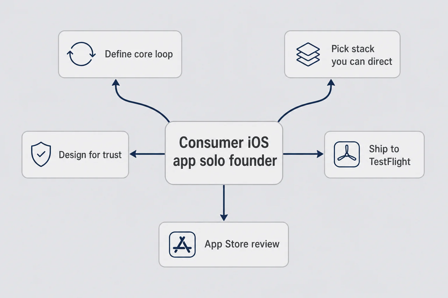
Here is the uncomfortable truth I had to accept in late 2024: I am a product designer, not a career iOS developer. I had spent years designing onboarding flows and paywalls for other people's apps. I had never submitted my own binary to App Store Connect. Plenty of founders in my shoes assume that means waiting for a technical co-founder or learning Swift for a year before you are allowed to ship. I did not have the patience for that, and honestly I did not think the problem required it.
How to build your first consumer iOS app as a solo founder is less about becoming Apple-level native and more about picking a stack you can direct with AI help, defining a core loop so tight you can explain it in one sentence, and respecting that your user is trusting you with something personal. Finish Him's loop is: screenshot in, three replies out, copy, done. No account signup. No prompt typing. No chat history stored on our servers. If you cannot describe your loop that simply, you are not ready to pick fonts yet.
The B2B micro-SaaS playbook does not transfer cleanly. Reese can teach you landing pages and cold email. That is real distribution wisdom for narrow B2B buyers. Your consumer app buyer is not checking email from a founder they never heard of. They find you in the App Store, or a friend sends a link, or they see a TikTok. The product has to explain itself in the first session because there is no sales call coming. Downloads without retention are vanity. Retention without revenue is a hobby. But none of it matters if the app feels creepy in the first thirty seconds.
I chose a path that let me ship as a designer who codes with help: Expo and React Native for the mobile app, Supabase for backend pieces I could configure without writing production server code like an engineer, OpenAI behind a server endpoint for the AI feature, RevenueCat for subscriptions. You might choose differently — if you are still deciding whether Expo even belongs in the mix versus a web builder or custom code, the build path picker is a short checklist for that call. The decision framework matters more than my exact stack: can you get to TestFlight in weeks, do you understand what data leaves the device, and can you maintain the thing when Apple emails you at 9 p.m. about a privacy label?
If you are comparing yourself to founders who have shipped ten apps, stop. Your first consumer iOS app is a learning project that might also make money. My philosophy, which I stand by even when review queue times hurt my feelings: your first app does not need to be your life's work. It needs to solve one embarrassing problem well enough that a stranger pays $4.99.
One more distinction that took me embarrassingly long to internalize: a consumer iOS app is not a website with an icon. You do not control the install surface. Apple does. You do not get to A/B test headlines in production the way Reese describes for landing pages. Your store listing is a cramped billboard, your first session is your onboarding, and your refund request inbox is your churn survey. Building for that reality early saves you from bolting B2B assumptions onto a pocket product.
Start with one embarrassing moment, not an app category
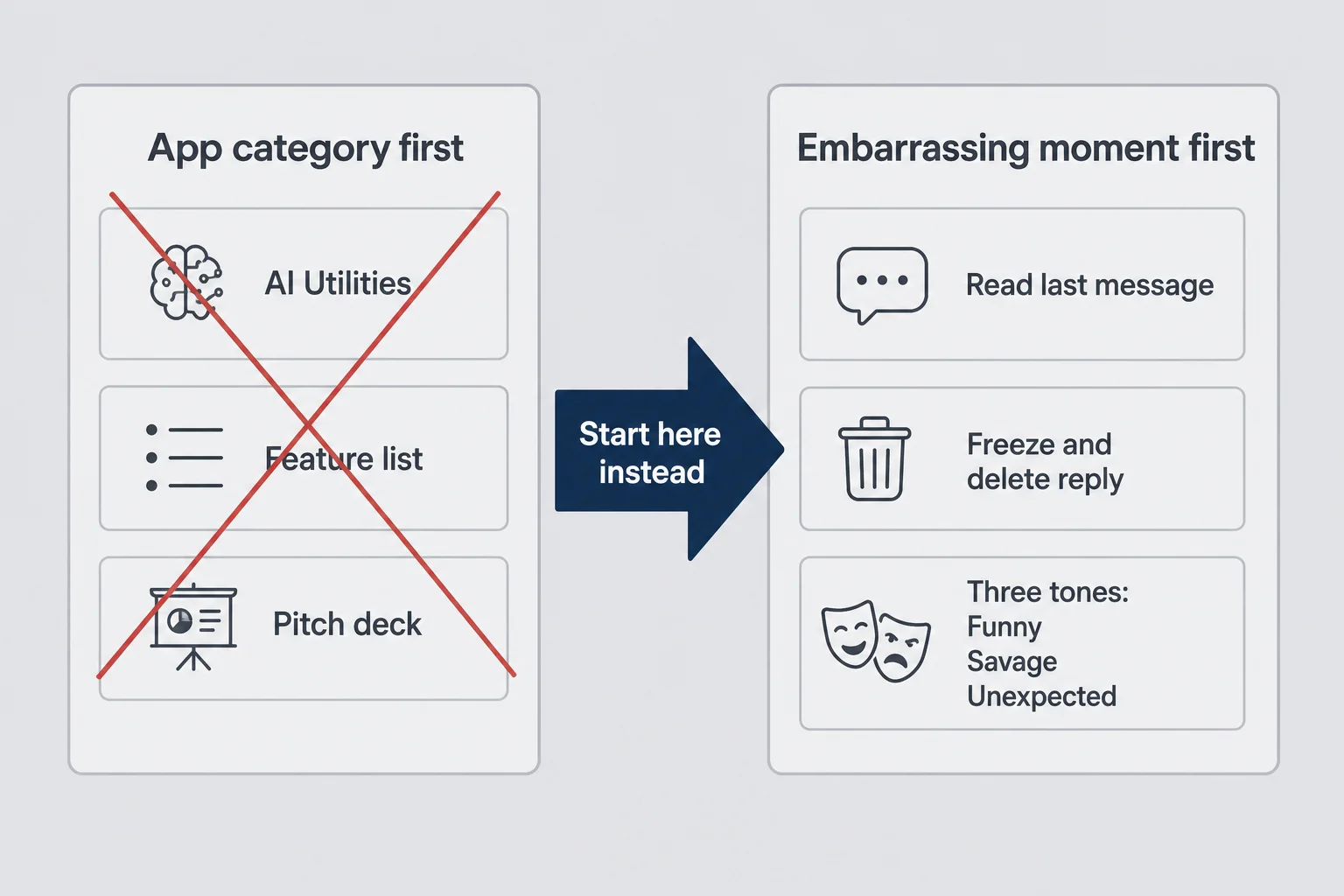
I did not start with "AI reply assistant market size." I started with the feeling of typing and deleting. The personal itch is not optional for consumer apps. It is the compass. B2B founders can sometimes validate a workflow they never feel themselves. Consumer products punish that approach. If you have not lived the awkward moment, you will misjudge how much trust the UI needs before someone uploads a screenshot of their dating app conversation.
Finish Him came from a specific embarrassment: I wanted three options, not one perfect line. Funny for when I wanted to keep it light. Savage for when I needed confidence without being cruel. Unexpected for when I wanted to surprise the room. One generic "AI reply" button would have been easier to build and worse to use. The tone split is the product. That is worth saying again because AI wrappers die when the output is a wall of text you still have to edit. My app wins when the reply is paste-ready in two taps.
Do not pick "productivity" or "AI utilities" as your category and work backward. Name the moment. "I freeze after I read the last message." "I want a comeback in group chat but everything I type sounds try-hard." "I am texting in a second language and want to sound natural." If you cannot picture the room, the lighting, the slight panic, you will build features instead of relief.
I sketched flows in Figma before I wrote meaningful code. Not because Figma is magic. Because consumer apps are emotional UX with a payment screen attached. Where does the screenshot come from? Photo library, camera, share sheet from Photos. What does the user see while the model runs? Not a blank spinner that feels like surveillance. What happens when they tap a card? Copy to clipboard, obvious confirmation, easy path back to Messages. Those questions are product design. They are also conversion.
Competitors exist. Generic ChatGPT can draft a reply if you type enough context. The bar is not "uses AI." The bar is faster and safer than the alternative for one moment. Finish Him asks for a screenshot, not a paragraph of explanation, because the screenshot is the context. That is a product call, not a model call. If your idea sounds clever in a pitch deck but does not map to a moment someone would pay to escape on their phone, keep looking.
What counts as validation for a personal app
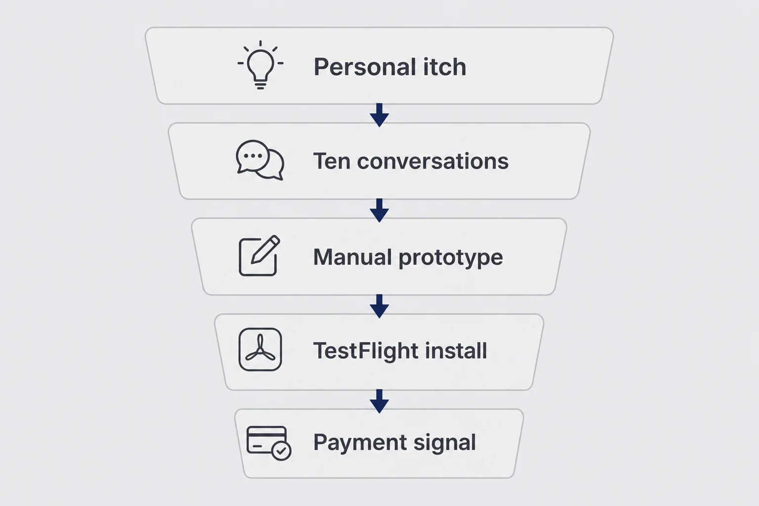
Validation for a consumer iOS app is not the same as validating a B2B micro-SaaS idea. Nobody is going to join a fake-door waitlist for "help me text my crush" and give you their work email. You need signals that map to private willingness to install, open, and eventually pay. I ran a messy version of this before I committed to the build.
First signal: tell the truth out loud to ten people who text the way you do. Not "would you use an AI app." Show them the embarrassment. "You ever stare at a chat for five minutes and send nothing?" Watch their face. If they laugh with recognition and pull out their phone to show you a thread, you have something. If they shrug, you have a feature idea.
Second signal: prototype the output, not the app. I used ChatGPT manually with blurred screenshots before the app existed. Crude, slow, not shippable. But I learned what "good enough" looked like for funny versus savage versus unexpected. I also learned where I felt gross about privacy. That gut check saved me from building a flow that asked for too much too soon.
Third signal: willingness to pay for speed and safety, not for AI. People already have free AI in a browser. They will pay for an app that feels discreet, fast, and tuned to the moment. I asked friends a simple question: would you pay a few dollars a month to never stare at a blank reply field again? Not everyone said yes. The ones who did said yes quickly. That mattered more than a long maybes list.
Imani writes well about validation without code. A Carrd fake door works for B2B workflow tools. For personal apps, I lean on conversations, manual prototypes, and small paid tests once TestFlight exists. When you want a structured read on whether to keep going, the Idea Validation Scorecard has a consumer-app mode for that. Five dollars from a stranger beats five hundred polite "cool idea" texts.
Kill criteria saved me time. If I could not get manual prototype outputs that made me laugh or exhale with relief, the model prompt was not ready. If friends would not install a TestFlight build after one awkward explanation, the onboarding copy was not ready. Consumer validation is emotional signal plus behavior, not spreadsheet vanity. Installs that never open again are the mobile version of waitlist signups that never convert.
Why I chose Expo instead of learning Swift from zero
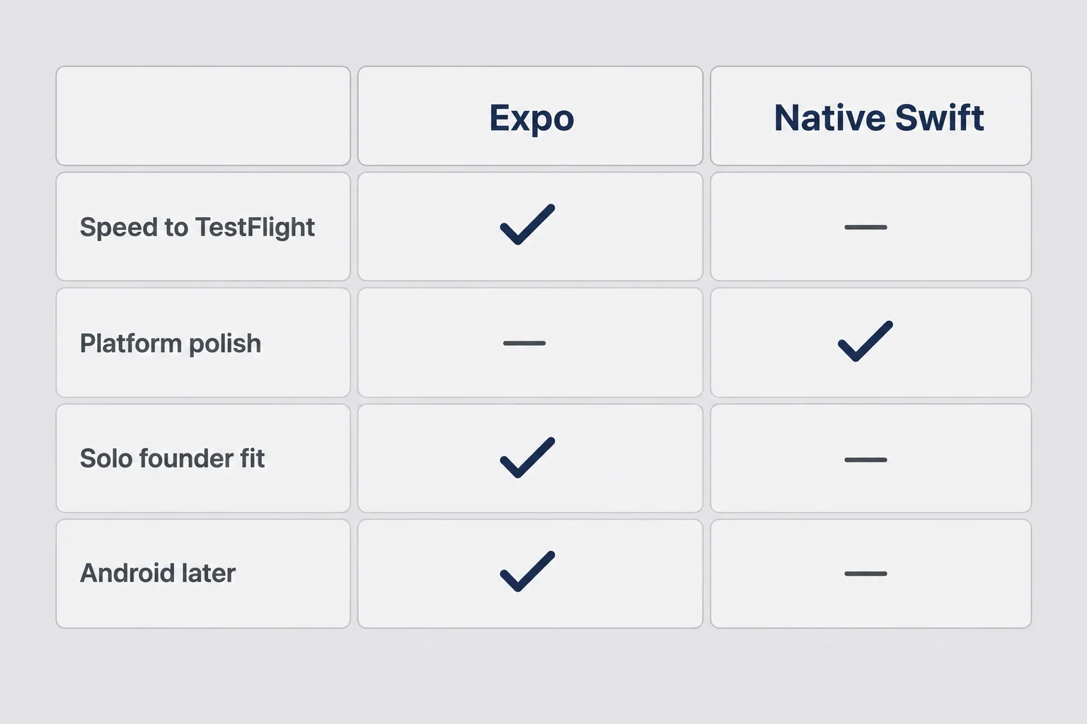
I want to be honest about the trade-off because indie Twitter loves picking fights about stacks. Native Swift and SwiftUI are the "right" answer if you want to become an iOS engineer, if your app is deeply tied to platform APIs, or if you care about every system animation feeling perfect. I respect that path. I did not take it for Finish Him because my bottleneck was not Apple's UI framework. My bottleneck was getting a secure screenshot upload, server-side generation, subscription limits, and a TestFlight build before I lost nerve.
Expo SDK 56 with React Native gave me file-based routing through Expo Router, TypeScript, image picking, secure storage, clipboard, sharing, and a dev client that could talk to native modules without me pretending to be Max for six months. EAS Build handled cloud builds for App Store submission. I am not going to pretend React Native is invisible. Some animations took longer than they would in Swift. I accepted that for v1.
The designer-who-codes path looks like this in practice: Figma for flows, Cursor and ChatGPT for "what does this error mean" and "how do I wire this screen," Expo docs for the happy path. If that sounds like you, Imani's guide to building without coding covers the same mindset from a B2B angle. I read enough API documentation to know what left the phone. I did not write every line of backend infrastructure myself. Supabase Edge Functions and storage policies were configured with help, same as many solo founders using AI as a junior engineer.
When would I pick Swift instead? If the core value required background processing tricks, heavy Core ML on device, or a level of tactile polish where React Native friction would show in every screen recording. If I were building a camera-first creative tool for photographers, maybe. A screenshot upload reply helper? Expo was the reasonable bet.
Android being on the roadmap also nudged me. Finish Him is iOS-first and currently in App Store review, but I always wanted a Play Store version without maintaining two totally separate codebases from day one. Expo does not make Android free. It makes it plausible for a solo founder who is not hiring a second mobile engineer in month two.
If you are a developer who already knows Swift, ignore me and ship native. If you are a product person with a personal app idea and a countdown clock in your head, Expo plus EAS is a legitimate way to learn how to build your first consumer iOS app without gatekeeping yourself on language purity.
The stack that shipped Finish Him
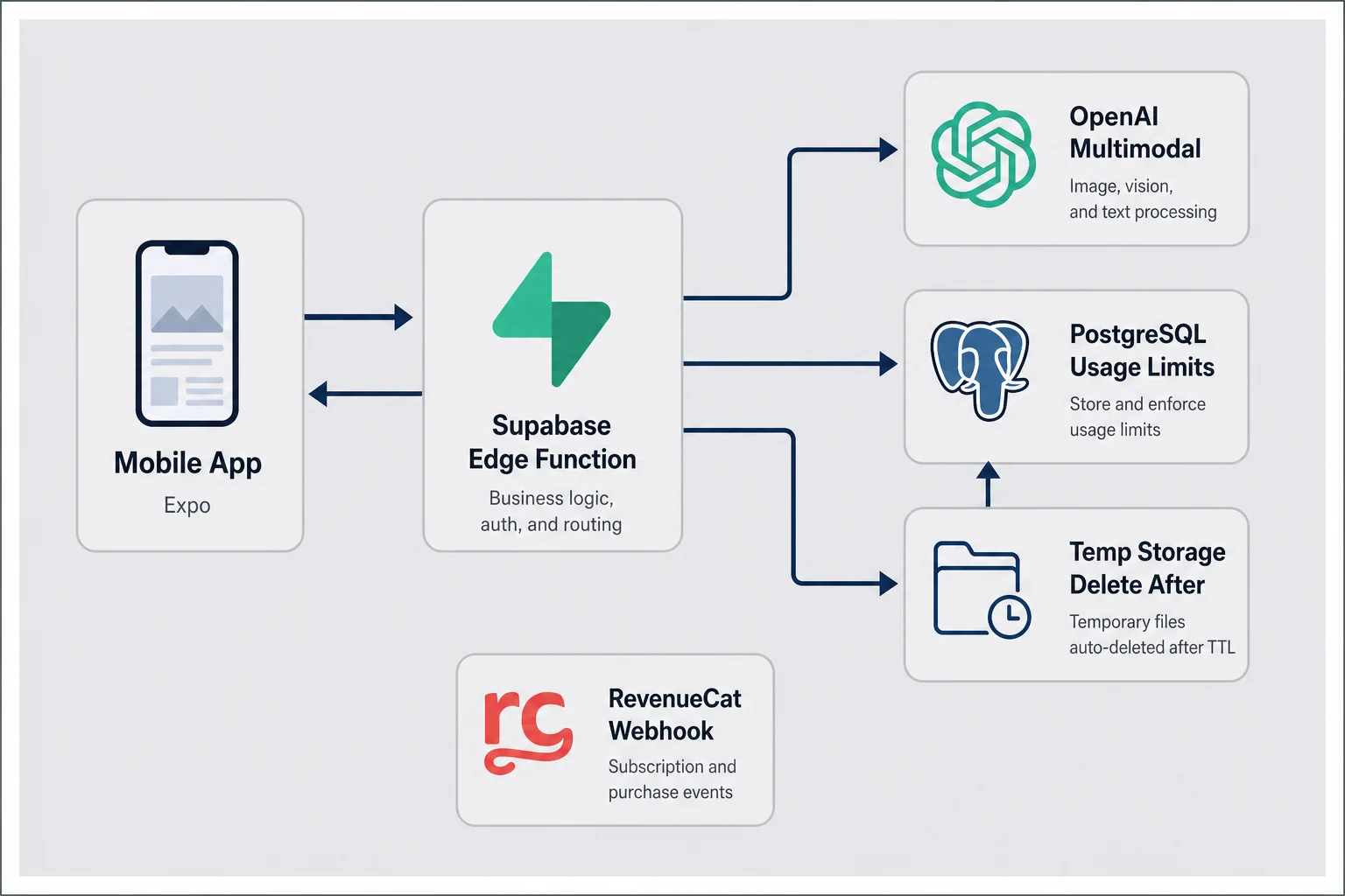
Here is the production stack behind Finish Him, not because you should copy it blindly, but because concrete names beat vague "I used AI backend" hand-waving. The mobile app is Expo SDK 56, React Native 0.85, React 19, TypeScript, Expo Router for navigation, TanStack React Query for server state, Zustand for light client state, Reanimated and Gesture Handler for interactions that needed to feel alive. Device integrations run through Expo Image Picker, Secure Store, Clipboard, and Sharing, including an iOS Share extension so you can send a screenshot from Photos straight into the app.
Mobile layer
The home screen is intentionally boring: one primary action, Finish Him, plus a small row of dots showing how many generations you have left today. Boring is a feature when someone's hands are shaky over a chat screenshot. Settings hold appearance (light, dark, system), plan status, upgrade, and restore purchase. I did not hide premium behind a maze. I also did not shove a paywall in front of the first upload. Order matters.
Backend layer
Supabase is the backend-as-a-service: anonymous auth so users start without email, PostgreSQL for profiles and daily usage tracking, Row Level Security so data access is not "hope the client behaves," storage for temporary screenshot uploads, and Edge Functions as the serverless API. The generate function accepts a multipart image upload, checks daily limits and premium status, calls OpenAI with the screenshot, records usage atomically, deletes the temp file, and returns funny, savage, unexpected, plus remaining count. I understand that flow. I do not pretend I wrote every policy line without help.
AI layer
OpenAI's multimodal model reads the screenshot and writes three replies. The API key lives only on the server. It never ships in the mobile binary. That is not optional for a consumer app handling private images. The model choice can change. The architecture rule does not: client talks to your endpoint, your endpoint talks to the model, secrets stay server-side.
Payments and analytics
RevenueCat manages iOS subscriptions (monthly and yearly through the App Store). A webhook syncs premium status to Supabase in real time so limits stay honest. PostHog tracks product events: app opens, uploads, generations, copies, paywall views. Enough signal to learn, not so much that I am surveilling message content. I do not train on user screenshots. OpenAI API usage is configured with training on customer data disabled for this product.
Build and distribution
EAS Build produces App Store binaries. Expo Dev Client supported development builds with native modules while I iterated. The app is under Apple review as I publish this article. That status is part of the stack too: your tool chain is not finished when the code works. It is finished when a reviewer can install it and your privacy answers match reality.
If this paragraph stack feels heavy for "just three replies," welcome to modern indie mobile. The feature is small. The trust infrastructure is not. Max's world of Next.js and Stripe has parallels: boring infrastructure around a sharp core loop. Different platform, same discipline.
Architecture in plain English (screenshot in, three replies out)
You do not need a computer science degree to understand the data path. You do need to understand it enough to explain it to a user who is scared you are saving their DMs. Here is Finish Him in plain English.
You pick or share a screenshot. The app uploads it to temporary cloud storage through a secure endpoint. The server checks who you are (anonymous session), whether you still have generations left today, and whether you are premium. If you pass, the server sends the image to the multimodal model with instructions to produce three styled replies matching the conversation context and language. The server records one usage unit, deletes the screenshot, and returns JSON with funny, savage, unexpected, plus how many generations you have left. The app shows three cards. You tap one, it copies to clipboard, you paste in Messages or WhatsApp or whatever you use. Tap Regenerate if you want another batch from the same screenshot, still respecting limits.
That diagram is the whole business in one picture. Nothing permanent in storage for chat content. Limits enforced server-side so tweaking a client build cannot bypass infinite free generations. Premium status arriving through RevenueCat webhooks so restore purchase actually works when someone switches phones.
Where people mess this up is skipping the delete step or logging image URLs "just for debugging" that accidentally become a hoard of private conversations. Do not do that. Your future self does not need that liability. If you want deep implementation notes on Edge Functions and RLS, that is Max's beach. If you want to ship as a product founder, know the path cold and verify it in testing.
Designing the first session so upload feels safe
Consumer apps win or lose before the AI runs. The first session is a trust negotiation. Someone is about to give you a screenshot that might include names, photos, flirtation, workplace drama, or family tension. Your UI has to feel like a discreet tool, not a data harvester.
Finish Him opens to one button. No email gate. No tutorial carousel with twelve slides about how AI is revolutionizing communication. Anonymous auth happens under the hood so the server can count daily usage without asking for identity before value. That choice trades away easy email marketing later. Good. This app is not a newsletter funnel with a chat feature glued on.
Upload paths
Photo library, camera, and iOS share extension cover the three real behaviors. People screenshot chats constantly. They also panic and want to photograph the screen directly. Power users share from Photos without opening the app first. Every path should land on the same processing screen with the same honest copy about what happens next.
The waiting moment
While the model runs, I show progress that feels intentional, not evasive. This is where many AI apps accidentally sound like they are uploading your entire camera roll to a server farm. Short, plain language works: we are reading this screenshot to write three replies, we are not saving your chat. Say it in the UI, not only in the privacy policy PDF nobody reads.
Results and copy
Three cards, three tones, tap to copy, visible confirmation on the card you chose. Regenerate stays available on the same screenshot because the first batch is not always the one. Daily remaining generations show as dots on the home screen so the limit never surprises someone mid-crisis. Surprise limits feel like a bait and switch. Visible limits feel like a product with rules.
One-handed use is not a nice-to-have for this category. People are holding the phone they were already texting on. Big tap targets. No critical action hidden in a top corner that requires a thumb stretch of shame.
Dark mode mattered more than I expected. Not because dark mode is trendy. Because people use messaging apps at night, in bed, in low light, when they are already slightly mortified. A blinding white upload screen feels like an interrogation room. Supporting light, dark, and system default in settings was a small build cost for a large vibe win.
I also killed an early idea for a "tone picker" before upload. Letting users choose funny versus savage before they saw the conversation sounded flexible. In practice it added a decision before value and made the app feel like a costume shop. The screenshot is the brief. The three cards are the options. Fewer choices before the magic moment, not more.
If onboarding feels like a chore, cut it. If upload feels like submitting evidence, rewrite the copy. Emotional UX is not soft stuff. It is the conversion rate. When I watch someone use Finish Him for the first time, I look at their shoulders more than the screen. A tiny exhale before the tap means we got the trust part right.
Privacy is the product when users share screenshots
Privacy copy users actually read
Put the promise where the screenshot leaves their camera roll: one short line that says the image is processed and deleted, not stored as chat history. If that sentence only lives in your lawyer's doc, you have already lost the nervous user.
I am wary of thin AI wrappers for the same reason you should be: if the only value is "we called the API," you are renting time until Apple ships the feature natively. Finish Him still has to earn trust every session because the input is intimate. Privacy is not a compliance checkbox. It is the product for this category.
Concrete decisions we made: screenshots upload only for processing, then delete immediately afterward. No permanent chat content on servers after a generation completes. Anonymous authentication without email or password to start. Server-side limits and premium flags, not honor system on the client. OpenAI called from the server with keys that never ship in the app bundle. No training on user content for this use case.
App Privacy labels on App Store Connect are part of the UX too. If you collect it, declare it. If you do not store it, say that clearly and make sure your backend matches your answers. Reviewers notice mismatches. Users notice vibes. Both hurt.
When I talk to founders about consumer AI, they want a magic model name. Users want to know if their ex's name is sitting in a database. Lead with the database answer. Specific beats vague every time: ephemeral processing, anonymous sessions, no chat history, delete after processing. Those are product decisions you can test with curl and a staging project, not marketing adjectives.
If you cannot explain your data path to a friend who is not technical, you are not ready for App Store review. If you can explain it and your architecture does not match, fix the architecture, not the explanation.
Free vs Premium without ruining the core loop
Pricing consumer subscriptions is a different muscle than B2B micro-SaaS pricing. Max can talk about charging $49 a month when you save finance teams hours. Your texting helper is competing with free embarrassment and a friend who says "just send lol." Price too high early and nobody learns if the product sticks. Price too low forever and you cannot cover model costs when usage spikes.
Finish Him uses a simple split:
| Free | Premium | |
|---|---|---|
| Daily generations | 5 per day | Up to 100 per day |
| Reply tones | Funny, Savage, Unexpected | Funny, Savage, Unexpected |
| Regenerate | Yes | Yes |
Free resets every day. Premium is monthly or yearly through the App Store via RevenueCat. Limits are enforced on the server. That table is the whole monetization philosophy for v1: the core loop is identical, the volume changes. I did not paywall "savage" behind premium because holding the funniest tone hostage on a dating panic app would feel gross and stupid.
Five free generations per day is enough to learn the product. Each generation is three replies, so fifteen lines to play with before the cap. That is real value. It is also a natural moment to upgrade if someone is texting all day. One hundred premium generations is high enough that most people never hit it, which is fine. Premium is paying for peace of mind, not meter anxiety.
Say you ship a reply helper at $4.99 a month. Forty subscribers in month one is roughly $200 MRR — easy to model in the MRR calculator before you obsess over App Store charts. Not quit-your-job money. Strangers paying for something you built on your phone is still a different kind of validation than your group chat hyping you up.
Do not cripple the free tier so hard that App Store reviews call you predatory. Do not give away so much that power users never pay and your OpenAI bill becomes a hobby expense. Watch costs per generation and adjust limits before you adjust hype.
Consumer pricing also has a shame curve. People will pay to avoid feeling stupid in a chat faster than they will pay for abstract "AI access." Frame upgrades around the moment, not the technology. I tested paywall copy that mentioned models and latency. It performed worse than copy that said, in plain language, you get more finishes today when you are tired of staring at the blinking cursor. Obvious in hindsight. Easy to forget when you spend weeks tuning prompts.
Annual plans matter on mobile even for small apps. Monthly feels like a subscription to an app category. Yearly feels like a tool you trust. I offer both through RevenueCat and let the App Store handle the receipt logic. Pick numbers you can live with if almost nobody upgrades at first. Early revenue is signal, not salary.
Subscriptions, RevenueCat, and explaining premium to a stranger
I once spent three days polishing a paywall screen before a single person hit the upgrade button. The paywall was pretty. The onboarding was the problem. Consumer subscriptions fail when people do not understand what they already got for free and what changes when they pay.
RevenueCat saved me from learning every StoreKit edge case on my first app. It handles offerings, purchase flows, restore purchase, and webhooks that sync entitlement to Supabase. The product work is still mine: what the paywall says, when it appears, how settings show plan status and remaining generations.
Restore purchase matters emotionally, not only legally. People switch phones. They reinstall. If premium disappears and support is just me in a Gmail tab, you lose trust fast. A visible restore button in settings is cheap insurance.
Explain premium in outcome language, not feature language. Not "advanced AI parameters." Yes "more finishes per day when you are tired of typing and deleting." Settings show Free or Premium and how many generations are left today. No dark patterns. No fake countdown timers. Consumer apps already fight skepticism. Do not borrow tactics from scammy games.
App Store subscriptions mean Apple takes a cut and users think in "cancel anytime" terms. That is fine. Build for sustainability, not imaginary margins. Model cost per generation plus Apple's share plus your time answering support email still has to leave room for profit or you built a charity with extra steps.
I am not going to flash revenue screenshots. I have not been live long enough to pretend I have figured out LTV. I can say what I optimized for: a stranger understands the upgrade in one screen, a paid user can restore without emailing me, and a free user still feels the real product.
TestFlight, App Store review, and the part nobody posts about
The romantic version of shipping stops at the confetti GIF. The real version includes provisioning profiles, export compliance questions, screenshot sizes that are somehow wrong anyway, and a status that says "Waiting for Review" while you refresh App Store Connect like it is a dating app.
TestFlight with friends was where I learned my first share-extension path confused people who otherwise loved the core loop. My mom was very polite about a build that crashed on the one screen that mattered. Fix that before review, not after Twitter applause.
Finish Him is in review as I write this. iOS first, Android later through the same Expo codebase with EAS pointing at Play Store when ready. That sequencing was intentional. One store, one nervous system, one round of privacy answers before I split attention.
Share extension on iOS is a small feature that changes behavior. People live in Photos and Messages. Meeting them in the share sheet reduces steps and feels native in a way a standalone upload button alone does not. It also adds review surface area. Worth it, but not free complexity.
When review stalls, do not invent drama. Build the next small improvement. Rewrite store copy so it describes the moment of relief, not a feature bullet list. "AI-powered messaging" is vague. "Upload a chat screenshot, get three replies, copy and send" is a test a reviewer can run. Your subtitle and keyword field are not SEO homework. They are how a stranger decides in two seconds whether this app is for them. Write for that person, not for your co-founder. Check the lengths in the App Store title character counter before you paste into Connect so a thirty-one-character subtitle does not become another round of review busywork.
Rejection is a specification written by someone tired. Read it twice. Fix the exact issue. Respond clearly. Resubmit without ego. Everyone's first app story includes some version of this paragraph. If yours does not yet, give it time.
Store screenshots are marketing, not documentation. I resisted the urge to show every settings toggle. The winning frame is the result screen: three cards, three tones, obvious copy buttons. Before-and-after emotion sells consumer apps. A grid of feature bullets does not. Same lesson Reese teaches for landing pages, different canvas.
Export compliance, content rights, and age rating questions sound bureaucratic until you realize they are asking whether your app respects the same user you are asking to upload private images. Answer carefully and consistently with your privacy story. "We process screenshots to generate replies and delete them" should be true in code, true in App Privacy, and true in review notes. Alignment is boring work that prevents exciting disasters.
I checked App Store Connect more often than I checked the chats my app was supposed to help with during review week. Priorities were confused. If that is you too, at least make the waiting useful: tighten one screen, fix one typo, write the support email you hope nobody needs.
What I'd tell myself before app number two
If I could send a note back to late-2024 me, it would be shorter than this article and meaner in a loving way. Pick one embarrassing moment and ship the smallest loop that solves it. Finish Him is not a platform. It is three cards and a copy button with guardrails, and that is enough for v1.
Validate with behavior that looks like your real user, not launch playbooks built for B2B founders with newsletters. Personal apps need personal signals. Choose a stack you can direct today, not the stack that wins Hacker News comments. Expo was my answer. Yours might differ.
Treat privacy claims like UI copy. Test them. Mean them. Price from day one with a free tier that still respects the user, server-enforced limits, and a premium story a stranger understands without a demo call. Plan emotionally for review wait. The app is real before Apple says yes.
Point yourself at the right teacher for the next question. Max for deep engineering. Imani for AI-native building without a CS degree. Reese for distribution when your product actually has a landing page and a work email buyer. Iryna for the pocket, the screenshot, the paywall in private. App number two, if there is one, will be easier because app number one taught me where design instinct ends and infrastructure begins. You do not need ten apps. You need one finished loop strangers can use without you in the room.
A few honest answers about building a consumer iOS app
Can you build a consumer iOS app without Swift?
Yes, if you pick a path that matches your skills and accept the trade-offs. Expo and React Native let a designer or product person ship to the App Store with AI-assisted coding without learning Swift from zero. Native Swift still wins on polish and platform feel for some apps. For a first consumer app with a clear core loop, Expo was the right bet for me because speed and one codebase mattered more than squeezing every iOS animation.
How do you handle screenshots and privacy in a consumer AI app?
Treat privacy as product design, not a legal footnote. Upload only when the user chooses, process on the server, delete the image immediately after generation, and never store chat content long term. Use anonymous auth so there is no email gate before trust is earned. Say exactly that on the App Privacy labels and in plain language inside the app. Users decide in the first ten seconds whether your app feels safe with their dating chat or group thread.
How many free generations should a consumer app offer?
Enough that a stranger can feel the full value loop once or twice, not so many that premium never makes sense. I landed on five free generations per day for Finish Him because three reply cards per generation means fifteen real replies to try before the limit bites. Premium goes up to one hundred per day. Server-side limits matter because client-side caps are trivial to bypass and users notice when the rules feel arbitrary.
Expo vs native Swift for your first consumer iOS app?
Swift if you want to become an iOS engineer and your app is deeply native. Expo if you are a solo founder optimizing for time to TestFlight and you can live with React Native trade-offs. I am not a career mobile developer. Expo plus EAS Build got me to App Store review without a year of Swift tutorials. Your first app is a learning project either way. Pick the path that gets you to a real install on a real phone fastest.
What if App Store review takes weeks?
Plan for it emotionally and operationally. Keep a TestFlight build warm with friends who will send honest feedback. Use the wait to fix copy, tighten onboarding, and re-read your privacy answers. Do not spam resubmits over tiny tweaks. If you get rejected, read the message twice, fix the specific issue, and reply clearly in Resolution Center. Waiting feels personal. It is mostly queue and policy. The app is still real while it sits in review.
Your first app only needs to solve one awkward moment well
I still overthink which reply to send in real life. The app works better than I do. That is fine. Your first consumer iOS app does not need to reinvent messaging or become your identity. It needs to make one awkward moment smaller for someone who is not you, but who feels like you on a Thursday night.
Finish Him exists because typing and deleting felt stupid and I had the tools to build something better than my own overthinking. If you have a moment like that, validate it honestly, pick a stack you can ship with, design for trust before you design for clever AI, and put it in review. The App Store is intimidating until you realize it is just another form with higher stakes.
You do not need a pitch deck. You need one problem worth solving in someone's pocket. Build that first. Everything else is noise until a stranger pays $4.99 without knowing your name.




Comments