Your Paywall Is a Trust Screen in Disguise
How a solo iOS founder designs paywall screens that feel safe, convert without creepiness, and survive App Review when the product handles personal moments.
 By Iryna25 min read
Listen to this article
24:03AI-generated podcast-style overview of this article (not a word-for-word narration).
I was sitting on a bench in Bryant Park on a Thursday, phone in both hands, watching a stranger use my TestFlight build. She got three paste-ready replies. She laughed at the funny one. She tapped the fourth generation and hit the paywall. Her shoulders dropped half an inch. Not anger. Disappointment. Like the app had been nice for a minute and then asked for money in a tone that did not match the moment.
I had spent a week on that screen. Gradient background. Three plan cards. A headline I thought sounded confident. What I had not spent enough time on was the sequence that led to it. She had uploaded a screenshot thirty seconds earlier. She had not decided yet whether she trusted me with her conversations. The paywall was not ugly. It was early. And early reads as greedy when the product is personal.
That is the thing nobody tells you when you search for ios paywall ux solo founder advice. The internet wants to talk about button color and annual-default tricks. Those matter at the margins. For consumer apps, especially your first one, the paywall is a trust screen wearing a price tag. If the user still wonders whether you will mishandle their data, no amount of typography saves conversion. If they already felt relief, a plain paywall converts fine.
I am Iryna. I design consumer products and shipped Finish Him Replies. I am not a StoreKit expert. I am someone who has redesigned a paywall three times because each version lied about when the app had earned the ask. This guide is for solo founders building something people use in private: dating helpers, health trackers, journaling tools, anything where the first session is emotional. I will cover what the paywall actually decides, the patterns that ship on iOS without feeling predatory, timing, soft versus hard gates, what belongs above the fold, how StoreKit fits in, App Review traps, and how I test changes without a growth team. For tier math and Apple's cut, read my iOS subscription pricing guide. For what happens before the paywall, read iOS onboarding. Bring your own bench. The park is optional.
iOS paywall UX solo founder: what the screen is really deciding
You are not only deciding how much to charge. You are deciding when the relationship changes from try to buy, what proof the user needed first, what tone the app uses when it asks for money, and whether canceling later will feel fair. Those decisions show up in one scrollable sheet on a five-inch screen. Get them wrong and users leave one-star reviews that mention feeling tricked, not overpriced.
The paywall is the moment your positioning becomes real. Your App Store listing can promise relief. Your onboarding can feel warm. The paywall is where you say: this costs money, on these terms, right now. Consumer users do not separate that from product quality. A clunky paywall feels like a clunky company. A calm paywall feels like a calm app. I know that sounds soft. It is also what I see in TestFlight sessions.
Solo founders compress roles. You are designer, copywriter, compliance officer, and the person who reads App Review rejection notes at midnight. Paywall UX is where those roles collide. Design wants beauty. Compliance wants renewal disclaimers. You want revenue. The user wants to know they are not locked into something shameful. Something has to give. Usually it is clarity. Pretty fades. Clear survives.
I think of four layers on every paywall decision. Timing: when does it appear. Framing: what outcome you lead with. Structure: how many plans and what is pre-selected. Tone: does it sound like the same app that helped them thirty seconds ago. Pricing posts talk about the number on the button. Paywall UX talks about whether the button belongs on this screen at this second.
There is a fifth layer solo founders forget: exit. What happens when someone taps Not now? Do they land back in the free experience smoothly, or in a dead end that feels like punishment? Punitive dismiss paths train users to delete the app. Graceful returns train them to try again tomorrow. Your paywall is also designing the no.
If you have not validated willingness to pay at all, step back. Read how to validate a consumer app idea before you polish pixels. A gorgeous paywall on a problem nobody pays for is still a hobby. A plain paywall on a real relief moment can fund your API bill. Priorities matter.
Competitor teardown helps here in a specific way. Screenshot five apps in your category at the moment they ask for money. Note timing, headline shape, number of plans, and whether restore is visible. You are not copying. You are learning what users in your category already expect. Deviating from category norms can be good or confusing. Know which you are doing.
This article owns the screen, not the spreadsheet. You will still need price targets. Use the Apple commission calculator when you want net proceeds without rebuilding math every time Apple changes a rule. But conversion is not only math. It is whether a person on a park bench would feel okay tapping Subscribe.
Why your paywall is a trust screen, not a pricing screen
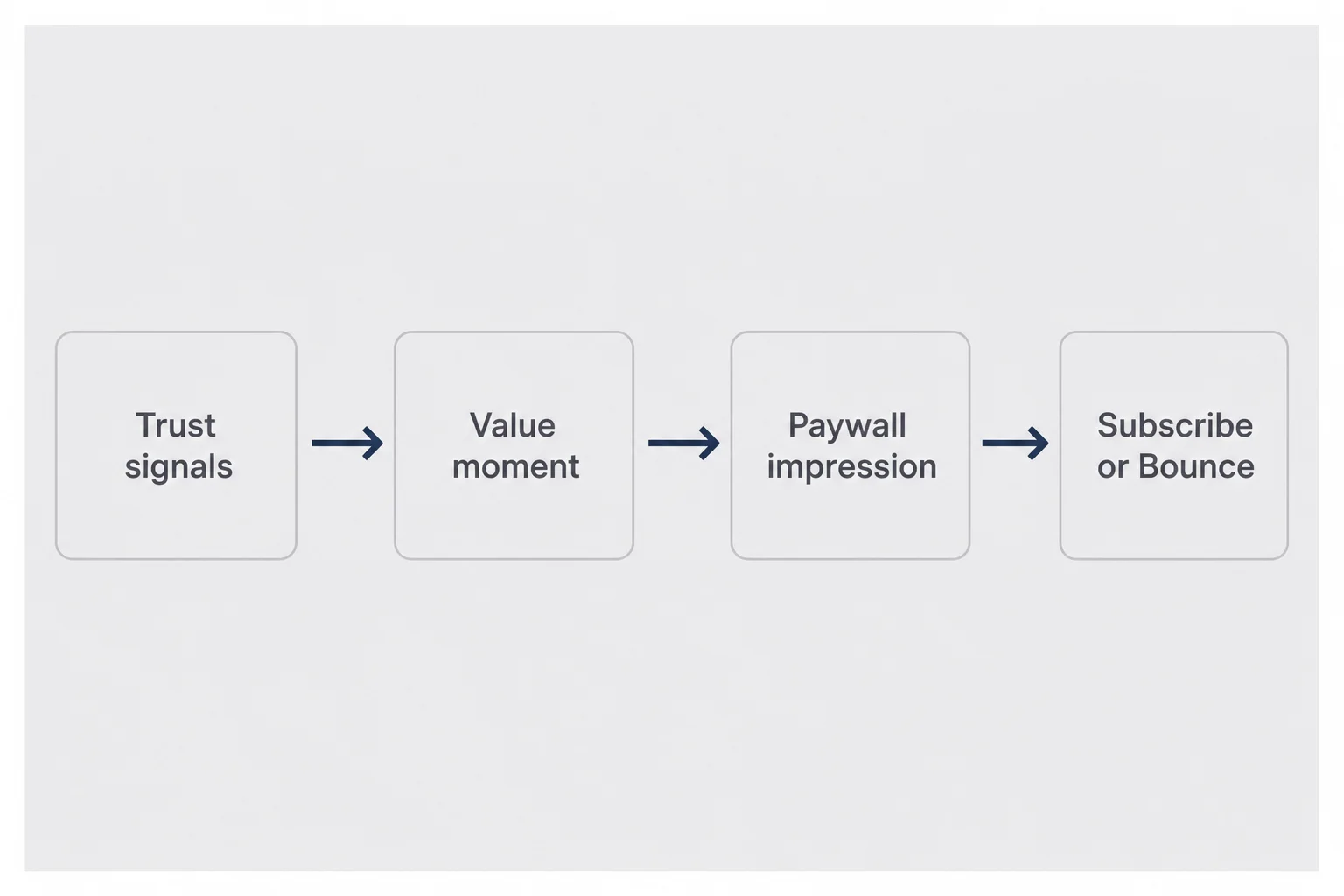
Personal apps fail paywalls for trust reasons more often than price reasons. I have watched users balk at $3.99 who would have paid $6.99 if the app had explained what happens to their screenshot. They were not calculating value. They were calculating exposure.
Trust signals accumulate before the paywall. Does onboarding explain data handling in plain language? Does the first action complete fast? Does the app ask for photo access with a sentence about why? Does the free tier let them feel the core outcome once? Each yes lowers resistance. Each no sends people to the paywall already skeptical. You cannot fix that with a bigger Subscribe button.
Consumer paywalls compete with shame, not with spreadsheets. A B2B buyer approves software because it saves time. A consumer buyer asks whether subscribing means admitting they need help with something they would not post about. Your paywall copy should acknowledge the category without being creepy. Lead with the outcome they already tasted. Not unlock premium AI. More like keep getting replies without rewriting the same text for twenty minutes.
Privacy copy belongs near the paywall for sensitive apps. Not a wall of legal text. One short line: screenshots processed and not stored, or whatever is true for your architecture. If you cannot say it simply, fix the product before you optimize the screen. I linked to our privacy and terms template post when I needed to align App Privacy labels with what the paywall promised. Consistency matters. App Review compares them.
Social proof helps when it is believable at your scale. Five-star average from twelve reviews is fine if honest. Invented ten thousand users is not. Solo founders can use human-scale proof: built for people who overthink texts, tested with real beta users. That sounds smaller than a fake counter. It also sounds true.
Restore purchases is a trust signal too. Visible, tappable, not buried in settings. People who share Apple IDs, people who reinstalled, people who are just cautious click Restore before they click Subscribe. Hiding it looks like you do not want them to find their old subscription. Apple requires it. Treat it as UX, not compliance clutter.
The emotional contract continues after purchase. Mention cancel anytime in App Store settings if it fits your tone. Do not fake urgency with countdown timers you cannot defend. Consumer users remember feeling manipulated. They cancel. They tell friends. One bad paywall experience is a retention problem months later. Consumer app retention starts at the gate.
What trust looks like on the screen
Trust is not one badge. It is a stack of small choices. Font weight that matches the rest of the app. Button labels that say Subscribe instead of Continue when money is involved. No surprise modal layers. If your onboarding used conversational copy and your paywall suddenly sounds like a terms-of-service robot, users notice the shift.
Color matters more than founders admit. Aggressive red sale banners work for e-commerce. They feel wrong in a journaling app someone opens at midnight. Muted palettes do not mean weak conversion. They mean the paywall belongs to the same product that felt safe a minute ago.
Microcopy around permissions still echoes at the paywall. If you asked for photo library access without explanation, users assume you will misuse data when you ask for money. Fix the upstream copy before you A/B test button radius.
I keep a literal checklist on a sticky note when I review paywall drafts. Does this sound like me? Would I tap this if a friend built it? Is anything here trying to trick me? Three nos means redesign, not ship.
The five paywall patterns that actually ship on iOS
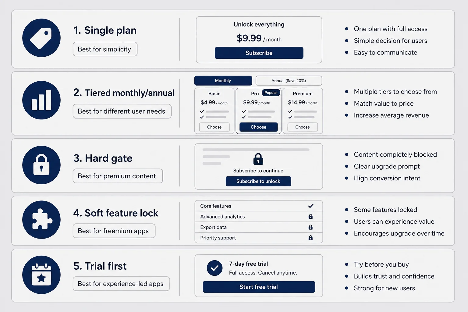
Most solo apps pick from a small set of patterns. Not because creativity is bad. Because phone screens are small and users are tired.
Single plan with optional trial. One price, one period, one primary button. Best when your app does one job and you want minimum cognitive load. I almost shipped Finish Him this way. Clean. Honest. Hard to optimize later without adding UI.
Tiered monthly versus annual. Two columns, annual pre-selected, savings badge. Works when monthly retention is already decent and you want cash flow. Do not show this on day one if you have zero renewal data. You are asking users to bet a year on you.
Hard paywall on launch. No free use without subscribing. Rare for solo personal apps. Works when the App Store listing and screenshots did all the selling and the value is obvious in a demo video. Risky when trust is the bottleneck. Apple scrutinizes these if there is no meaningful free experience.
Soft paywall feature gate. App is usable; premium unlocks more uses or better output. My default recommendation for emotional consumer apps. Daily free generations, export locked, advanced tone behind premium. User learns the rhythm before money enters.
Trial-first. Free trial starts, paywall at trial end. Powerful when the app needs a week of habit. Dangerous when people sign up for trial, forget, and feel scammed. Be explicit about renewal. Consumer apps get angry emails you will read personally.
Pick one primary pattern at launch. Mixing hard gate plus confusing trial plus three tiers is how solo founders simulate a growth team without the analytics to support it. I chose soft gate with a daily cap because asking for a card before someone trusted me with a screenshot felt wrong. Your category may differ. Meditation apps can hard-gate content. Utility apps can single-plan. Match pattern to trust curve, not to RevenueCat case studies from 2022.
Pattern choice is not permanent. I tightened limits after I saw which users returned organically. Loosen if conversion is zero and retention is high. The mistake is changing pattern and copy and timing in the same release. You will not know what worked.
Matching pattern to category
Dating and messaging helpers almost always need soft gates. Health and mood apps need soft gates plus careful trial language. Photo editors can hard-gate export while soft-gating filters. Content libraries can hard-gate if the free sample is genuinely representative.
When you browse competitor paywalls for inspiration, copy the structure, not the pixels. Their trust curve is not yours. A meditation app can charge on day one because the category trained users to expect it. Your weird little utility has not trained anyone yet.
If you are unsure, default soft. You can always tighten. Un-tightening after users call you predatory is harder.
When to show the paywall (timing beats copy)
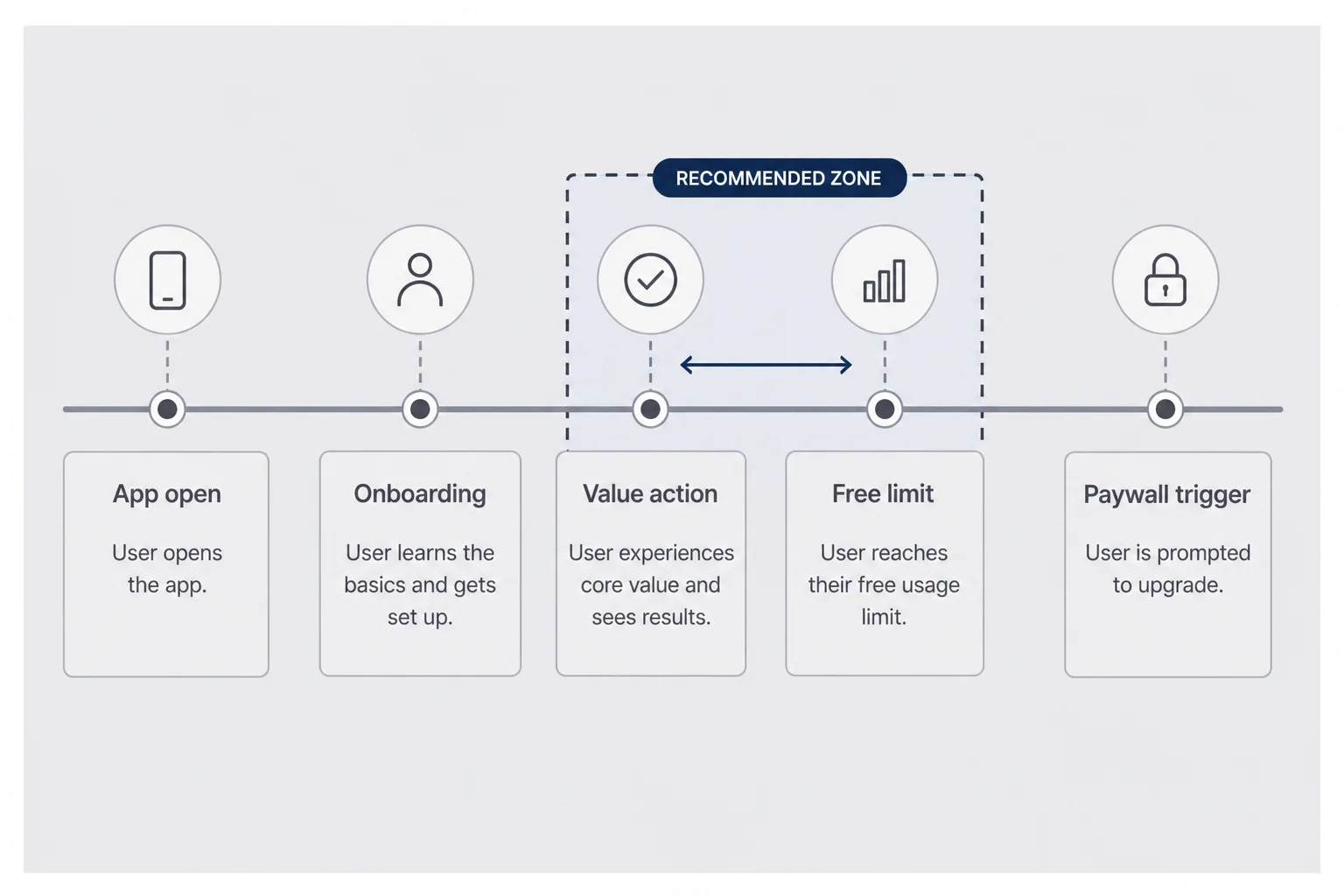
The best paywall headline in the world loses if it appears at the wrong second. Timing is the highest-leverage UX decision solo founders underinvest in because it is invisible in Figma.
Too early: first launch, before onboarding, before first success. User has no proof. Paywall feels like a toll booth on a road they have not driven.
Just right: after first outcome, or when hitting a limit they understand. User thinks okay, I get this, I want more.
Too late: after they extracted all value from the free tier repeatedly without ever seeing an upgrade path. User treats premium as optional forever.
I map sessions on paper. Open, onboard, core action, result, limit, paywall. Where do people drop? If they die on step two, fix onboarding before the paywall. If they complete core action three times then leave, your limit might be too generous or your upgrade prompt invisible.
Common triggers that work for consumer apps: second or third use of the paid feature, attempt to save or export, attempt to use a premium-only mode, end of onboarding carousel if onboarding demonstrated value. Common triggers that fail: immediately after account creation, before permissions finish, mid-action when a network request is still running.
Interstitials versus sheets. Full-screen paywalls feel heavier. Apple subscription sheets feel official. Hybrid works: your branded screen explains value, button opens StoreKit purchase. Do not fight the platform chrome users already trust. Weird custom purchase buttons that look like ads hurt conversion.
Re-show rules matter. If someone dismisses the paywall, when do you ask again? Every session is harassment. Never again is leaving money on the table. I use a soft reminder after another successful free use, not on every cold open. Track dismissals. Respect them.
Coordinate with push and email later. Paywall timing in-app is the foundation. If you email upgrade offers before users finish first session, you feel spammy. Sequencing is product design. Reese's onboarding email sequence post is useful once in-app timing is sane.
Session maps I actually draw
On a legal pad, one row per tester. Columns: opened app, finished onboarding, completed core action, saw paywall, subscribed, one-word emotion. Patterns jump out. Three people write confused next to paywall means copy problem. Three people never reach core action means onboarding problem. Solo founders skip this because it feels unscalable. It is faster than guessing for a month.
Paywall on second session can outperform paywall in first session for apps people open once and leave. Wait until they return with intent. Paywall on first session can win for acute problems where delay feels like withholding relief. Know which app you built.
Soft paywall vs hard paywall for personal apps
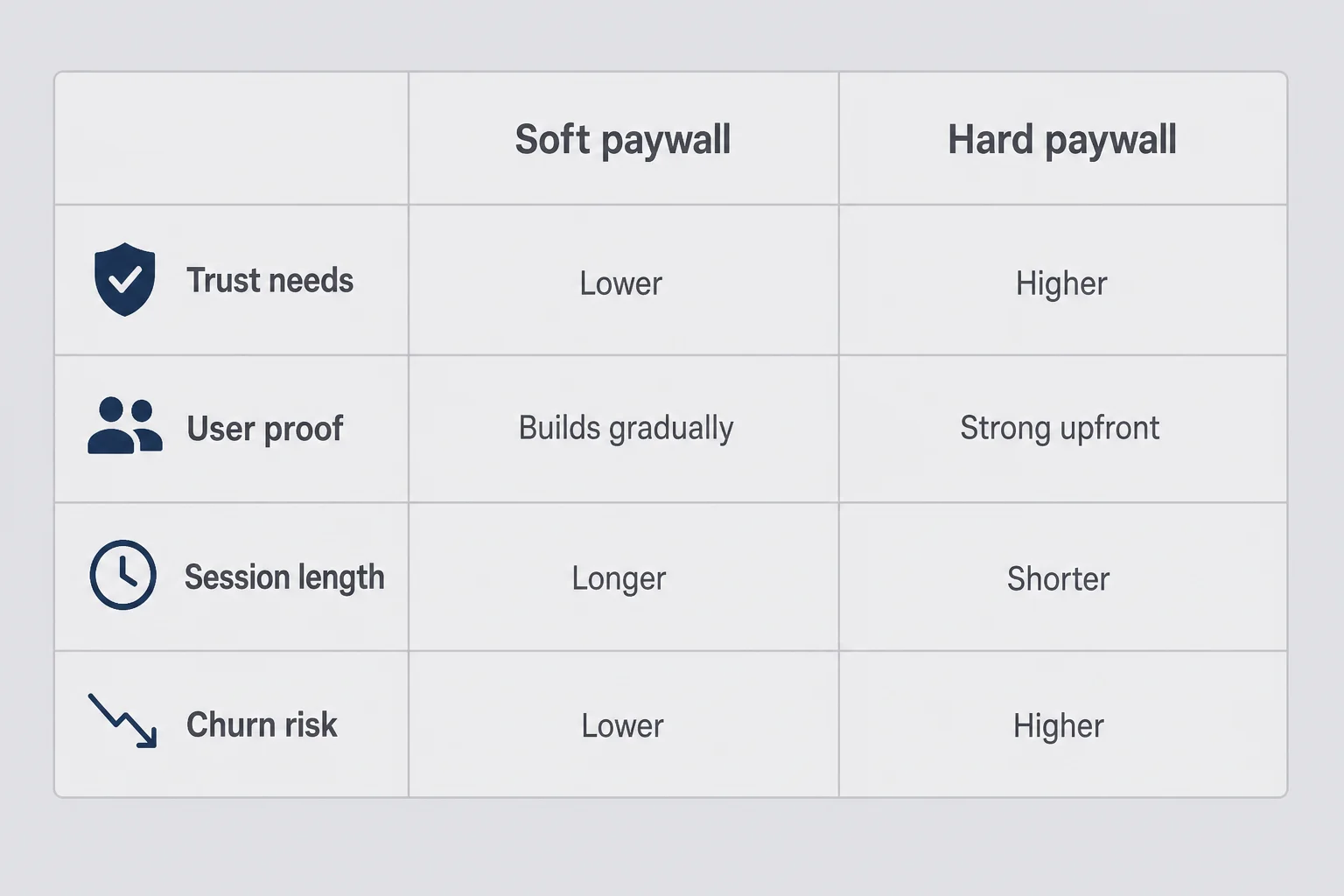
I bias toward soft paywalls for personal consumer apps because the first session is often the most vulnerable one. Hard paywalls optimize for conviction you may not have yet.
Soft paywall strengths: lets users taste relief, collects honest retention signal, lowers review risk when free tier is meaningful, matches how people try apps in public places without committing on the spot. Weaknesses: free users cost API money, support load from people who hit limits, slower revenue if limits are too loose.
Hard paywall strengths: filters serious users, simplifies code paths, can work if marketing already explained price. Weaknesses: brutal for trust-heavy categories, high bounce on first launch, painful App Review if free experience is thin.
Hybrid paths exist. Hard paywall for one premium feature, soft cap on the core loop. Or generous trial that functions like soft access until day seven. Pick the hybrid only if you can explain it in one sentence to a tester.
Finish Him stayed soft: a few free generations per day, upgrade for unlimited. Hard-gating the first reply would have killed the trust moment that makes the app make sense. A fitness app might hard-gate workout plans but soft-gate logging. A journal app might soft-gate entries and hard-gate export. Category matters.
Watch for trial abuse if you go trial-heavy. Apple and users both notice. Design for honest use. Solo founders cannot win an arms race with serial trial resetters. Price for sustainable free tier cost instead.
If conversion is low but session replay shows people love the free tier, tighten the limit or improve upgrade copy before jumping to hard paywall. If conversion is low and people bounce before free use, the paywall is not your first problem.
The free tier is part of paywall UX
Your free limit is a sentence in the paywall story. Three per day reads differently than one per week. Generous limits build habit but delay revenue. Tight limits convert faster but feel stingy if the core action is emotionally heavy. I picked three generations because it matched how often I personally got stuck in a week, not because a spreadsheet said so.
Explain the limit before users hit it. A small banner after the second free use prepares the third. Surprise limits feel like bait. Announced limits feel like a product with rules.
When you change the limit, tell existing users in release notes or an in-app modal. Silent changes erode trust faster than a price increase with explanation.
What to put above the fold on a consumer paywall
Above the fold on a phone is roughly one headline, one subline, and the top of your plan cards. Everything important must live there.
Lead with outcome, not feature bullets. Bad: unlimited AI generations, priority processing, premium models. Better: send the reply without rewriting it for twenty minutes. Features can sit below for scanners. The headline should echo language users already saw in onboarding.
One primary button. Secondary actions like restore and terms should be visible but visually quieter. Multiple competing CTAs look like you are not sure what you want.
Pre-select a plan on purpose. If you offer monthly and annual, pick the one that matches your business goal and label why. Annual saves twenty percent is fine if true. Do not fake savings math.
Show price and period clearly. $4.99 per month with renewal note beats tricky weekly framing for most solo apps. Apple requires disclosure copy. Put it there. Small but readable.
Use one visual that matches the app tone. Screenshot of the paid result, iconography from your onboarding, not stock photos of smiling strangers. Consistency tells users they are still in the same product.
Avoid dark patterns. Pre-checked annual, confusing toggle, tiny close button, fake system alerts. Apple rejects them. Users screenshot them for Twitter. Your reputation is not worth an extra point of conversion.
Accessibility: Dynamic Type friendly layouts, sufficient contrast, VoiceOver labels on plans. Solo founders skip this and wonder why good users churn. It is part of UX.
Legal links: privacy policy and terms near the paywall. Match URLs to App Store Connect entries. Mismatch triggers review delays.
Below the fold without the clutter
Feature lists can live lower on the scroll if you need them. Three bullets max. Each bullet should be an outcome fragment, not engineering specs. Sync across devices is fine for productivity apps. For personal apps, prefer bullets about feelings and results.
Comparison tables between plans work when you have two real choices. More than two plans on a phone screen is a design failure unless you are a streaming service with lawyers.
Close button placement matters. Users should be able to leave without feeling trapped. Trapping increases one-stars, not LTV. I use a clear X or Not now that returns them to the free tier they understand.
StoreKit, RevenueCat, and what to wire first
You can ship with StoreKit 2 and SubscriptionStoreView if you want native sheets and fewer dependencies. RevenueCat shines when you want a dashboard, experiments, or Android later. Both work. Broken entitlement logic does not.
Wire in this order. Define products in App Store Connect with stable IDs. Load products in app. Show paywall when your timing rules fire. Purchase flow updates entitlement state. Restore purchases on tap. Transaction listener handles renewals and refunds. UI reads one source of truth: isPremium.
Do not hand-roll purchase buttons that skip Apple's flow unless you enjoy rejection notes. Custom design around StoreKit is fine. Fake purchase simulation in production is not.
Test every state in Xcode with a StoreKit configuration file: purchase success, user cancel, restore, expired subscription, billing retry. Solo founders often ship happy-path only. Users live in the sad paths.
Keep paywall UI dumb. A view that reads isSubscribed from a single service. When subscription flips, dismiss paywall automatically. Nothing feels worse than paying and still seeing the gate.
Analytics events worth logging: paywall_impression, paywall_dismiss, trial_start, purchase_success, restore_tap. You do not need twenty events. You need a funnel you can read weekly.
If you use RevenueCat, still understand what it wraps. When the dashboard says churn, you should know whether that is Apple billing or user cancel. Ownership beats outsourcing understanding.
SwiftUI paywall structure that survived review
I keep paywall state in an observable object that listens for transaction updates. The view binds to products loaded on appear. Purchase taps call async purchase, handle user cancel silently, surface real errors with plain text. On success, entitlement flips and the sheet dismisses.
Avoid blocking the main thread while products load. Show a skeleton or spinner only for product fetch, never for the purchase sheet Apple provides. Users interpret spinner on Subscribe as sketchy.
Family sharing and offer codes can wait. Ship the boring path first: one subscriber, one device, restore works.
App Review paywall pitfalls solo founders hit
App Review is a UX gatekeeper. Common rejections tied to paywalls:
Paywall before value with no real free path. If users must pay to do anything, your screenshots and description must reflect that clearly. Surprise paywalls get flagged.
Misleading trials. Say when billing starts. Say how to cancel. Do not imply free when it is not.
Missing restore. Visible on the paywall or one tap away. Test it on a device with a sandbox account.
Terms and privacy links broken or generic placeholders. Fix before submission.
Copy that promises features locked behind paywalls you have not implemented. Reviewers tap everything.
Subscription management confusion. If you mention cancel in app, link or explain Settings path honestly.
I keep a pre-submission paywall checklist: fresh install to paywall path, restore, purchase, dismiss, purchase again after delete. Screenshot the disclosure text. Match it to review notes field. Boring work saves days in Waiting for Review.
Guideline changes move. When Apple cracks down on dark patterns industry-wide, consumer apps feel it first. Build paywalls you would show your skeptical friend on a park bench. That is a decent compliance strategy.
Rejection for Guideline 3.1.2 is common when subscription information is incomplete. Read the note literally. Fix what they name. Resist rewriting the whole paywall in panic. Small compliance fixes often clear in one resubmission.
If your app uses AI-generated content behind the paywall, disclosure requirements may affect copy. Align paywall promises with what the free tier actually demonstrated. Reviewers test paths, not intentions.
How I designed the Finish Him paywall (and what I'd change)
Version one was too early in the flow. Version two was prettier and still too early. Version three moved the gate to after a successful generation and explained the daily limit in plain language before the sheet appeared.
Headline focused on outcome: three replies ready when you are stuck. Not AI-powered assistance. Subline mentioned daily free uses and what premium adds. Plans: monthly hero, annual secondary. Restore and terms footer. No fake urgency.
What worked: users who laughed at a free reply understood what premium bought. What failed initially: I buried privacy reassurance below the fold. Moving one line up helped more than gradient tweaks.
The paywall also had to match App Store screenshots. If listing visuals promise calm texting help and the paywall screams LIMITED TIME, the disconnect hurts conversion and reviews. Treat listing, onboarding, and paywall as one continuous voice. Reese's positioning post applies even when you think you are only tweaking a sheet.
I avoided showing competitor logos or fake as seen in press lines. Solo apps look silly pretending to be TechCrunch famous. Honest small-scale copy aged better.
What I would change next: clearer preview of premium-only tones before the paywall, not only on it. And better handling when API errors happen right before the gate. Nothing makes you distrust an app like a failure followed immediately by pay me.
I test copy in TestFlight notes and watch session recordings when available. Five sessions teach more than fifty hours in Figma.
Pricing display mistakes on the paywall
Showing weekly price when you mean monthly is a classic dark pattern. Apple has punished apps for it. Show the price users will see on their Apple ID receipt. If you offer annual, show per-month equivalent only if the math is honest and labeled.
Do not compare your price to a fake crossed-out higher price unless you actually ran that higher price. Users notice. Reviewers notice.
Align paywall numbers with subscription pricing decisions you already made. Changing price on the paywall without updating your positioning elsewhere confuses everyone.
Testing paywall UX without a growth team
You do not need Optimizely. You need discipline.
Recruit five testers who match your ICP, not five founder friends who say looks great. Ask them to think aloud. Record with permission. Note where they hesitate before Subscribe. Pay attention to the pause before the tap. That pause is the paywall failing or succeeding. Long pause with confused muttering means framing problem. Quick dismiss without reading means timing problem. Long read then close might mean price, or might mean they need to think in private and will return. Ask.
Change one variable per release when possible: timing, headline, limit, or default plan. Two weeks of data beats gut feeling if traffic is tiny but non-zero. If you only get twenty impressions a week, qualitative testing matters more than significance math. Do not let low traffic become an excuse to never ship paywall improvements.
Compare paywall impression to purchase rate, not downloads to purchase rate. Downloads lie. Impressions face the users who actually saw the ask. Build a simple ratio in a spreadsheet: purchases divided by paywall views. Track weekly. Ignore daily spikes from your mom reinstalling.
Read App Store reviews that mention money, scam, or subscription. Patterns beat averages. One recurring phrase is a copy fix. Three mentions of did not know it would charge means trial disclosure fix, not button color.
If numbers are too small for statistics, use qualitative thresholds. Three of five testers confused by trial terms means fix terms. Zero purchases but high dismiss after free success means upgrade value is unclear. Two purchases from friends does not mean product-market fit. Strangers paying means something.
Pair with retention. Paywall conversion that brings in users who churn in week one is not a win. Consumer retention metrics should move together with paywall changes over time. A paywall that converts browsers who never open the app again is a tax on your review score.
Cheap tools that are enough
Screen recording from TestFlight feedback. A spreadsheet with weekly paywall funnel counts. App Store Connect subscription reports. You do not need a warehouse on day forty-seven. You need a habit of looking once a week and changing one thing.
When someone emails asking why subscribe, reply and ask what felt unclear. That email is UX research. Founders delete them. Keep them.
Document paywall versions in release notes for yourself. v1.2 moved gate after second generation. v1.3 headline rewrite. Future you forgets. Future you will thank present you.
Questions people ask about iOS paywall UX
When should I show the paywall in a consumer iOS app?
Show it after the user has felt one clear moment of relief or progress, not on first launch. For personal apps, that usually means after they complete the core action once or twice, or when they hit a fair free limit they understand. A paywall before trust feels like an ambush. A paywall after value feels like a natural next step. Track where users bounce in your first session and move the gate to just after the step where retention improves.
Should I use a hard paywall or a soft paywall?
Use a soft paywall when your app handles private or emotional input and users need proof before paying. Hard paywalls work when the value is obvious in thirty seconds and your App Store screenshots already sold the outcome. Most solo consumer apps should start soft: limited daily uses, one premium feature locked, or a generous free tier. You can tighten later when retention data says people come back without prompting.
How many subscription options should I show on the paywall?
One hero plan at launch, with an optional annual toggle once monthly renewals look stable. Three or more visible tiers create choice paralysis on a phone screen. Highlight the plan you want people to pick. If you offer monthly and annual, pre-select annual only when you have proof that long-term users love the app. Never add a weekly tier just because a competitor did.
Do I need RevenueCat or is StoreKit enough?
StoreKit 2 and SubscriptionStoreView are enough for many solo apps at launch. RevenueCat helps when you want cross-platform entitlements, cleaner analytics, paywall A/B tests, or you hate reading Apple's transaction listener docs at midnight. Wire purchases correctly either way: verify transactions, handle restore, and keep entitlement state in one place your UI can read.
What gets consumer paywalls rejected in App Review?
Missing restore purchases, hidden renewal terms, misleading free trial language, dark patterns that obscure price, and paywalls that appear before any value on first launch without a clear free path. Apple also flags apps that feel like bait-and-switch: screenshots promise one thing, paywall demands payment immediately for basic use. Include terms and privacy links, show billing period clearly, and match your listing copy to what users see on day one.
How do I test paywall UX without a growth team?
Watch five strangers use TestFlight and narrate what they think the paywall is asking. Log paywall impressions, trial starts, and purchases in simple analytics. Change one variable per release: headline, timing, or free limit. Compare week-over-week conversion, not day-over-day noise. Solo founders do not need multivariate tools on day one. They need a screen that does not make honest people feel scammed.
The ask has to match the moment you already gave them
I still think about that TestFlight session in Bryant Park. The paywall was not evil. It was just earlier than the relief she had felt. Consumer iOS is unforgiving that way. Users forgive ugly. They rarely forgive tone-deaf timing.
Your paywall is not a separate design file. It is the last sentence of your first session. If onboarding promised calm, the paywall should sound calm. If the app just helped someone send a text they were afraid to send, the paywall should feel like continuing that help, not like a parking meter.
Ship one pattern. Wire StoreKit correctly. Show the gate after value. Write copy you would say out loud. Test with strangers. Fix timing before you fix gradients. The rest is iteration, not magic.
If you are staring at a paywall in Figma right now, close the color picker and write the sentence you would say to a friend who just used the app for the first time. Build the screen around that sentence. Everything else is decoration.




Comments