They Opened It Once. That Was the Whole Relationship.
First-session trust, activation, and Day 1 return visits for consumer iOS apps, from a solo founder who learned downloads are not retention.
 By Iryna27 min read
Listen to this article
18:15AI-generated podcast-style overview of this article (not a word-for-word narration).
The status flipped to Ready for Sale on a Wednesday. I took a screenshot like it was a diploma. Friends texted congrats. I refreshed downloads like the number was a pulse.
Then the quieter part started. People installed. Some opened. A lot of them never came back. The home screen forgot me faster than App Review ever did. I checked App Store Connect the way I used to check Waiting for Review, except now the status was fine and the product still felt unfinished in a different way. Approval had answered "can you ship." It had not answered "will a stranger keep you."
That is the gap nobody warns you about when you are obsessing over binary uploads and privacy labels. Getting through App Store review is a gate. Consumer app retention solo founder work is what happens after the gate: the first open, the first awkward trust decision, the chance they return tomorrow when the same embarrassing moment shows up again. Downloads without that return visit are applause for a demo. They are not a business.
I am writing this as someone who shipped one consumer iOS app, Finish Him Replies, and learned the hard way that a polished paywall cannot save a first session that feels invasive or empty. If you are still choosing whether the idea is worth building, start with how to validate a consumer app idea. If you are still wiring the core loop, read how to build your first consumer iOS app. This piece assumes you can get someone into the App Store. The question is whether they stay long enough to care.
Also, an honesty note before we get tactical. Retention advice online often assumes a growth team, a notification calendar, and a budget for creative testing. You might have Cursor, a TestFlight circle, and a Sunday afternoon. Good. Most of what follows is subtraction and clarity, not a new stack. If a tactic needs three specialists to run, it is not your first lever.
Consumer app retention solo founder: the part after "Ready for Sale"
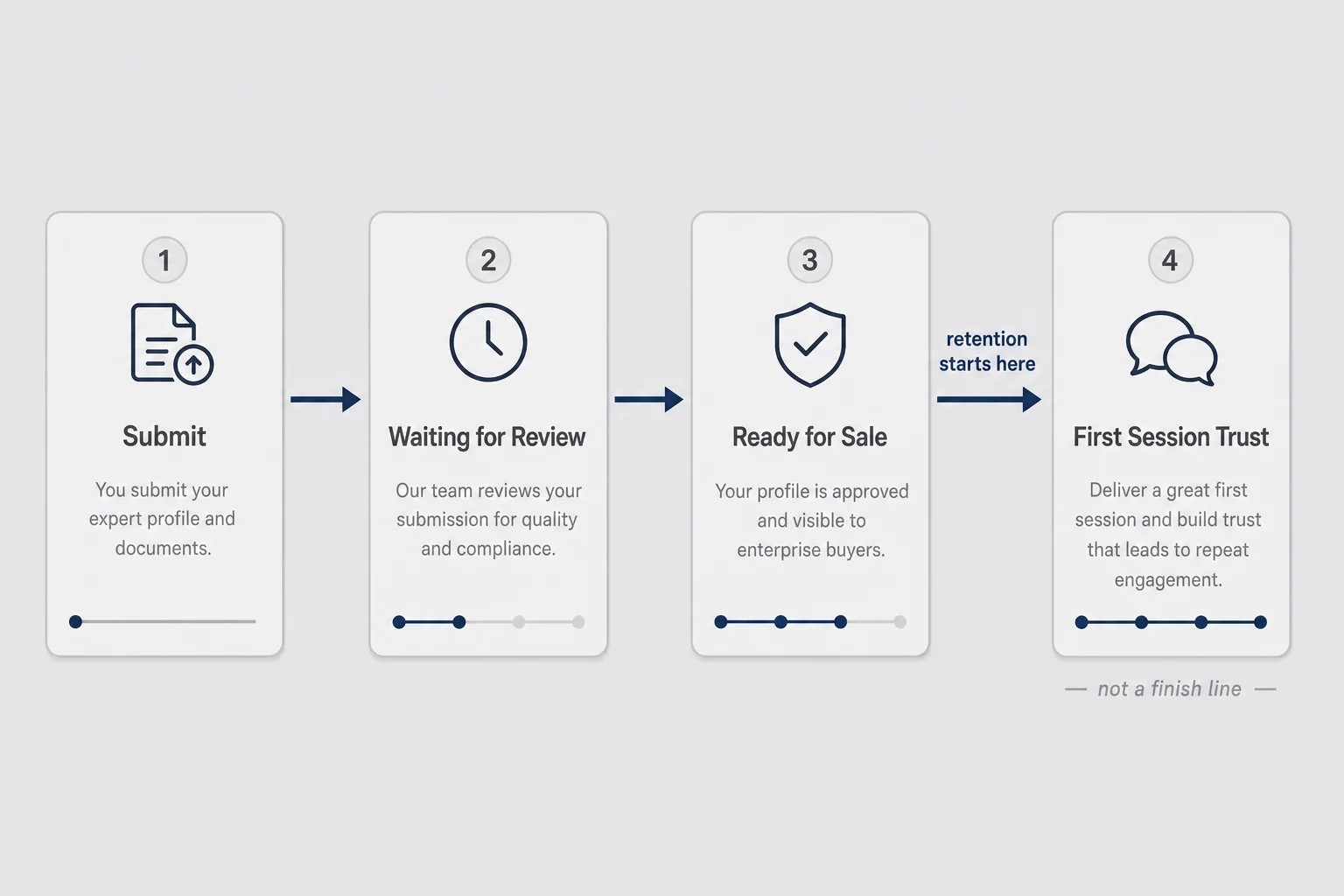
Ready for Sale means Apple will let strangers buy what you built. It does not mean those strangers will form a habit. It does not mean your onboarding makes sense on a cold phone. It does not mean your permission prompts feel like a fair trade.
I used to treat launch day like the climax. In consumer apps, launch day is closer to the opening scene. The real plot is whether a person who has never heard your story can feel relief in the first minute, trust you with something personal, and have a reason to open the app again when life repeats the same itch. That plot does not care how long you waited in review. It cares whether the first screen matches the hope that got them to tap Get.
B2B founders talk about churn in seats and charts in dashboards. That language is useful for money math. It is the wrong texture for a dating-reply helper, a money-anxiety tracker, or any app people use in private. Consumer retention fails earlier and more quietly. Nobody sends a cancellation email. They swipe you off the home screen while waiting for coffee. You will not get a thoughtful note about why the workflow did not fit their team. You will get silence and a slightly lower install graph next week.
So when I say consumer app retention solo founder, I mean a product job with three parts. First session: did they reach a moment that proved the app works. Trust: did anything feel creepy, confusing, or extractive before that moment. Return: did tomorrow's version of the same problem bring them back without you begging via push.
Those three parts are ordered on purpose. Return visits cannot rescue a first session that felt wrong. Push cannot invent a need the product never proved. Pricing experiments cannot fix a free path that never delivered one honest win. Start at the earliest break.
If you only optimize the App Store listing and ignore those three, you will buy yourself more first opens that bounce. ASO can get the download. It cannot make the first session feel safe. A prettier screenshot of a happy path you do not actually ship is just a faster way to disappoint the right people.
Downloads are not a relationship
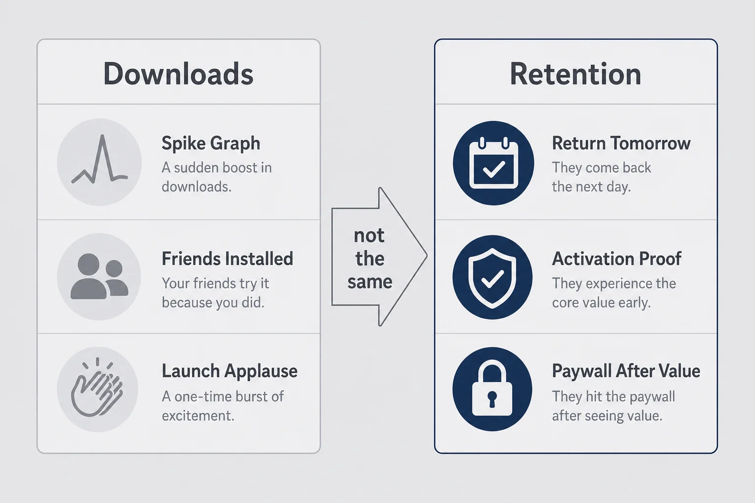
I know how intoxicating the download graph looks. A spike after you post in a community. A friend of a friend who "definitely" installed. A TestFlight cohort that felt warm because they already knew you. Warm installs lie gently. They already trust you as a person, so they forgive a messy empty state. Strangers will not.
None of that is retention. Retention is the unglamorous percentage of people who come back after the novelty wears off. For a subscription app, it is also the only path to a paywall that does not feel like a scam. If they never felt the core value, asking for $4.99/month is not pricing. It is hope with a receipt. I would rather see twenty people reach a real win than two hundred people bounce off a signup wall and never form an opinion about the product itself.
Here is the position I will hold for the rest of this article: for personal consumer apps, first-session trust is the retention strategy. Habit loops and notification calendars come later. If the first open feels wrong, you do not have a re-engagement problem. You have a product problem wearing a growth costume.
Caveat, because honesty matters. Some apps are inherently infrequent. A travel packing checklist might be seasonal. A tax helper might be annual. Infrequent use is not the same as failed retention. Failed retention is when the use case is frequent (a texting helper, a daily mood check, a habit you already do weekly) and people still disappear after one confused open. Know which product you built before you panic about Day 7 charts copied from a meditation app blog.
Say you get eighty downloads in week one from a Reddit thread and a couple of TikTok stitches. Forty people open the app. Twelve reach the main action. Four come back the next day. Two eventually hit the paywall with enough context to understand it. That funnel is ugly and also more useful than a thousand installs with no return path. Your job is not to decorate the top of the funnel. Your job is to widen the middle without making the first minute feel like an interrogation.
Friends will tell you the app is "so cool." Cool is not a retention metric. Cool is a compliment at a dinner table. Watch what happens when someone who does not know you installs on a Thursday night because a thread mentioned your category. That stranger is your real customer. Design for their impatience.
What first session retention actually means on a phone
First-session retention on iOS, in practical terms, is not a fancy cohort chart. It is whether the person who just installed you still has a reason to keep you by the time they background the app.
On a phone, that decision is brutal and fast. One hand. Partial attention. Another app notification competing for the same thumb. They are not "evaluating your solution architecture." They are deciding if this thing is worth the home screen real estate. Desktop SaaS gets a browser tab and a little more forgiveness. Mobile gets a glance between subway stops.
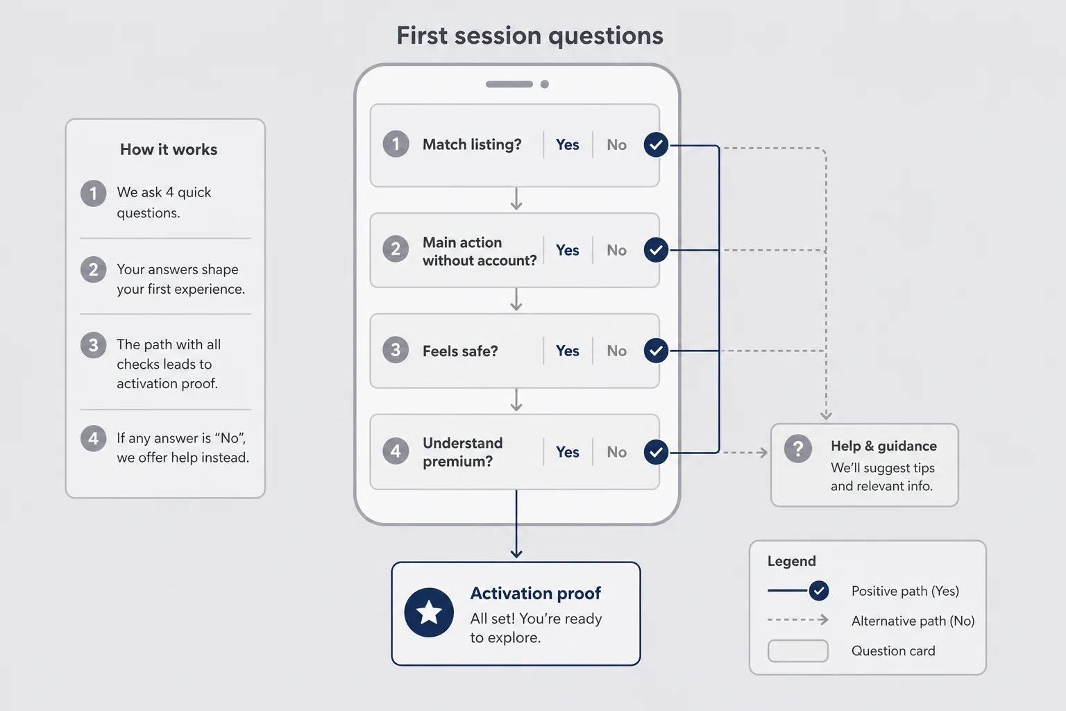
I think about first-session retention as four questions the user never says out loud. Did this match what the listing promised? Can I do the main thing without creating an account first? Does this feel safe with my private stuff? Do I already understand what I would pay for later?
If the answer to any of the first three is no, they leave. If the fourth is no because you never showed value, your paywall conversion will look like a pricing problem when it is actually an activation problem. I have watched founders rewrite tier copy for a week when the real issue was that free users never generated a single useful output. The tiers were fine. The first win never happened.
iOS app activation is the clean name for the proof moment. For Finish Him, that moment is not "opened the app." It is "got three paste-ready replies from a screenshot and understood I could send one." Until that happens, I have not retained anyone. I have entertained a curious tap. Opening the app is tourism. Copying a reply is the product.
Your activation moment will sound different. "Logged the first expense and saw the total update." "Saved the first outfit and the closet stopped looking empty." "Finished the awkward text without opening ChatGPT in Safari." Name it in a sentence a friend would understand. If you cannot, you will optimize the wrong screens.
One more distinction that matters on phones: session length is not proof. A reply helper can deliver value in under a minute and that is success. A long confused session where someone taps settings for three minutes is not engagement. It is a person looking for the exit. Measure the proof, not the lingering.
The sixty-second trust test
I run a mean little exercise before I ship onboarding changes. Fresh install. Airplane mode off. No sandbox muscle memory. I give myself sixty seconds to reach the core action without explaining anything out loud.
If I cannot, strangers will not either. They will not have my patience, my screenshots folder already staged, or my forgiveness for a confusing permission sheet. They also will not have my emotional investment in the gradient I spent a weekend picking. Fresh eyes are cruel. That is why they are useful.
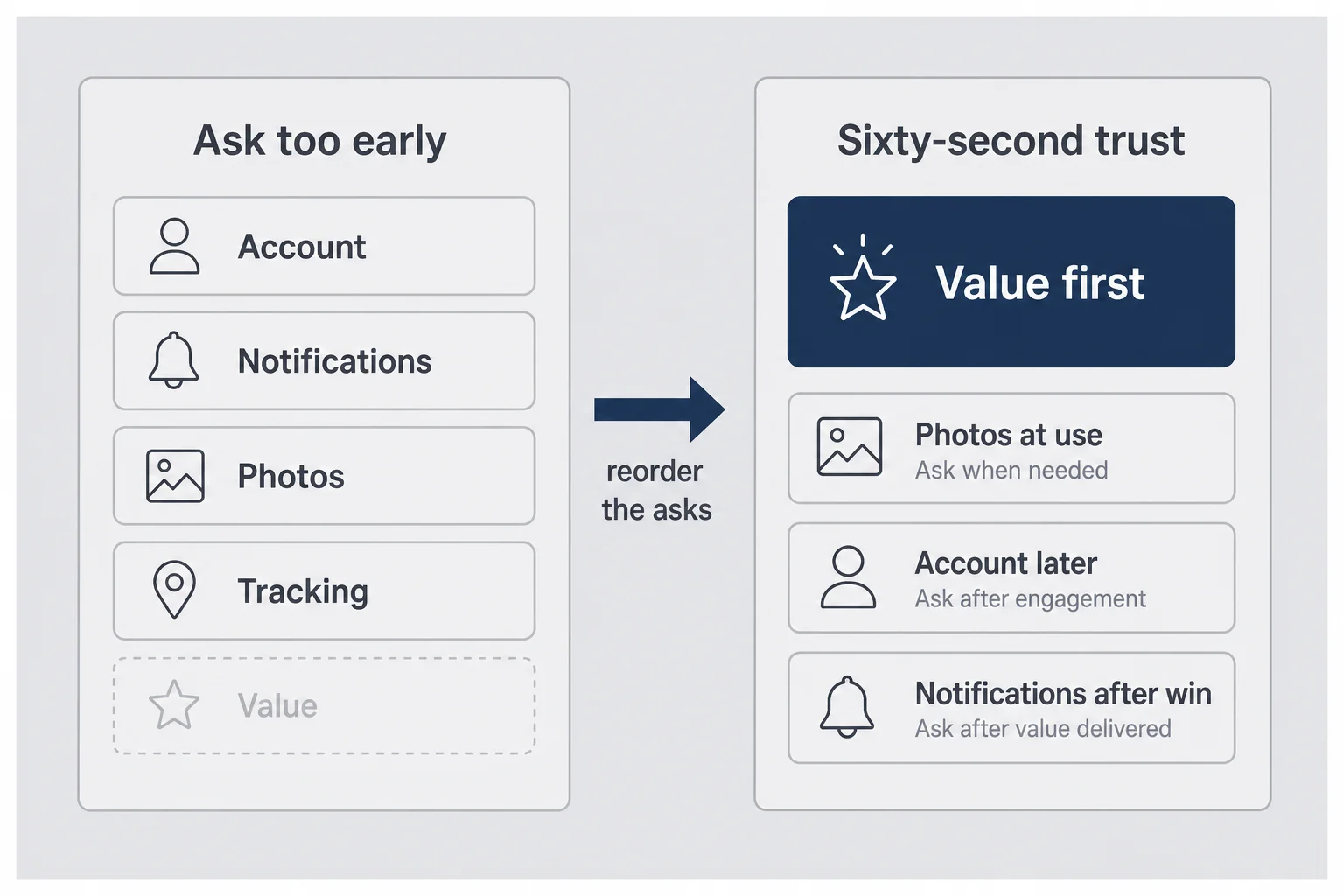
The sixty-second trust test is not about speedrunning for its own sake. It is about removing every ask that arrives before value. Consumer apps die when the first minute is a stack of demands: create account, enable notifications, allow tracking, rate us, watch a four-screen carousel, then maybe do the thing you came for. Each demand spends a little of the goodwill the App Store listing earned. Spend it all before value and you have nothing left when the product finally appears.
Trust is not a privacy policy paragraph alone. Trust is the feeling that the product is on your side in a private moment. That feeling can break on a single system dialog that arrives too early. It can also break on cute copy that tries too hard. Personal problems do not need a hype narrator. They need a calm tool.
Do the test on a real device, not only the simulator. Do it standing up, with one hand, the way someone opens an app while half-watching a show. If your flow only works when the user is sitting at a desk with both thumbs free and a tutorial voice in their head, it does not work.
Permission prompts before value
Camera, photos, notifications, tracking. Each one is a tiny courtroom. The user is deciding whether you are worth the access.
Ask for photos before they understand why, and a reply helper starts to feel like spyware. Ask for notifications before they have felt relief, and you sound needy. Ask for tracking on first launch and you look like every other app that treats people as inventory. In categories that already feel vulnerable, the bar is higher. People are not being dramatic. They are protecting themselves.
My rule is boring and it works: ask at the moment of use, with one sentence of human context on a screen you control before the system dialog appears. "I need photo access to read the chat screenshot you pick. Nothing gets saved to a gallery on my side." Then the system prompt. Not the other way around. The pre-prompt screen is not optional fluff. It is where you earn the tap.
If a permission is optional for the first win, keep it optional. Hard walls on day zero teach people to delete you rather than negotiate. I would rather ship a slightly constrained first win than a perfect technical path that never gets used because the permission sheet scared everyone off.
Sign-up walls that feel like interrogation
I have designed a lot of signup screens for other people's products. I have also sat in the user seat and closed apps the second they demanded an email for a task that clearly did not need one yet.
For personal apps, early account walls are especially sharp. The user is already a little embarrassed. Now you want their email, maybe Apple, maybe Google, before they have seen whether you even help. That is not onboarding. That is a door fee. It also creates a weird social risk: "if I sign up, this awkward problem is now attached to my identity in yet another database."
Prefer anonymous first value when the architecture allows it. Save the account for restore purchases, sync, or history they asked to keep. If your product truly cannot work without identity, say why in plain language and keep the form short. "Sign in so your replies stay on this phone if you reinstall" is better than a generic "Join the community." Community framing is often a costume for data collection. Users can tell.
And please do not hide the skip. A skip button that looks like a legal footnote tells people you are ashamed of letting them try the product. If skip exists, make it a real choice with equal visual weight. If skip does not exist, own that decision and make the value of signing in obvious before the fields appear.
Name your activation moment before you polish anything else
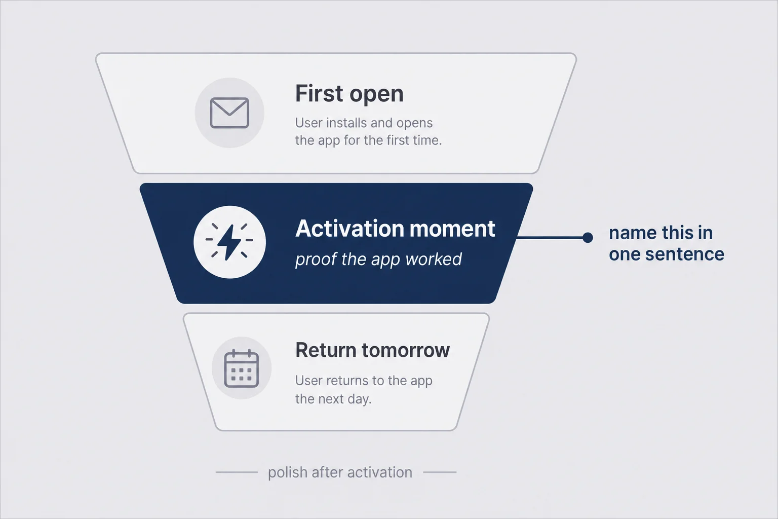
Founders love polishing. I say that with love, as a designer who once spent three days refining a paywall gradient while the first-run path still dumped people into an empty state that looked broken.
Activation first. Polish second. Marketing third. That order is uncomfortable because polish is visible and activation work is invisible until you measure it. Invisible work is still the job.
Write your iOS app activation sentence on a sticky note. Put it above your monitor. Every screen in the first session either moves someone toward that sentence or it is a candidate for deletion. If a screen exists only because a competitor has one, delete it from the first session. You can always add ceremony later for people who already love you.
Be ruthless about what counts. Examples that are specific enough to build toward: a reply helper where the user pastes or uploads a conversation and copies a reply they would actually send; a habit app where they complete one check-in and see a log that proves it counted; a budget app where they add one real expense and see the category total update; a journaling app where they finish one entry without being forced into a seven-day challenge pitch.
Notice what is not on that list: viewed the feature tour, created an account, enabled notifications, opened the paywall. Those can be useful later. They are not proof the product worked. They are proof the user survived your process.
Once you have the sentence, instrument it. One event. Name it something you will still understand in three months. Then look at the percentage of first opens that reach it. That percentage will humble you faster than follower counts. Humbling is useful. Panic is optional.
If that activation rate is low, do not buy ads. Do not rewrite the App Store subtitle again. Sit with a friend, hand them a phone with a clean install, and watch without coaching. The silence where they hesitate is your roadmap. Ask one question after: "Where did you feel unsure?" Then fix that place before you touch brand colors.
Consumer app onboarding that gets out of the way
Consumer app onboarding has a branding problem. People hear "onboarding" and invent a mini TED talk inside the app. Swipe. Swipe. Swipe. "Welcome to the future of texting." Nobody asked for a future. They asked for help with a message sitting unread in another app.
Good consumer onboarding is mostly subtraction. Get the person to the activation moment with the fewest screens that still feel oriented. Explain only what is confusing. Defer everything else. If you feel proud of how educational your first run is, check whether you are teaching or stalling.
I like a simple structure for personal apps. Screen zero can be a single honest sentence about what happens to their data if the product is sensitive. Then land them as close to the main action as possible. Offer an optional tip near the control they need, not a lecture before they can touch anything. Orientation can live beside the tool. It does not have to live in front of the tool like a velvet rope.
There is a version of this that looks modern and still fails: a beautiful animated intro that takes eight seconds before any interactive control appears. Motion can feel premium in a demo video. In a first session on a tired Thursday, motion can feel like waiting. Prefer interactivity over spectacle.
If you want a B2B-flavored onboarding playbook for web SaaS, Reese wrote about customer onboarding for solo founders. Steal the idea of naming a magic moment. Do not steal a thirteen-email mindset for a phone app someone opens in bed. Email drips assume a browser product and an inbox relationship. Your user might never give you an email on day one, and that can be fine.
Skip the carousel unless it earns its screens
Carousels are the common tax on that curiosity budget. Four screens of benefits, a "Get Started" button that actually means "now create an account," then a permissions gauntlet, and the energy from the App Store listing is gone. They survive because they look like work in a Figma file. They die in analytics because people skip them, and skipping means they learned nothing while you spent a week writing captions.
Keep a carousel only if each screen teaches a gesture or a rule the UI cannot show by itself. "Swipe a reply to copy" might earn a screen. "We use AI" usually does not. "Join thousands of happy users" never does. Social proof belongs near a paywall or on the listing, not as a tax before the first useful tap.
A better pattern for many consumer apps is progressive disclosure. Let them attempt the main action. If they stall for a few seconds on an empty control, show a tip. If they succeed, stay quiet. Silence after success is a feature. People who just got value do not need a confetti celebration that asks them to share on social. They need an easy path to do the useful thing again.
Empty states that feel broken vs empty states that invite
The first session of a consumer app is almost always an empty state. No history. No screenshots yet. No logged workouts. No saved looks. If that emptiness looks like a bug, people assume the app is broken.
Design the empty state as a guided first win. One clear primary button. One sentence that names the action. Optional secondary that explains privacy or shows an example. Secondary should never compete visually with the primary. If everything is bold, nothing is.
For Finish Him, an empty home that only said "No chats yet" would feel dead. An empty home that says "Upload a screenshot of the conversation you are stuck on" with a big obvious control tells you what to do with your thumbs. Same emptiness. Different emotional read. The first version of an empty state is often written like an engineer status message. Rewrite it like a human giving directions.
Sample content can help when it does not lie. A demo conversation labeled as an example is fine. Fake "friends" who appear to have messaged the user is not fine. People can smell fake social proof, and in personal categories it reads as manipulative. If you show an example, label it Example in plain type. Clarity beats cleverness when trust is fragile.
Privacy is retention when the problem is personal
This is the hill I will die on for consumer AI apps and anything that touches dating, health-adjacent feelings, money stress, or private messages.
Privacy is not a footer link. Privacy is retention.
If someone wonders whether their chat screenshot will train a model, live on a server forever, or show up in a breach blog next year, they will not complete activation. They might not even grant photo access. They will leave and tell themselves they "weren't ready to try an app for that." That story protects their dignity. Your analytics will just say bounce.
Be specific in the product, not only in the legal page. Ephemeral processing. No chat history stored on your servers if that is true. Anonymous session if that is true. No training on user content if that is true. Put the sentence near the scary action, not three taps into a settings maze. People do not read policies when they are mid-anxiety. They read the line next to the Upload button.
I wrote a longer piece on terms, privacy copy, and App Privacy labels because solo founders often treat those as launch chores. They are trust surfaces. A beautiful onboarding that contradicts your privacy label will not save you in review or in the user's gut. If your binary sends content to a model provider, say so in language a non-engineer understands. Vague "AI-powered" marketing with a quiet data path is how trust dies.
One practical test. Show your first-run flow to someone who is not a founder. Ask only: "What do you think happens to your data here?" If they shrug with discomfort, rewrite until the answer is calm and accurate. Retention cannot outrun a creepy first impression.
Also keep your product promises and your App Privacy labels aligned. Reviewers notice mismatches. Users notice vibes. Both matter. If you claim you do not collect data you actually collect, you have not built a retention strategy. You have built a future support headache.
Day 1 retention for a mobile app: what to measure when you are one person
Day 1 retention for a mobile app intimidates solo founders because the industry talks like a growth team lives in your Slack. You do not need twenty funnels. You need a small set of truths you will actually look at on Monday mornings.
I care about four numbers early. First opens. Activation rate (first opens that reach your proof moment). Same-day or next-day return among people who activated. Paywall views among people who activated, not among confused bounce traffic.
That is enough to know whether you have a product. App Store Connect gives you retention charts by cohort without you building a warehouse. Pair it with something lightweight for custom events. I am not here to sell you a stack. I am here to stop you from drowning in dashboards while the first session still asks for seven permissions.
A few interpretation rules that saved me from panic. Early cohorts are noisy; twenty installs is not a science fair. Compare your week to your previous week, not to a viral meditation app's blog post. If activation is weak, ignore Day 7; you do not have a habit problem yet. If activation is decent but Day 1 return is awful, look at whether the job-to-be-done is frequent enough, and whether the app leaves a reason to return (history, unfinished thread, a saved draft, a streak that is not insulting).
Max has a whole post on micro-SaaS analytics for solo founders if you want the broader instrumentation mindset. For consumer iOS, keep the consumer lens: trust and time-to-value first, chart elegance later. His churn writing for B2B is also worth reading as money math, with the caveat that reducing micro-SaaS churn often assumes a logged-in workflow product. Your Day 0 problem may be emotional, not seat-based.
Also resist the vanity of session length. A reply helper can deliver value in forty seconds and that is a win. A journaling app might want longer sessions. Match the metric to the job.
When numbers are ugly, change one thing per week. If you rewrite onboarding, move the paywall, and add push in the same release, you will learn nothing useful. Solo founder analytics only work when the experiment is small enough to attribute.
The paywall timing mistake that kills return visits
I have strong feelings about paywalls because I have designed too many pretty ones that nobody reached with goodwill intact.
If your paywall appears before the user has felt the relief they downloaded you for, you are not monetizing. You are interrupting trust. Some people will pay anyway out of curiosity. Many more will close the app and never reopen it, which wrecks both retention and your sense of whether the price was "wrong." You will conclude people will not pay $4.99 when the truth is they never understood what $4.99 bought.
For consumer subscriptions, I prefer a simple sequence. Free path to one real win. Soft reminder of what premium includes after that win. Harder wall only when they try to repeat the valuable action beyond a fair free limit, or when they explicitly tap Upgrade. The free win should be real, not a teaser that withholds the useful output. Showing three reply styles and locking the copy button is a special kind of insult.
Weekly, monthly, yearly, lifetime: that is pricing strategy, and it matters. Timing is a separate lever. A fair price shown too early still feels like a shakedown. An okay price shown after delight feels like a reasonable trade.
Restore Purchases should be obvious. Nothing says "I do not respect you" like trapping a returning subscriber behind a wall with no restore path. That is retention poison with a one-star aftertaste. Put Restore near the purchase buttons. Do not bury it in a settings archaeology dig.
And please do not A/B test paywall aggression before you can get people to activation. You will optimize the wrong door. Aggressive walls can inflate short-term conversion while quietly destroying return visits. If your Day 1 retention falls while paywall conversion rises, you did not find product-market fit. You found a way to tax confused traffic.
When push notifications make people delete you
Push is not a retention strategy for a product people have not bonded with. Push is a megaphone. If the relationship is weak, a megaphone makes you annoying.
The classic mistake is asking for notification permission on first launch, before value, with system copy the user barely reads. They tap Don't Allow out of reflex, or they Allow and then resent every ping until they delete the app to make the badge stop. Either outcome is bad. Denied permission closes a channel you might have earned later. Granted-then-resented permission turns your icon into an enemy.
Earn the prompt. Ask after a successful activation, with a preview of the kind of message you would send. "Want a nudge when you leave a reply draft unfinished?" is a different emotional ask than "Enable notifications to stay engaged with our brand." Brand language belongs on a landing page. On a phone, talk like a useful tool.
Send fewer messages than the growth Twitter account in your head recommends. Personal apps are intimate. A daily "We miss you" is not intimacy. It is a clingy ex with a Firebase campaign. If you cannot write a notification that would help you on a bad day, do not send it.
If your retention depends entirely on push to create the need, the underlying product habit is weak. Fix the returning reason in the product. Use push as a reminder of a reason that already exists. A packing list can remind someone the night before a trip. A reply helper can remind someone they left a draft. A generic "open the app" reminder is not a reason.
What I would fix before I bought another ad
Paid acquisition into a leaky first session is how solo founders set money on fire with better screenshots.
Before I spent on ads for a consumer app, I would want an activation rate that does not make me wince, at least a small set of people returning the next day without me texting them, a paywall that appears after value with tiers I can explain in one breath, privacy copy near the scary action that a non-founder understands, and a listing that matches the first-run experience so I am not buying disappointed traffic.
If those are shaky, the cheaper move is product work. Watch five clean installs. Cut two screens. Move one permission. Rewrite one empty state. Measure again next week. That week of product work often returns more than a week of creative testing into a funnel that still asks for an account on screen one.
Organic channels still matter. An honest post in a niche community can get you the right curious people. Just do not confuse attention with retention. Attention is the spark. Retention is whether the spark becomes a habit when nobody is watching your launch thread. Launch posts create a temporary audience of cheerleaders and lurkers. Your product has to convert the lurkers after the thread dies.
If your broader marketing brain wants channel strategy for web micro-SaaS, Max's marketing for solo founders piece is useful. For consumer iOS, I would still sequence it the same way: product trust first, distribution second. Distribution amplifies whatever your first session already is. Amplifying confusion is expensive.
Questions people ask about keeping first-time users
What is a good Day 1 retention rate for a consumer iOS app?
There is no universal good number. Categories differ, and early organic installs are noisy. Treat Day 1 as a product health signal, not a vanity score. If most people never return after the first open, fix time-to-value and trust before you buy traffic. Compare your own cohorts week over week instead of chasing a blog benchmark.
Should my consumer app require an account on first launch?
Usually no, not before the user has felt the core value once. Account walls feel like interrogation when the problem is personal. Let someone complete the main action anonymously if you can, then invite signup to save history or sync. If you truly need an account for the product to work, make the why obvious in one sentence and keep the form short.
When should I show the paywall for better retention?
After the user has experienced the relief the app exists for, not before they understand what they would pay for. A pretty paywall on screen two can kill return visits even if the product is good. Soft walls, limited free wins, and clear premium benefit copy retain better than a surprise gate. Price and tier choices are a separate problem from when the wall appears.
How do I measure first session retention without a data team?
Track four numbers and ignore the rest for a month: first opens, activation rate, next-day return among people who activated, and paywall views among those same activated users. App Store Connect retention charts plus a lightweight analytics tool are enough. If you cannot name the activation event in plain language, measurement will not save you. Instrument the moment that proves the app worked, then watch drop-off before it.
Do push notifications improve consumer app retention?
Only when they remind someone of a real need they already felt, not when they announce that you exist. Asking for notification permission on first launch is a common way to earn a delete. Earn the prompt after value, write copy that sounds human, and send fewer messages than your ego wants. A silent useful app beats a noisy needy one.
Is retention the same problem as B2B SaaS churn?
Related money math, different emotional mechanics. B2B churn often looks like failed onboarding into a workflow. Consumer app retention often fails in the first sixty seconds because the app felt creepy, confusing, or empty. Fix trust and activation on the phone before you import dashboard playbooks written for invoice software.
Your app only works if they come back awkward
Here is the thought I keep coming back to after Ready for Sale stopped feeling like a finish line.
Your first consumer app does not need to become a lifestyle brand. It needs to survive the second open. The second open is where the embarrassing problem shows up again in real life, and the person remembers you exist without a launch post reminding them. That quiet remembrance is the whole game.
Build for that moment. Make the first session feel like help, not intake. Name the activation proof. Measure it without turning your evenings into dashboard theater. Be boringly specific about privacy. Show the paywall after relief, not before.
I still check download numbers more than I should. I am human. The useful discipline is treating those numbers as traffic into a trust test, not as proof the business works. The business starts when a stranger comes back awkward, alone, and chooses your app again because last time it actually helped.
Downloads will flatter you. Return visits will tell you the truth. I would rather have a smaller graph and a product people reopen when their thumb hesitates over a chat than a spike that looks good in a screenshot and dies by Friday.




Comments