You're the Only One Reading the Dashboard
How a solo founder can run micro-SaaS analytics without a data team: skip vanity metrics, pick one honest number, track activation and churn, and set up a stack in an afternoon.
 By Max27 min read
Listen to this article
19:54AI-generated podcast-style overview of this article (not a word-for-word narration).
Last winter I opened a project I had not touched in a while and found eleven browser tabs pinned to analytics. Google Analytics, a PostHog board, a Stripe dashboard, a spreadsheet pulling from all three, a Twitter analytics page I have no memory of caring about. I had built a small tool to check numbers, and somewhere along the way the numbers had become the tool. I was spending more time arranging dashboards than talking to the people the dashboards were supposed to describe.
Here is the uncomfortable part. With all of that instrumentation, I could not have told you the one thing that mattered: were people who signed up last month still getting value this month? I had traffic charts down to the hour and no idea whether the product worked.
That is the trap of micro-SaaS analytics for a solo founder. You are not a data team. You do not have an analyst filtering signal from noise, or a growth lead who lives in the funnel. It is you, at night, staring at graphs that go up and down for reasons you can't explain, trying to feel like you're in control. Most of what you're looking at is theater.
This is a post about micro-SaaS analytics solo founder style: running the numbers when you are the only person reading them. Not enterprise dashboards, not a modern data stack with a warehouse and dbt models. The three or four numbers that actually tell you whether a bootstrapped product is alive, how to instrument them in an afternoon, and how to build a weekly habit that keeps you honest instead of anxious. If you have not shipped yet, this is premature; go validate the idea first. If you have paying users and a nagging feeling your dashboards are lying to you, this is for you.
Micro-SaaS analytics solo founder reality: what to track when you're the only one reading
Analytics at a normal company is a division of labor. Someone instruments events, someone builds the dashboards, someone else interprets them in a meeting, and a founder acts on the summary. Every step has an owner who filters noise before it reaches the next person. By the time a number lands in front of the CEO, three people have already decided it's worth looking at.
You have none of those filters. You are the person writing the tracking code, the person reading the chart, and the person who has to decide whether a dip means anything. That collapse of roles is the whole problem with solo founder SaaS metrics, and almost nobody talks about it. The advice you find online was written for teams. It assumes someone will stop you from obsessing over a metric that doesn't matter. Nobody is going to stop you. You have to build that discipline yourself, into the system, because willpower at 11 p.m. is not reliable.
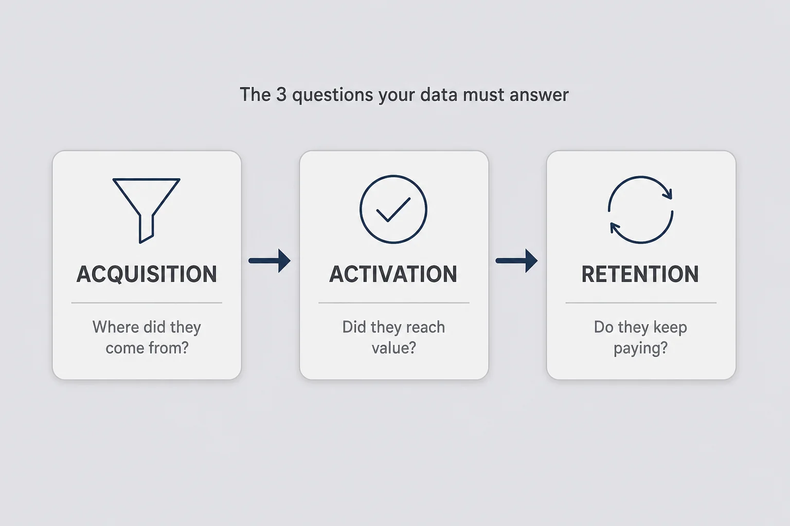
So the goal is not more data. It's less, chosen deliberately. A solo founder needs analytics that answer three questions and refuse to answer the rest:
- Where did people come from, and which sources actually convert?
- Do new users reach the point where the product is useful?
- Do they keep paying, and who's about to leave?
That's it. Acquisition, activation, retention. If a chart doesn't help you answer one of those, it's decoration, and decoration at 11 p.m. is how you convince yourself to build a feature nobody asked for. I have done exactly that. I once spent a weekend on a dashboard that broke down signups by hour of day, learned that people sign up on weekday mornings, and changed nothing about my business as a result. The database was fast. The business was not.
The reason to keep the set small is not laziness. It's that every metric you track is a metric you'll feel obligated to move, and you have maybe ten hours a week. Spend them on numbers that change decisions. When you're the only reader, the cost of a bad metric isn't a wasted meeting. It's a wasted week of your one life building the wrong thing.
Vanity metrics are a comfortable place to hide
There's a specific feeling I get when a product isn't working and I don't want to admit it. I open the traffic dashboard. Pageviews are up. I feel a little better. Nothing about the business has changed, but I've had my hit, and I can close the laptop telling myself we're growing.
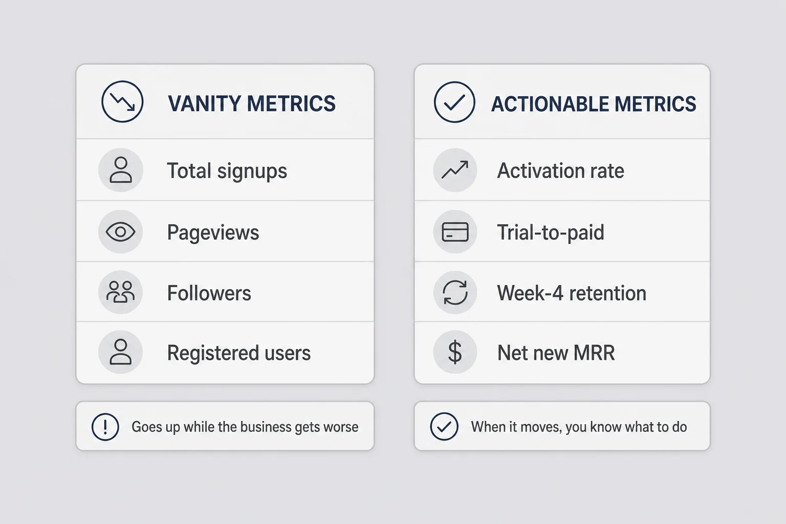
Pageviews, signups, followers, total registered users, email subscribers, GitHub stars. These are vanity metrics, and they're comfortable precisely because they mostly go up and rarely go down. Cumulative numbers only climb. A "total users" counter feels like progress even when every one of those users churned in week two. It's the analytics equivalent of a scale that only shows your highest weight ever.
The tell is simple. A vanity metric is one that can go up while your business gets worse. Total signups climbs while activation collapses. Traffic spikes from a link that sends people who bounce in four seconds. MRR looks flat and healthy while it's actually new revenue papering over the exact same amount of churn underneath, which means you're running to stay in place and calling it stability.
Actionable metrics have a different quality: when they move, you know what to do next. Activation rate drops, so you look at onboarding. Trial-to-paid conversion falls, so you look at what happens during the trial. Week-four retention slides, so you talk to the people who left. Each one points somewhere. It gives you a next action instead of a feeling.
I'm not saying traffic is worthless. If you're doing SEO for a micro-SaaS, traffic by source is a real input, because it tells you which content earns its keep. The problem is when traffic becomes the headline number, the thing you check first and celebrate loudest, while the numbers that predict revenue sit in a tab you never open. Rank your metrics by how close they sit to money, and put the honest, uncomfortable ones at the top where you have to see them. If the first thing you see when you open your analytics is a number that makes you feel good, you designed your dashboard to lie to you.
Pick the one number that says the business is alive
If I could keep only one metric, it would be some version of net new paying customers per month. Not signups. Not trials. People who gave you money this month minus people who stopped. For most bootstrapped products that single number, tracked over time, tells you more than any dashboard.
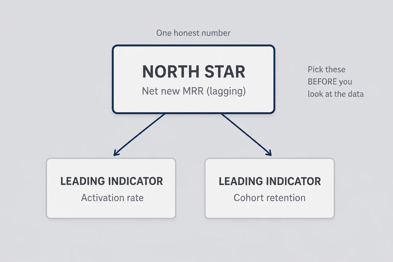
The idea people borrow from bigger companies is a "north star metric," the one number a whole team optimizes. At solo scale the concept still works, but the purpose is different. You don't need alignment across a team of forty. You need one number that's honest enough that you can't fool yourself, and central enough that moving it means the business is genuinely healthier. For a subscription product, monthly recurring revenue growth is usually the closest thing to truth, because it already nets out the churn that vanity metrics hide. If you want to sanity-check what a given customer count means in revenue, I built a rough MRR calculator for exactly that kind of back-of-envelope math. To see how much churn eats before new sales land, use the churn impact calculator.
But raw MRR can still mislead you at small numbers. If you have twelve customers, one annual plan landing in a given month makes the chart look like a hockey stick, and one enterprise-ish churn makes it look like collapse. So I pair the headline number with a leading indicator, something that moves earlier and predicts where MRR is going. Activation rate is my favorite, because it's the earliest signal that the product still works for new people. Retention by cohort is the second, because it tells you whether the value lasts.
Think of it as one lagging number and one leading number. MRR growth is lagging: it tells you what already happened. Activation is leading: it tells you what's about to happen a month from now. If activation is climbing, next quarter's MRR will probably be fine even if this month looks flat. If activation is quietly falling while MRR holds steady on old customers, you're looking at a cliff you can't see yet, and the dashboard that only shows revenue will look great right up until it doesn't.
Here's the discipline that's hard when nobody's watching: pick these before you look at the data, not after. It's dangerously easy to browse your analytics, find the chart that happens to be going up, and retroactively decide that's your north star this month. That's not measurement. That's motivated reasoning with a UI. Write down your one honest number and its leading indicator, put them at the top of whatever you check, and don't let a good-looking chart demote them.
What to instrument before you write any tracking code
The mistake I made for years was instrumenting pageviews first and events never. Pageviews are the default because they're free; you drop a snippet in and the numbers start flowing. But pageviews tell you where people went, not what they did, and for a product, what they did is the entire question. Knowing someone visited /dashboard tells you almost nothing. Knowing they created their first project tells you they might stick around.
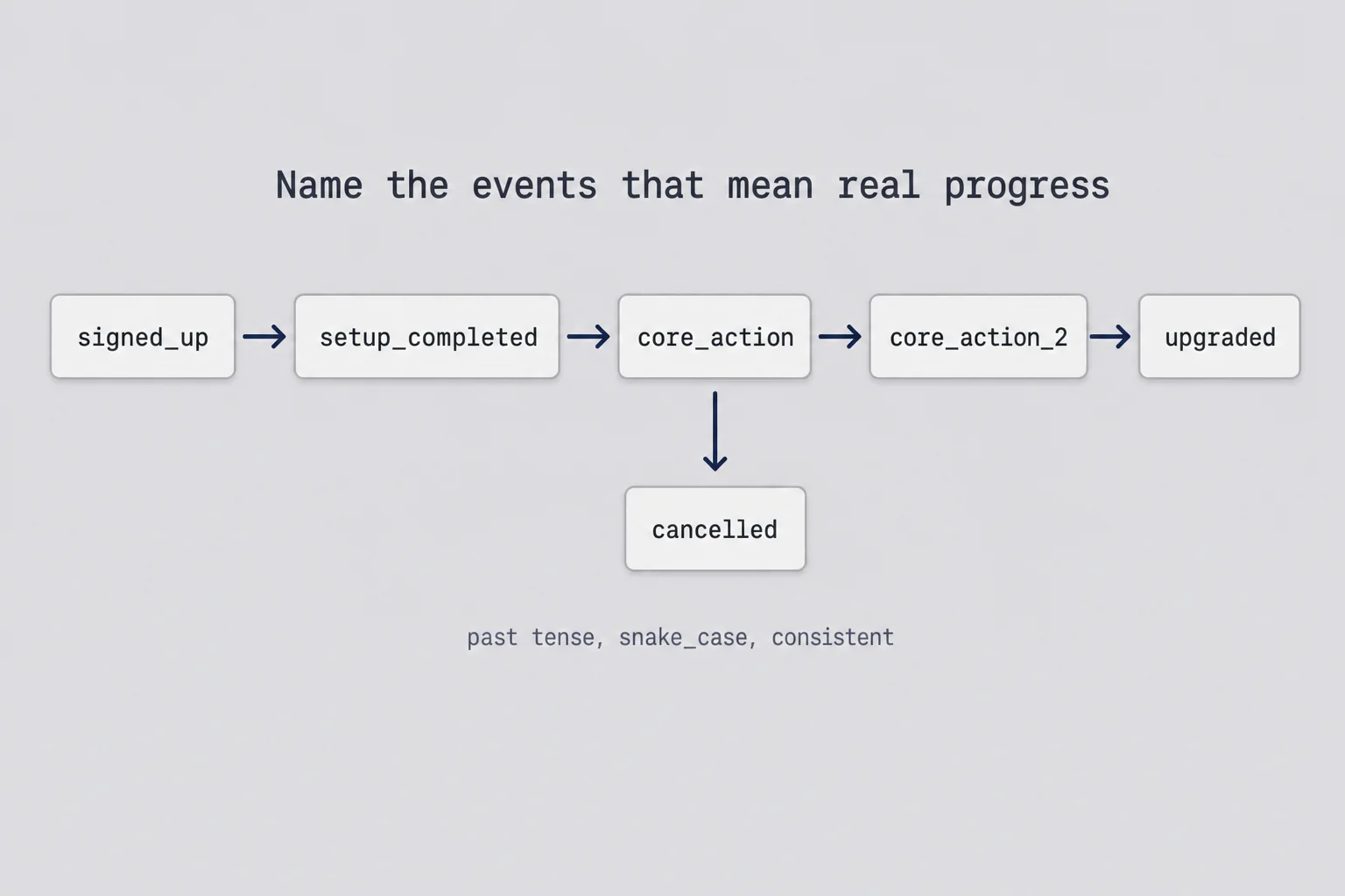
So before you touch any tool, spend twenty minutes writing down the handful of events that represent real progress through your product. Not every click. The moments that matter. For a typical micro-SaaS that list is short, maybe six to ten events, and it usually looks something like signed up, completed setup, performed the core action for the first time, performed it a second time, hit a limit, upgraded, cancelled. The core action is the one your product exists to do. If you built an invoicing tool, it's "sent an invoice," not "opened the invoices page."
Name them like a human would say them, in past tense, consistently. invoice_sent, project_created, report_exported. Pick a convention and never deviate, because six months from now you'll have Invoice Sent and sent_invoice and invoice-send in the same dashboard and no way to tell if they're the same thing. This sounds pedantic. It is pedantic. It's also the difference between analytics you trust and a pile of events you gave up on. Product analytics for a micro-SaaS lives or dies on whether your event names mean something a month later.
For each event, capture a little context: which user, when, and one or two properties that will let you slice later. On invoice_sent you might attach the plan the user is on and whether it was their first invoice. Resist the urge to attach forty properties. You will never use most of them, and every property is a small decision you're deferring to a future self who's just as busy as you are now.
Track the core action, not the tour
The single most useful event is the one that represents your product delivering its promise once. Everything else is context around it. If you only had time to instrument one event, instrument that.
One more thing to decide up front: what counts as identifying a user. You want product events tied to an account, so you can follow a real person from signup through activation to renewal or churn. That means calling your analytics tool's identify function when someone logs in, with a stable user id. Get this right on day one; retrofitting identity onto months of anonymous events is miserable, and I've done it, and I don't recommend it.
The analytics stack I actually run as a solo founder
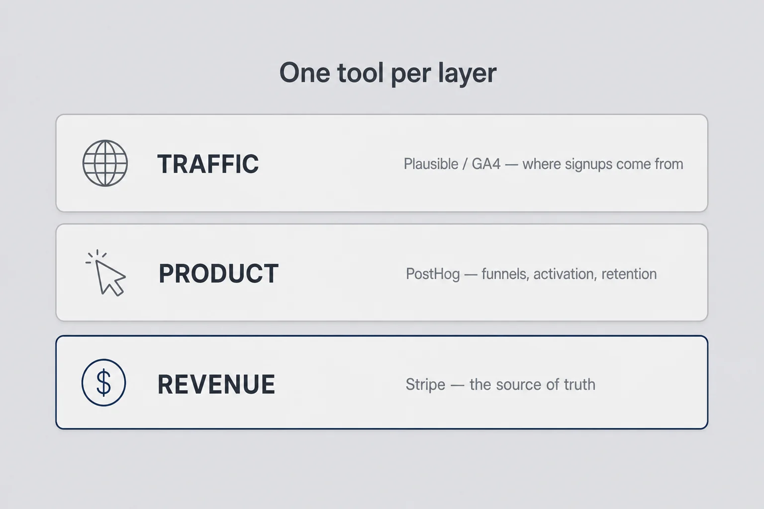
I'll tell you what I actually use, with the caveat that stacks are personal and the tool matters far less than the discipline. The pattern I keep coming back to is three layers: one tool for traffic, one for product behavior, and Stripe as the source of truth for money. Product analytics for a micro-SaaS gets confusing when you try to make one tool do all three, so I stopped trying.
Traffic: Plausible or GA4
For traffic I lean toward Plausible style lightweight analytics: privacy-friendly, no cookie banner, a single clean number for visitors and sources. GA4 is free and more powerful, but it's also heavier than most solo founders need and the interface actively fights you. If you already know GA4, keep it. If you're choosing today and you mostly want to know which content and channels send signups, a lightweight tool will save you hours of confusion. This layer answers one question: where do people come from before they sign up.
The one thing worth setting up carefully here is UTM tagging on any link you control, so a signup from a newsletter looks different from a signup off a search result or a Reddit comment. Without it, half your traffic shows up as "direct" and you're guessing which of your efforts actually worked. With it, you can finally answer whether the two hours you spent writing a comment somewhere turned into anything. That's the only traffic question that changes what you do next: keep doing the thing that converts, stop doing the thing that just makes the pageview line go up.
Product: PostHog
PostHog is where I spend most of my analytics time, and if you set up only one tool, make it this one. It's built for exactly the questions a product founder asks: funnels, retention curves, and "what did this specific user do before they cancelled." PostHog for solo founders is genuinely a good deal, the free tier is generous well past your first hundred users, and it's open source if you ever want to self-host. You send it the events you named earlier, identify users when they log in, and it turns that into funnels and retention charts without you building anything. This is the layer that answers whether the product works.
Revenue: Stripe is the truth
Money lives in Stripe, and Stripe is the only number I trust without cross-checking. Your analytics tools estimate; Stripe knows. It has a built-in dashboard with MRR, churn, and active subscriptions that's good enough that I rarely build anything on top of it early on. When you do outgrow it, the Stripe billing setup you already have gives you clean webhook data to pipe into a spreadsheet or PostHog. The rule I hold to: if a revenue number in any other tool disagrees with Stripe, Stripe wins and the other tool is wrong.
The whole thing costs close to nothing until you have real revenue, which is the point. I've watched founders sign up for a $200-a-month analytics platform before they had a single paying customer, then feel obligated to use it to justify the spend. Buy reporting after you have something worth reporting on. Until then, free tiers cover you completely, and the constraint is healthy: it keeps you from drowning in tools you don't need. You can always add complexity. You can rarely remove it once it's load-bearing.
Track activation, not signups
If you take one habit from this post, make it this: track activation rate, not signups. Signups measure your marketing. Activation measures your product. Confusing the two is how founders pour money into ads while the actual leak is in the first ten minutes after someone arrives.
Activation is the percentage of new users who reach the first moment of real value, whatever that means for your product. The hard part is defining that moment in one sentence, honestly. It's not signing up. It's not filling out a profile. It's the thing that makes a busy stranger think "oh, this is useful." For a reporting tool it might be seeing their first correct chart with their own data. For an invoicing tool it might be sending a real invoice to a real client. Write it as one event, then measure how many signups do it within a defined window, say seven days.
I go deep on the moment itself in the customer onboarding post, because defining the magic moment is really an onboarding decision. But the measurement side belongs here. Once you've named the activation event, PostHog gives you the number almost for free: a funnel from signed_up to your activation event, and the conversion rate between them is your activation rate. Track that rate over time and you have the single best leading indicator of whether the business is getting healthier.
What's a good rate? There's no universal answer, and anyone who gives you a confident benchmark is guessing about your specific product. What matters more is the trend and the honesty of the definition. If you set the bar at "logged in twice," you'll get a beautiful activation rate and learn nothing. If you set it at the real value moment, the number might be uncomfortably low, and that discomfort is the point. A low activation rate is not bad news. It's a map. It tells you the leak is before value, not after, which means you fix onboarding before you spend another dollar on traffic.
The reason this matters more than almost anything else: fixing activation improves every downstream number at once. Better activation means better trial-to-paid conversion, which means better retention, which means higher MRR from the same amount of traffic. It's the single highest-impact number a solo founder can move, and most founders never define it because signups feel like enough. Signups are people raising their hand. Activation is people actually getting what you promised. Only one of those pays rent.
Build one funnel you'll actually look at
A funnel is just a sequence of steps with a drop-off between each. Visitor to signup to activation to paid. The value isn't the chart; it's that it shows you exactly where people fall out, so you know which single step to fix next instead of guessing.
The trap is building ten funnels. I've done it. You end up with a beautiful analytics project and no decisions, because ten funnels is ten things to feel bad about and no clear priority. Build one. The core funnel from stranger to paying customer, four or five steps, no more. Every step should be an event you already named. If you can't build the funnel from existing events, that tells you your event tracking has a gap, which is useful information on its own.
Once it's built, you read it the same way every week: find the biggest drop-off, and that's your job this week. Not the second biggest, not a small optimization on a step that's already converting at eighty percent. The biggest leak. If ninety percent of signups never activate, there is no point touching your pricing page or your ad copy. The building is on fire at one specific spot, and the funnel is pointing right at it.
There's a subtlety at small volume that trips people up. When you have thirty signups a month, a funnel step going from sixty percent to forty percent might be three people and pure noise. Don't overreact to week-to-week swings at low numbers; you'll chase ghosts and rewrite onboarding based on one confused user. Look at the funnel over a longer window, a month or a quarter, and treat any single week as a hint, not a verdict. The math that makes a funnel trustworthy needs volume you probably don't have yet. Until you do, use it to find the obvious, large, persistent leak, and ignore the wiggles. The obvious leak is usually obvious. If half your signups vanish before doing anything, you don't need statistical significance to know that's the problem.
Reading churn and retention without a data team
Churn is where analytics stops being flattering and starts being useful. It's also where solo founders look away, because a cancellation feels personal in a way a low pageview count never does. But retention is the number that decides whether you have a business or a leaky bucket you keep pouring traffic into.
The single most useful view here is cohort retention. Group users by the month they signed up, then watch what fraction are still active, or still paying, one month later, two months later, three. PostHog builds this for you from the events you're already sending. What you're looking for is the shape of the curve. Does it drop hard in month one and then flatten, or does it keep sliding forever? A curve that flattens means you've found a group of people the product genuinely serves; they stick. A curve that never flattens means people try it, get some value, and drift away, and no amount of new signups will save you because the bucket has no bottom.
A concrete version helps. Say the June cohort starts at 20 paying customers. A month later 14 are still paying, then 13, then 13 again. That's a curve that dropped and flattened around 65 percent, and the flat part is the signal: you have a core of people the product keeps serving. Now compare a July cohort that goes 20, then 15, then 11, then 8, still sliding at month three with no floor in sight. Same starting number, completely different business. The first cohort is worth pouring traffic into. The second one means every dollar you spend on acquisition is renting customers, not buying them, and you should fix the product before you touch the ad budget. You cannot see either of these shapes from an MRR number alone, which is exactly why the headline metric needs the cohort view sitting next to it.
Early churn and late churn are different problems with different fixes, and lumping them together hides both. Someone who cancels in week one almost never reached value; that's an activation and onboarding problem, and the fix is upstream. Someone who cancels in month six got value for a while and then stopped needing it, or found something better, or their situation changed; that's a product depth or pricing problem. I dug into the retain side of this in how to reduce churn in a micro-SaaS, and the short version is that most early cancellations are people who never really started. Analytics tells you which kind of churn you have. Your response depends entirely on the answer. When you know the rate, the churn impact calculator turns it into dollars and the new-customer count you need just to stay flat.
At solo scale you have a superpower a big company doesn't: you can read every single cancellation. Ten churns a month is not a cohort chart to a big company, but to you it's ten emails you can actually send. Set up an event or a Stripe webhook that pings you when someone cancels, and where it's appropriate, send a short honest note asking what didn't work. Half won't reply. The ones who do will tell you more than any dashboard. I've had a single cancellation email reveal a bug that was quietly killing my activation rate for months, something no chart flagged because the users were technically "active" right up until they gave up. Numbers tell you what's happening. People tell you why. You need both, and you're one of the few founders small enough to get the why cheaply.
Wire up analytics in an afternoon
Enough theory. Here's how I'd instrument a micro-SaaS from scratch in an afternoon, concretely. The goal isn't perfect coverage. It's the three or four numbers that matter, live and trustworthy, by dinner.
Start with the traffic layer, because it's the fastest. Add your lightweight analytics script to the site, confirm it registers a visit, and check that referrer data shows up. Fifteen minutes. Don't customize anything yet.
Then the product layer, which is where the real work is. Install the PostHog SDK, and do two things well: identify users on login, and send your named events. In practice that's a thin wrapper so you're not scattering analytics calls all over your codebase.
import posthog from "posthog-js";

export function identifyUser(userId: string, plan: string) {
  posthog.identify(userId, { plan });
}

export function track(event: string, props?: Record<string, unknown>) {
  posthog.capture(event, props);
}
Then call track at the handful of real moments you defined earlier, using the exact event names from your list:
import { track } from "@/lib/analytics";

export async function sendInvoice(invoice: Invoice, isFirst: boolean) {
  await deliverInvoice(invoice);
  track("invoice_sent", { plan: invoice.userPlan, first_invoice: isFirst });
}
That's the core action instrumented with enough context to build a funnel and slice by plan. Do the same for signup, setup completion, and hitting a limit. Resist adding more. You can always add events later when a real question comes up; you cannot easily clean up a hundred half-baked events you added "just in case."
Revenue is already handled, because Stripe tracks it whether you do anything or not. If you've got the billing wired up, open the Stripe dashboard, find MRR and churn, and bookmark it. That's your revenue layer, done, for free.
Verify events before you trust them
Before you build a single funnel, trigger each event yourself and confirm it lands in PostHog with the right name and properties. Nothing wastes more time than debugging a funnel that was broken at the tracking layer the whole time. An event that doesn't fire is worse than no event, because you'll trust a chart built on nothing.
By the end of the afternoon you have traffic sources, a product funnel from signup to activation, cohort retention, and revenue from Stripe. Four numbers that actually predict the health of the business, and not one dashboard you built to make yourself feel good. That's a complete solo founder analytics setup, and you'll notice it took an afternoon, not a stack migration. The rest is discipline, which is the hard part and costs nothing.
The weekly ritual that keeps the numbers honest
Instrumentation is the easy 20 percent. The habit is the other 80, and it's where almost everyone fails, because nobody's holding you accountable to look at the right things on the right cadence. So build the cadence into a ritual, once a week, same slot, and make it boring on purpose.
Mine takes fifteen minutes on Monday morning. I open exactly three things in order: Stripe for net revenue movement, the PostHog funnel for activation, and the retention curve. Signups I glance at last, precisely because they're the most tempting and the least important. Then I write one sentence in a running note: what changed and what I think it means. "Activation down to 34% from 41%, probably the new required field in setup." That sentence is the whole point. It forces interpretation instead of staring, and next week I can see whether my guess was right.
The order matters more than it sounds. If the first thing you see is signups or traffic, you get your dopamine hit and read the rest with a warm glow that hides bad news. Lead with revenue and activation, the numbers most likely to be uncomfortable, and read the flattering ones last when they can't color your judgment. Design the ritual so the honest numbers hit you before the comforting ones do.
And then close the laptop. This is the part I'm still bad at. The temptation is to check daily, or hourly on a launch day, refreshing like it's a stock ticker. At solo-founder volume, daily numbers are almost pure noise; three signups instead of one is not a trend, it's a Tuesday. Checking constantly doesn't give you information. It gives you anxiety dressed up as diligence, and it steals the hours you should spend building or talking to users. One honest look a week beats seven anxious ones. The dashboard will still be there Monday, and it'll have enough signal by then to actually mean something.
When to close the dashboard and trust your gut
There's a failure mode on the other side of all this, and I'd be lying if I pretended analytics is always the answer. Sometimes the right move is to close the dashboard entirely and go do the unmeasurable work.
When you have ten customers, you don't have data. You have anecdotes, and that's fine, because at ten customers anecdotes are richer than any chart. A funnel built on thirty signups is mostly noise, and treating it as truth will send you chasing statistical ghosts. Early on, ten real conversations will teach you more than any dashboard, and the founders who insist on "being data-driven" at twenty users are usually hiding from the scarier work of talking to people. Data-driven at that scale is a costume. The data isn't there yet.
Analytics tells you what and where. It almost never tells you why, and it never tells you what to build next. No chart will invent a feature or reveal an unmet need; that comes from conversations, support tickets, the free trial user who emails you confused, the thing you notice while watching someone use the product over their shoulder. Use analytics to find the leak. Use your judgment and your users to decide what to do about it. The dashboard is a smoke detector, not an architect.
There's a specific version of this I see with pricing. Founders stare at conversion charts trying to divine the perfect price, when the honest move at twenty customers is to email a few of them and ask what they'd pay, or just raise the price and watch what happens. I wrote about that instinct in micro-SaaS pricing for solo founders: early on, a willingness-to-pay conversation beats a funnel every time, because the funnel can only measure the price you already picked. Analytics is good at telling you a number is falling. It's useless at telling you what number to try instead.
So here's the balance I try to hold. Instrument early so you have history when you finally need it, because you can't retroactively track what you didn't capture. But don't let the numbers run the company before there are enough of them to mean anything. Small data plus real conversations beats big dashboards plus silence, every single time, and it's not close.
A few honest answers to questions I get
What analytics does a solo founder actually need?
Three things: where signups come from, whether new users reach value, and whether they keep paying. That maps to a traffic tool, a product analytics tool, and your Stripe data. Everything past that is optional until you have real volume. Most founders track ten dashboards and act on none of them.
Should I use PostHog or Google Analytics for a micro-SaaS?
They answer different questions. Google Analytics or Plausible tells you about traffic and marketing before signup. PostHog tells you what people do inside the product after signup, which is where activation and retention live. For a micro-SaaS the product analytics matter more, so if you only set up one tool, make it PostHog and read revenue from Stripe.
What is a good activation rate for a micro-SaaS?
There is no universal number, but if fewer than thirty percent of new signups reach your first value moment within a week, onboarding is usually the problem, not marketing. Define activation as one concrete in-product action, then measure the percentage of signups who do it. Watch the trend more than the absolute figure.
How much should I spend on analytics tools as a solo founder?
Close to zero at the start. PostHog, Plausible, and your Stripe dashboard all have free or cheap tiers that cover you well past your first hundred customers. If a tool costs more than a few dollars per month before you have revenue, you are buying reporting you are not ready to use.
How often should I check my SaaS analytics?
Once a week for a real review, and otherwise almost never. Checking a live dashboard every hour tells you nothing except your own anxiety, because daily numbers at small scale are mostly noise. Pick one weekly slot, look at signups, activation, and churn, write one sentence about what changed, and close it.
The dashboard doesn't run the business
The healthiest thing I ever did for one of my products was delete eight of those eleven analytics tabs. Not because the data was wrong, but because most of it was answering questions I wasn't asking and hiding the two or three that mattered. What was left fit on one screen: revenue, activation, retention. Numbers I'd act on, not numbers I'd admire.
Analytics for a solo founder isn't about seeing everything. You can't act on everything, and trying to just spreads your attention thin across charts that don't change decisions. It's about choosing the few numbers honest enough that you can't fool yourself, checking them on a schedule instead of a whim, and then spending the hours you saved on the work that actually moves them. The building. The talking to users. The unglamorous fixes that a chart pointed at but couldn't perform.
If you're setting this up for the first time, start smaller than feels responsible. One north-star number, one leading indicator, a funnel, a retention curve. Read them once a week, write one sentence, and get back to work. The dashboard is there to keep you honest, not to keep you busy. The moment it starts eating the time you'd spend making the numbers better, close it.




Comments