They Swiped Through Three Slides and Left
First-session iOS onboarding for consumer apps: skip the carousel, earn permissions, and get strangers to one honest win before you ask for anything.
 By Iryna25 min read
Listen to this article
21:02AI-generated podcast-style overview of this article (not a word-for-word narration).
The third slide said "Track your progress effortlessly." She swiped. The fourth said "Join thousands of happy users." She swiped again. The fifth asked for her email before she had done the one thing the App Store screenshots promised. She closed the app. I know because I was on a FaceTime with a friend testing my build, and I watched her thumb move like she was dismissing a telemarketer.
That was the week I learned ios app onboarding solo founder work is not a design polish pass you schedule after "real features." It is the product. For consumer iOS apps — especially personal ones — the first session decides whether anyone ever sees your paywall, your push notifications, or your carefully worded App Store listing. You can ship through App Review, celebrate Ready for Sale, and still lose strangers in the time it takes them to decide whether you feel trustworthy on a cold phone.
I am Iryna. I shipped Finish Him Replies, a screenshot-to-reply helper for awkward texting moments. I have redesigned onboarding flows for other people's apps and still embarrassed myself with carousel slides nobody read. This article is for solo founders building consumer iOS apps who do not have a growth team, a UX researcher, or patience for B2B SaaS playbooks that assume a landing page and a demo call. If you have not wired the core loop yet, start with how to build your first consumer iOS app. If you are already fighting one-and-done installs, pair this with consumer app retention — onboarding is the opening scene of that story, not a separate genre.
One honest framing before tactics: onboarding is subtraction. Your instinct as a builder is to add explanation because you know how clever the backend is. Your user's instinct on first open is to decide whether you are safe, fast, and relevant. Those instincts collide on screen one. The solo-founder win is not a prettier tutorial. It is fewer gates between install and relief.
I learned this the expensive way with carousel slides that repeated my App Store screenshots in slightly worse typography. Each slide felt responsible — "we should explain the AI," "we should mention privacy," "we should show social proof." Stacked together they felt like a pitch deck for investors, not a handshake for a stranger holding their phone one-handed in a parking lot. The fix was not better illustration. It was deleting until the screenshot button was the hero.
If you take nothing else from this piece: measure your onboarding by time-to-first-win, not by slide count. Everything below is detail on how to shrink that time without feeling shady.
iOS app onboarding solo founder: what the first session actually decides
Onboarding is the contract you sign with a stranger in the first minute. Not the terms-of-service PDF — the emotional contract. Can I trust you with something personal? Will you waste my time? Do you understand the moment I am in, or are you showing me a feature map?
For ios app onboarding solo founder work, I mean everything from the launch splash through the first time the user completes the core action — before paywall, before account creation if you can avoid it, before you ask for notification access. That window is brutally short on mobile. People install on impulse from a screenshot or a friend's mention. They are standing in line, half-watching a show, or avoiding eye contact in an elevator. Your onboarding is not a keynote. It is a handshake in bad lighting.
The first session decides three things that downstream metrics will only reflect, never fix. Trust: did anything feel creepy, extractive, or confusing before value appeared. Clarity: did they understand what to do next without reading a manual. Proof: did the app deliver one honest win that matches the App Store promise.
Miss any of those and you do not have an onboarding optimization problem. You have a product rejection that happens silently. Nobody emails you a thoughtful churn survey. They just stop opening. That is why I treat onboarding as retention infrastructure, not a marketing skin you paint on at the end. Reese's B2B onboarding emails matter for web SaaS. Your consumer app's first session happens on a phone, alone, often about something embarrassing. Different room. Different rules.
Caveat worth saying out loud: some apps need setup — health data, bank linking, Bluetooth pairing. I am not telling you to skip necessary steps. I am telling you to earn each step with copy that names the user's moment, not your architecture. Necessary friction with context beats slick friction with buzzwords.
Think about the last app you deleted after one open. You probably did not write a review. You might not even remember the name. You remember the feeling — too many questions, too much hype, too little proof. That feeling is onboarding failure wearing a retention costume. Your job as a solo founder is to design for the person who has seventeen apps in a folder they never open and zero patience for your roadmap.
I also want to separate onboarding from "first-run education." Education implies lecture. Onboarding, done right, implies guided practice. The user does something small that mirrors the habit you want. You remove obstacles until that action is obvious. Anything that does not help the first action is decoration. Decoration is expensive when you maintain it alone.
Why most onboarding advice was written for a team you do not have
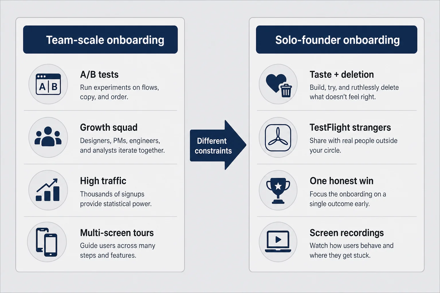
Search "mobile onboarding best practices" and you will find beautiful case studies from companies with dedicated growth squads, experiment platforms, and enough traffic to A/B test button colors for a month. That is not insulting those teams. It is acknowledging you are not them. A solo founder with two hundred TestFlight installs does not have the same toolkit as a consumer app with two million weekly actives. Copying their carousel length because a blog said "five slides converts" is how you ship a tutorial nobody reads.
Team-scale onboarding assumes you can instrument everything, run parallel cohorts, and have a designer iterate screens weekly. Solo-founder onboarding assumes you get one shot to not feel scammy before a stranger deletes you. Your competitive advantage is not velocity of experiments. It is taste and proximity to the user problem. You built the app because something annoyed you personally. That instinct matters more than a generic template — if you listen to it instead of padding slides.
B2B SaaS onboarding articles also leak into iOS advice in unhelpful ways. Signup walls make more sense when the product is a team workspace and IT might provision seats. Consumer apps about dating anxiety, photo editing, habit tracking, or reply drafting die behind email gates. The user is not buying software for their company. They are trying to feel less stupid in the next ten minutes. Web playbooks that prioritize "capture the lead" before "deliver value" poison mobile first sessions.
What you actually have as a solo founder: your own embarrassment as a compass, five to ten honest testers who do not already love you, screen recordings, and the ability to delete screens without a committee meeting. That is enough if you use it ruthlessly. You do not need a research lab. You need strangers who will tell you where they got confused while you resist the urge to explain aloud what the button "obviously" does.
I still fall for template envy. I see a slick onboarding in a category leader and think I should match the polish. Then I remember they have a hundred people and I have Tuesday night. My job is not to clone their slide count. My job is to shrink time-to-first-win until a cold user nods instead of squints.
Another trap: importing web onboarding patterns wholesale. Progress bars across five screens feel logical on desktop SaaS. On iPhone they feel like homework. Modal sheets stacked on modal sheets train users to hunt for the close button. Native iOS patterns — clear navigation bars, one primary action per screen, SF Symbols used sparingly — signal that your app belongs on the platform. Strangers forgive ugly. They do not forgive alien.
If you are a designer-founder, your Figma file is not the user's reality. Prototype on device early. Thumb reach matters. Bright sunlight matters. The difference between a button that looks centered in Figma and a button your thumb can hit while walking is onboarding. Test on the smallest phone you support, not just the Pro Max on your desk.
The sixty-second rule: value before anything else
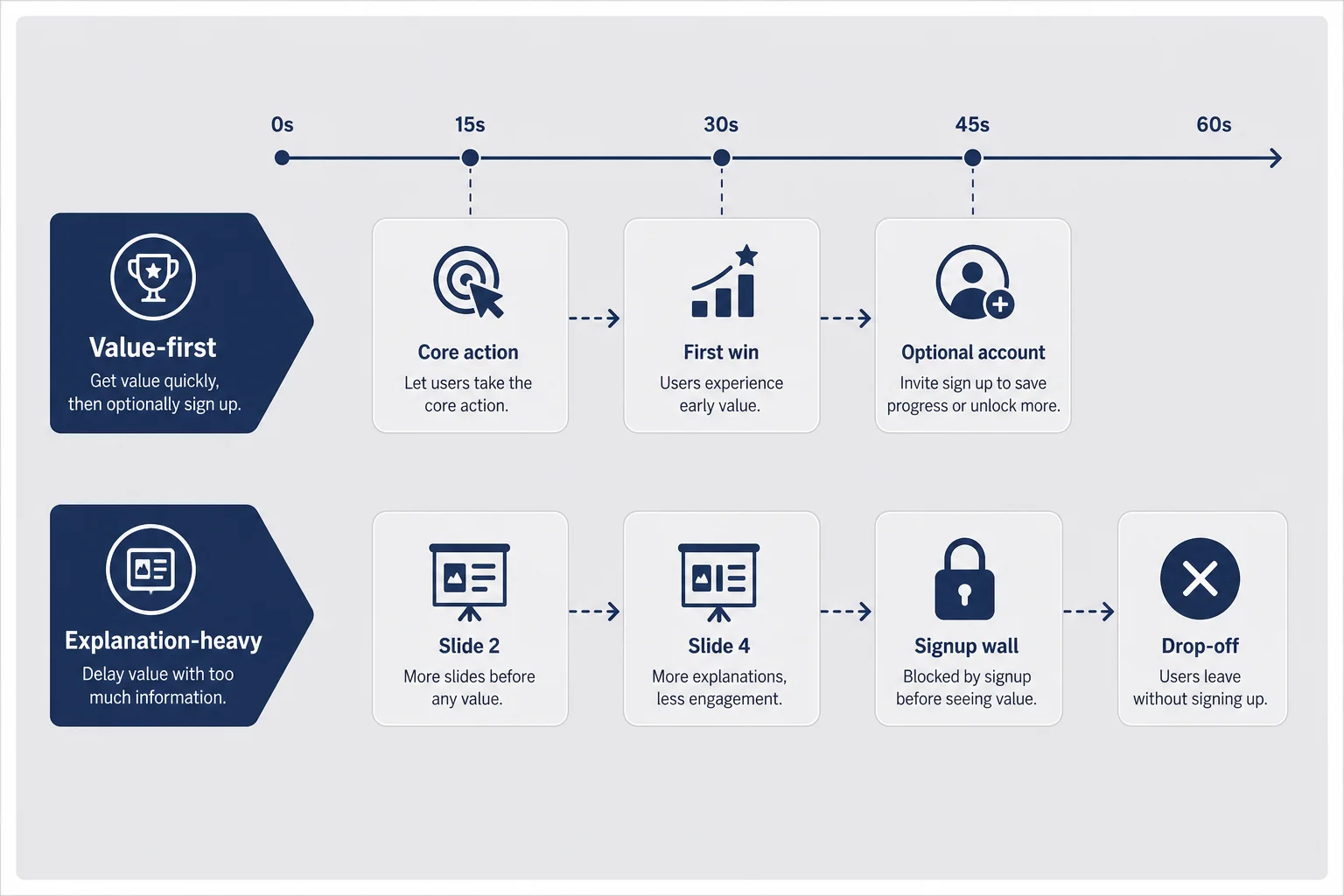
Here is the rule I come back to when I want to add "just one more" explanatory screen: if a stranger cannot taste the core value within about sixty seconds of first open, you are teaching instead of helping. Teaching is fine for complex professional tools used at a desk. It is deadly for consumer apps opened in stolen moments.
Sixty seconds is not a scientific constant. It is a discipline. Count it on a stopwatch during your next TestFlight session. Launch cold. No narrator. Where are you at fifteen seconds? Thirty? If you are still swiping carousel marketing copy, you are burning the only attention budget you will get for free.
Value-first onboarding means the user performs the main action — or a honest slice of it — before you ask for account, payment, or broad permissions. For Finish Him Replies, that meant screenshot in, three replies out, copy one. No account. No tutorial on "how AI works." For a habit tracker, it might mean log one entry with a default category. For a photo app, apply one filter to a sample image before camera access. The specifics change. The order does not: prove the promise, then ask for commitment.
Explanation-heavy onboarding flips the order. Slides about mission. Slides about community. Slides about awards you do not have yet. Then a signup form. Then a paywall. Then the actual feature behind another tap. Each layer feels reasonable in a Figma flow. Stacked on a phone, it feels like a funnel built for your conversion spreadsheet, not for a human who wondered if your app could help with tonight's text.
When I catch myself writing onboarding copy, I ask: could this line appear on a billboard without the app and still make sense? If yes, it probably belongs in marketing, not in screen two. Onboarding copy should be instructional and moment-specific. "Paste a screenshot to get three reply options" beats "Revolutionize your communication journey."
Hard trade-off: some founders fear giving away too much free. Valid concern — but consumer apps rarely fail because the free slice was too generous. They fail because nobody reached the free slice. Pricing and paywall timing is its own article. Onboarding's job is to make the paywall legible later, not to block the proof now.
Concrete example without pretending these are my real metrics: say you ship a journaling app. Sixty-second value might be one prompt answered and one entry saved locally. Not ten prompts. Not a mood chart. One entry that feels like theirs. If you spend fifty-five seconds on font pickers and theme selection, you are onboarding for Pinterest, not for relief.
Speed also means reducing choices. Every fork on first open is a tiny tax. "Choose your goal" with six tiles sounds personalized. It often reads as "we are not sure who you are either." Default intelligently. Let power users customize later in settings where motivated people go. The first session is for skeptics, not enthusiasts.
Account walls and the signup trap
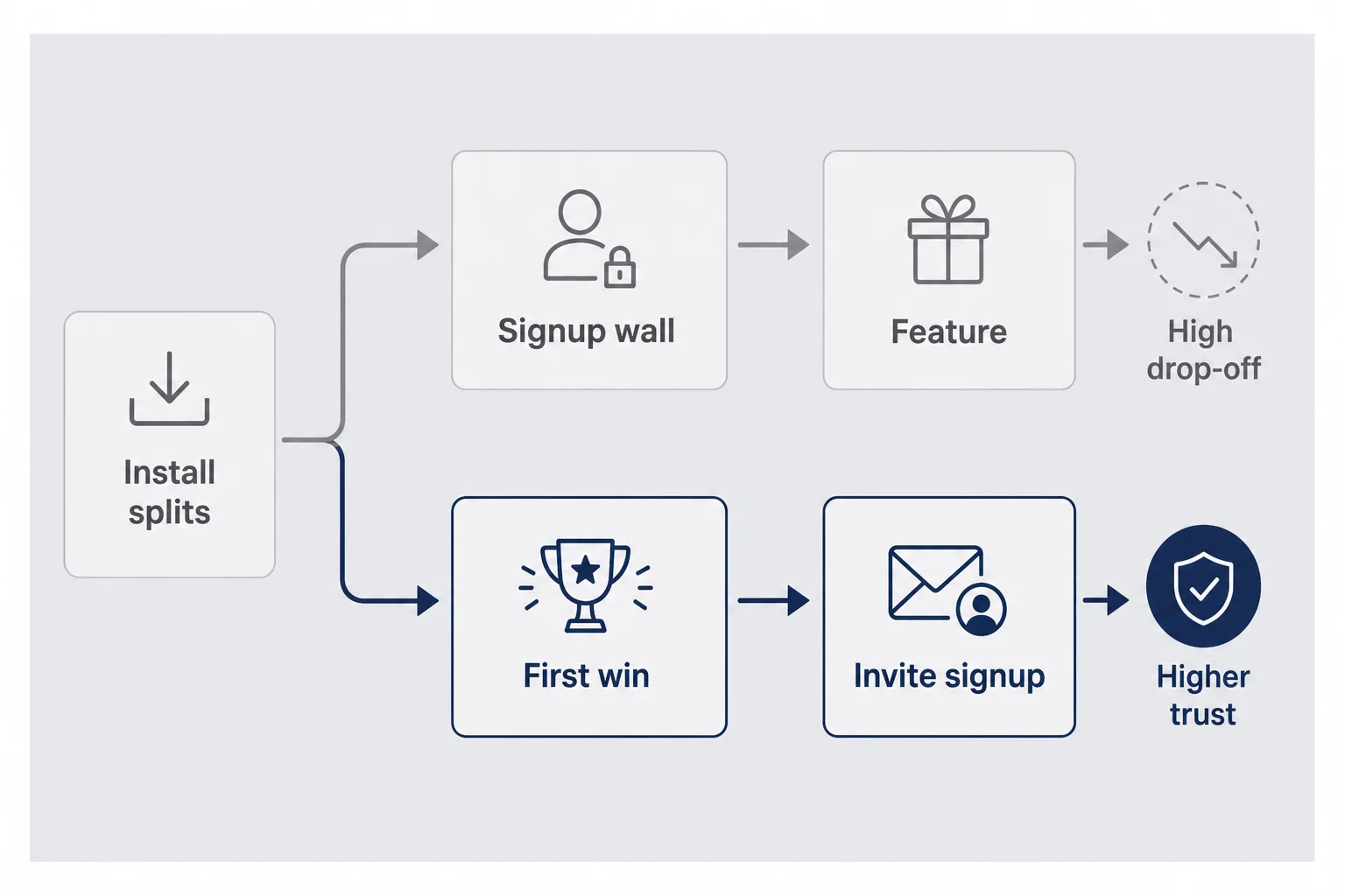
The signup trap looks responsible from the builder's side. You want emails for lifecycle campaigns. You want accounts for sync. You want to reduce anonymous abuse of an AI endpoint. All real pressures. On the user's side, the signup wall often reads as "prove you are serious before we prove we are useful." On a personal consumer app, that tone is backwards.
Default stance for solo founders in B2C: let the first win happen without an account. Invite signup after success with a single sentence of benefit — save your history, sync across devices, back up your streak. If the product cannot function without an account — rare for many consumer utilities — say why immediately and minimize fields. Email and password is already heavy. Asking for name, birthday, and marketing opt-in on screen one is a hobby project collecting contacts, not an app helping someone tonight.
Social sign-in with Apple is worth offering when you do need accounts. It is fast and familiar on iOS. Still do not lead with it before value unless authentication is the product. I have seen apps where Sign in with Apple is screen one and the actual feature is screen four. Apple did not intend that button to be a toll booth for curiosity.
Anonymous sessions are underrated for solo founders worried about API cost. You can rate-limit device identifiers, cap free generations, and still let someone feel the magic once. Abuse happens. So does silence from legitimate users who bounced at email. Measure which pain is actually killing you before you optimize for the scarier story.
When you must collect email early — say, a waitlist-era build — at least align copy with the moment. "Save these three replies to your inbox" is different from "Join our community of innovators." One names a user outcome. One names your ego. Guess which converts strangers who do not owe you loyalty yet.
Permission prompts that do not feel like a shakedown
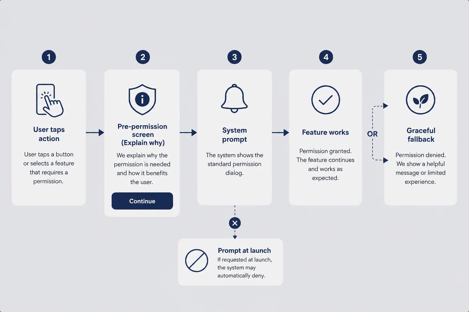
iOS permission dialogs are binary and brutal. The system sheet does not explain your nuance. It asks for photos, camera, notifications, tracking — with Apple's generic copy and your app's name attached. If the user taps Don't Allow on a cold open, you do not get a graceful second chance on the same screen. You get settings archaeology later. That means your onboarding must earn the tap before the system sheet appears.
The pattern that works: pre-permission context on your own screen, then the system prompt, only when the user has a reason to say yes. Not "We need photos access to improve your experience." That sentence has never convinced a human. Try "Pick a screenshot from your camera roll so we can draft replies" right before the photo picker flow. Try "Remind you when your trial ends in two days" before notifications — if that is actually what you send.
Order matters. Camera and photo library requests should arrive at the moment the user taps the action that needs them, not at launch. Notification permission on first open is one of the fastest ways to train deletes. Location permission for a feature used once a month should not greet people at the splash screen. Contextual asks feel like part of the job. Upfront asks feel like surveillance.
The App Tracking Transparency prompt is its own religion. If you do not need cross-app tracking for your solo business model, consider whether you are triggering it because a SDK defaulted to yes. Privacy labels and honest data use are part of onboarding trust too — especially for apps that touch screenshots, health, or messages. I wrote about terms and privacy copy from a consumer lens; the short version here is do not surprise people about what leaves the device.
When permission is denied, your onboarding should degrade gracefully. A photo app that becomes a blank wall after denial failed. An app that explains "You can still paste text manually" survived the no and might earn a settings visit later. Solo founders skip degraded paths because building them is annoying. Users experience them as respect or disrespect.
Microcopy on permission screens deserves the same care as marketing copy. "Enable notifications to stay in the loop" is vague guilt. "Get a reminder before your trial ends" is a bargain. "We will never sell your data" belongs in privacy policy, not as a substitute for explaining the ask. Users are not lawyers. They are tired humans guessing whether you will spam them.
Photos access for screenshot-based apps — my lane — is especially sensitive. You are asking for the camera roll that might contain private conversations, medical screenshots, banking alerts. Pre-permission copy should name the narrow use: "We only read the screenshot you select." If your architecture truly processes only the picked image, say that plainly. Trust is onboarding for personal apps.
Empty states, tutorials, and the first honest win
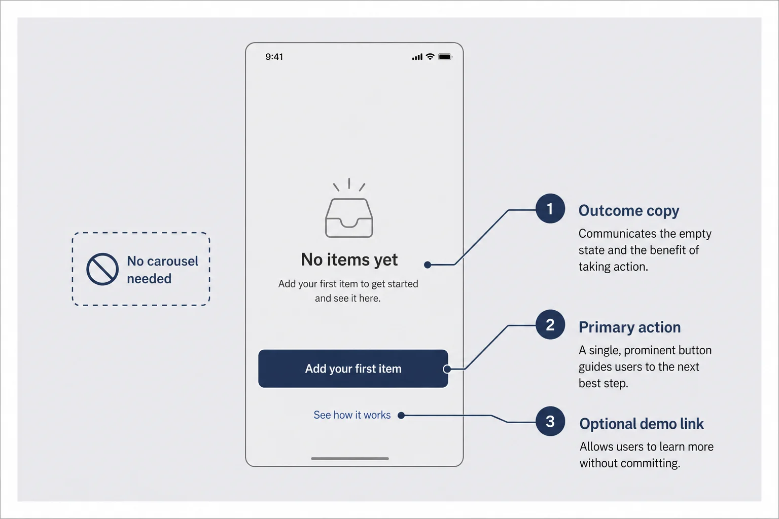
The empty state is onboarding for people who skip carousels — which is everyone you care about. A blank screen with a tiny plus icon is not minimalism. It is homework. The first screen after any optional welcome should answer: what do I do, what happens when I do it, and why is it safe.
Strong empty states have one obvious primary action, one line of outcome copy, and optionally a secondary path for skeptics — sample data, demo mode, import example. Weak empty states have illustrations of happy people and no verb. I have designed both. The verb wins.
Product tours and coach marks are seductive because they let you keep a cluttered interface and "teach" it. Tours also break on every UI tweak and annoy power users who reinstall. Default to fixing the screen before adding pulsing circles. If TestFlight strangers stall on the same button three times, rename the button or move it — do not add a tooltip that points at it like a museum exhibit.
The first honest win must match what your App Store screenshots promised. If screenshots show a polished result, the first session should produce something close to that result — not a settings maze. Screenshot mismatch is an onboarding failure that looks like a marketing failure in reviews. "Not as advertised" one-stars often mean your first sixty seconds lied gently.
For subscription apps, the win might be free-tier complete enough to feel real. Three useful replies, one exported edit, one tracked day. Not a crippled demo that teases. Tease culture trains skepticism. Generous first wins train word of mouth — and make the paywall conversation honest later.
Delete onboarding screens when you can merge their job into the empty state. The best onboarding I shipped recently was removing two slides and adding one sentence above the primary button. Time-to-win dropped. Support questions did not spike. That is the solo-founder dream: less UI, same clarity.
Demo modes get overlooked. If your app needs user content to shine — portfolios, workouts, budgets — ship credible sample data behind a "See an example" link. Not lorem ipsum. A believable fake month of entries beats an empty chart that screams "you do all the work first." Samples set taste expectations. They also shorten the path for reviewers and journalists who will not import their real life during a five-minute look.
Haptics and motion are onboarding too. A subtle success vibration when the first action completes rewards the nervous system. Overanimated confetti on screen two feels like a mobile game begging for retention. One calm confirmation is enough. You are building trust, not a slot machine.
Onboarding screens you can probably delete
Carousel slides that restate the App Store description are the first candidates for deletion. Apple already showed your screenshots. Repeating them inside the app insults the user's intelligence and burns seconds. Mission statements belong on your website. Inside the app, speak in imperatives and outcomes.
"Meet the team" slides for a solo founder app are awkward unless the team is literally you and the story builds trust for a sensitive use case — therapy-adjacent, finance, health. Even then, one line beats five portraits. Strangers do not bond with your headshot before they trust the utility.
Feature grids — icon, title, subtitle, repeated — are Product Marketing Mad Libs. If you need six icons to explain the app, the app might be unfocused. Consumer solo founders usually win with one sharp job. Onboarding should reflect that focus, not preview a roadmap fantasy.
Rating prompts during onboarding are a special crime. You have not delivered value. You are asking for public praise because some growth blog said early ratings help ASO. They do — when earned. Prompting before the first win earns one-stars from people who feel hustled.
Legal walls have a place, but minimize friction. Link terms in settings for low-risk apps. If you must show acceptance on first launch, keep it one screen with plain language summary, not a scroll of terror. Users associate dense legal onboarding with apps that already know they will disappoint.
Every screen you delete is a screen you do not maintain when you change the core flow next month. Maintenance matters when you are one person. Lean onboarding is not just UX. It is operational survival.
Interstitials that beg for App Store ratings, Twitter follows, or Discord joins during onboarding are side quests. If your core loop works, people will find your community. If it does not, joining your Discord just centralizes complaints. One social ask after a week of use beats three asks before value.
Localization note for solo founders going international: short English onboarding is easier to translate than clever idioms on five slides. If you plan to localize, write plain sentences now. Future you translating through AI will thank present you for avoiding puns on screen three.
Where the paywall belongs (without re-litigating pricing)
Paywalls are not onboarding, but they show up during onboarding often enough to cause damage. Screen-two paywalls were trendy because they maximize "seen paywall" metrics. They also maximize bounce before value for apps that need trust first. I am not arguing against subscriptions — Finish Him is subscription-backed. I am arguing against asking for money before the user knows what premium feels like.
Soft sequencing that works for many consumer apps: first win free, then explain what repeats, then show price when they try the repeating action or hit a generous limit. Hard paywall before any output can work for niche pro tools with sophisticated buyers. It rarely works for emotional B2C apps where the user is deciding if you are creepy.
If you show a paywall during onboarding, the copy must reference something they already experienced — "Unlock unlimited replies like the three you just copied" — not generic premium tiers floating in space. Subscription pricing strategy covers numbers and Apple tax. Onboarding only needs to make the upgrade legible.
Trial toggles and annual highlights belong on the paywall screen, not spread across three onboarding slides before the user has context. Confusion between onboarding and monetization is how apps end up with seven screens before utility. Users do not separate your funnel stages. They feel one continuous ask.
When in doubt, delay the paywall one session. Let day-one be about proof. Let day-two be about habit and upgrade. You will learn more from return behavior than from forced monetization on a cold install.
What to measure when you are the whole analytics team
You do not need a data warehouse to know onboarding is broken. You need four events and the honesty to watch them. First open. Activation — define this as the core action completed once. Second open within forty-eight hours among activated users. Paywall view among activated users if you monetize in-app.
If you cannot name the activation event in one sentence, fix that before you add charts. "User is active" is not an event. "Screenshot analyzed and reply copied" is. "First habit logged" is. Vague activation definitions make onboarding look fine while strangers leave confused.
Funnel visualization can be a napkin. One hundred installs, forty reach activation, twelve return next day — that is a story. Twenty reach activation — your onboarding or core loop is broken before marketing spends a dollar. Tools like Plausible, TelemetryDeck, or even careful logging to a simple backend work at solo scale. App Store Connect retention charts help but blur why. Pair store-level retention with your named activation event.
Drop-off per screen matters if you still have a multi-step onboarding. Log screen views sparingly — privacy labels should reflect what you collect. If only ten percent reach screen four of five, screens one through three are not "educating." They are leaking. Delete or merge.
Session recordings from TestFlight volunteers beat aggregate numbers for qualitative ah-ha moments. Watching someone hesitate on your permission copy once will teach you more than a week of guessing. Delete recordings after review if your privacy story promises that. Trust compounds.
Do not optimize onboarding for signups if retention is the bottleneck. A fat email list of people who never activated is a newsletter, not an app business. Sequence matters: activation first, return second, monetization third. Skipping steps because a metric is easier to move creates local maxima that hurt later.
Watch for false positives from your own reinstalls. You know where the buttons are. You skip the onboarding because muscle memory. Reset onboarding state in debug builds. Walk through as if you are new every release candidate. I keep a checklist note on my phone: cold install, deny photos once, allow photos once, deny notifications, complete core action. Boring repetition catches regressions.
Compare platforms only when useful. If you ship iOS first, do not assume Android web articles about back-button behavior apply. iOS users expect certain gestures and sheet patterns. Onboarding that fights platform conventions feels scammy even when your intentions are fine.
TestFlight strangers beat your mom's feedback
Your mom will use the app because she loves you. She will also say "this is amazing" when the primary button is invisible. Friends who know your vision fill in gaps strangers cannot see. TestFlight beta is onboarding QA if you recruit honestly.
Recruit people who match the awkward use case without owing you kindness. Dating app helpers need single friends willing to admit they stress over replies. Finance apps need people who actually worry about spending — not your roommate who never checks bank balances. Five painful sessions beat fifty polite ones.
Ask for screen recording on first open. Tell them to think aloud. Do not explain during the recording — bite your tongue when they miss the obvious button. Obvious to you is the disease. Their miss is the data.
Give a scenario, not a feature tour. "You got a text you do not know how to answer. Try this app cold." Scenario-based tests surface onboarding gaps feature lists hide. You learn where copy fails emotionally, not just where taps fail technically.
Iterate in small builds. Changing one permission sequence per TestFlight build teaches causality. Changing everything at once teaches confusion. Solo founders have the advantage of shipping a build after dinner. Use that speed for onboarding fixes before App Store scale multiplies embarrassment.
When strangers succeed without you talking, you are closer to launch. When they fail silently, fix onboarding before you buy ads. Distribution amplifies first-session truth. It does not rewrite it.
Offer a small incentive if you must — coffee gift card, free month — but do not recruit only hustlers hunting beta perks. You want honest confusion, not professional feedback performers who say "great UX" because they want access. Mixed groups beat homogeneous friend circles.
After tests, fix the top one or two blockers, not every nit. Onboarding iteration is a funnel too. If everyone dies at permission, ignore font kerning for a week. Solo founders spread thin fixing seven small things while the giant hole remains. Ruthless prioritization is a growth skill wearing a product hat.
Document what you learned in a short internal note — even a Notes app bullet list. "v0.4: moved photo ask to button tap, +activation in TF." Future you will forget why a screen exists. Onboarding debt accumulates invisibly until a redesign panic. Paper trail prevents sacred cows.
Questions I get about mobile onboarding
How many onboarding screens should a consumer iOS app have?
As few as possible — often zero carousel slides. If you need more than three screens before the user tries the core action, you are probably explaining instead of demonstrating. One welcome line, one permission with context, one path to the first win is a common solo-founder ceiling. Delete anything that does not change behavior on a cold install.
Should I require signup before first use?
Usually no for consumer apps with personal use cases. Let strangers experience the relief your app exists for once, then invite an account to save history or sync. If signup is mandatory, say why in one sentence on the first screen and keep fields minimal. Account walls before value are one of the fastest ways to earn a one-star uninstall.
When should I ask for notification permission?
After the user has completed a meaningful action, not on launch. Pre-permission screens that explain what you will send and when earn higher opt-in than system prompts on screen two. If you cannot name a specific notification someone would want tomorrow, you are not ready to ask. Silent useful apps beat noisy needy ones.
Do I need a product tour or tooltip walkthrough?
Only if the interface is genuinely non-obvious after one glance. Most solo founders over-tour because they are afraid of support questions. A clear empty state with one primary button usually teaches faster than five coach marks. Test with strangers on TestFlight — if they stall, fix the screen, do not add another overlay.
How do I test onboarding without a UX research team?
Recruit five to eight people who do not already love you, send a TestFlight build, and watch them screen-record the first two minutes. Ask them to think aloud. Note where they hesitate, tap the wrong thing, or ask what something means. One afternoon of awkward silence beats a month of guessing from your own muscle memory.
Is onboarding different from retention?
Onboarding is the first chapter of retention. If the first session fails, no push strategy or paywall polish fixes it. Consumer apps often lose people in the first sixty seconds, not on day thirty. Nail time-to-value and trust on the first open; retention metrics become readable only after that.
The first session is the product
I deleted two carousel slides on a Thursday. Same core feature. Same paywall later. Fewer words before the screenshot button. TestFlight completions went up not because I hacked growth — because I stopped arguing with strangers in slideshow form.
iOS app onboarding solo founder work will never be finished. Every new feature tempts you to add another explanatory layer. Resist. Your App Store screenshots make a promise. The first session is where you keep it or break it. Everything after — retention pushes, price tests, ASO experiments — sits on top of that handshake.
You do not need a team's tooling. You need a cruelly short path to one honest win, permission asks that sound like part of the job, and five recordings of people who do not love you yet. Ship that. Then worry about slide seven.
The apps I keep on my home screen all passed the same invisible test: first open felt respectful. They did not ask for marriage before the first date. They did not confuse me with jargon. They let me try the thing, then invited more commitment once I cared. That is the bar. Not pretty. Not clever. Respectful speed.
Go delete one onboarding screen tonight. Run one TestFlight session tomorrow. Your future retention graph will not thank you loudly — it will just stop lying as much.




Comments